PH热榜 | 2026-04-04
一句话介绍:Google Vids 2.0是一款集成AI视频生成、编辑与分享的免费工具,通过文本或图片生成高质量视频、创建定制音乐与数字人,解决了非专业用户在营销、教育、社交等场景下制作高质量视频内容门槛高、成本高的痛点。
Chrome Extensions
Artificial Intelligence
Video
AI视频生成
视频编辑
内容创作
谷歌Workspace集成
免费工具
数字人
定制音乐
营销工具
生产力应用
多模态AI
用户评论摘要:用户普遍关注AI功能的实用性与限制。主要反馈包括:肯定其免费、集成化优势;询问AI数字人在B2B场景中如何保持品牌一致性;探讨自定义音乐是自动匹配还是手动选择;质疑免费额度(约10条/月)是否足够;并与其它昂贵或功能有限的工具进行对比。
AI 锐评
Google Vids 2.0的发布,远不止是一次功能迭代,而是谷歌将其分散的AI能力(Veo、Lyria、Gemini)进行“工作流级”整合的一次关键落子。其真正价值不在于某个单项技术领先,而在于试图用“免费+生态绑定”策略,重新定义大众视频创作的生产关系。
表面看,它用“免费”和“降低门槛”吸引创作者、教育者、小企业主等长尾用户,直击传统视频工具昂贵复杂的痛点。但深层逻辑是,谷歌正将AI视频生成从“技术演示”推向“规模化应用”。通过设定免费额度(实为引流和培养习惯)与高阶订阅捆绑(Google AI Ultra),它构建了一个清晰的用户转化漏斗。更关键的是,它与Chrome、YouTube及Workspace的深度集成,形成了从创作、录制到分发的闭环,这远非独立AI视频工具可比。用户被锁定的不仅是工具,更是整个谷歌生态的工作流。
然而,犀利之处在于其面临的矛盾。评论中关于“额度限制”和“品牌一致性”的疑问,恰恰点出了当前AI生成内容的阿喀琉斯之踵:在追求“规模化”生成的同时,如何保证内容的独特品质与品牌调性?AI生成的音乐和数字人能否真正摆脱“塑料感”,满足B2B等专业场景的需求?这仍是未知数。此外,谷歌此举无疑将对Canva、CapCut乃至Adobe等造成压力,但自身也可能陷入与内部产品(如YouTube Create)的定位重叠与资源内耗。
总而言之,Vids 2.0标志着AI视频竞争已从模型能力比拼,进入生态整合与工作流重塑的新阶段。它的威胁不在于做出了多么惊艳的视频,而在于让视频制作变得像编辑文档一样平常且深入谷歌生态腹地。但其成功与否,最终将取决于AI生成内容的质量天花板,以及用户是否愿意为更专业的“一致性”和“额度”付费。
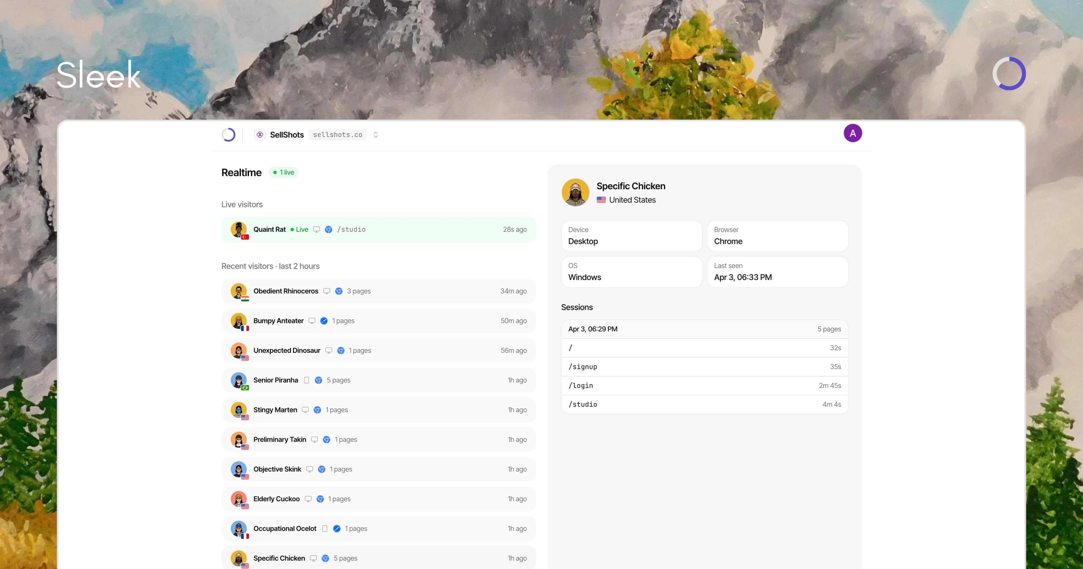
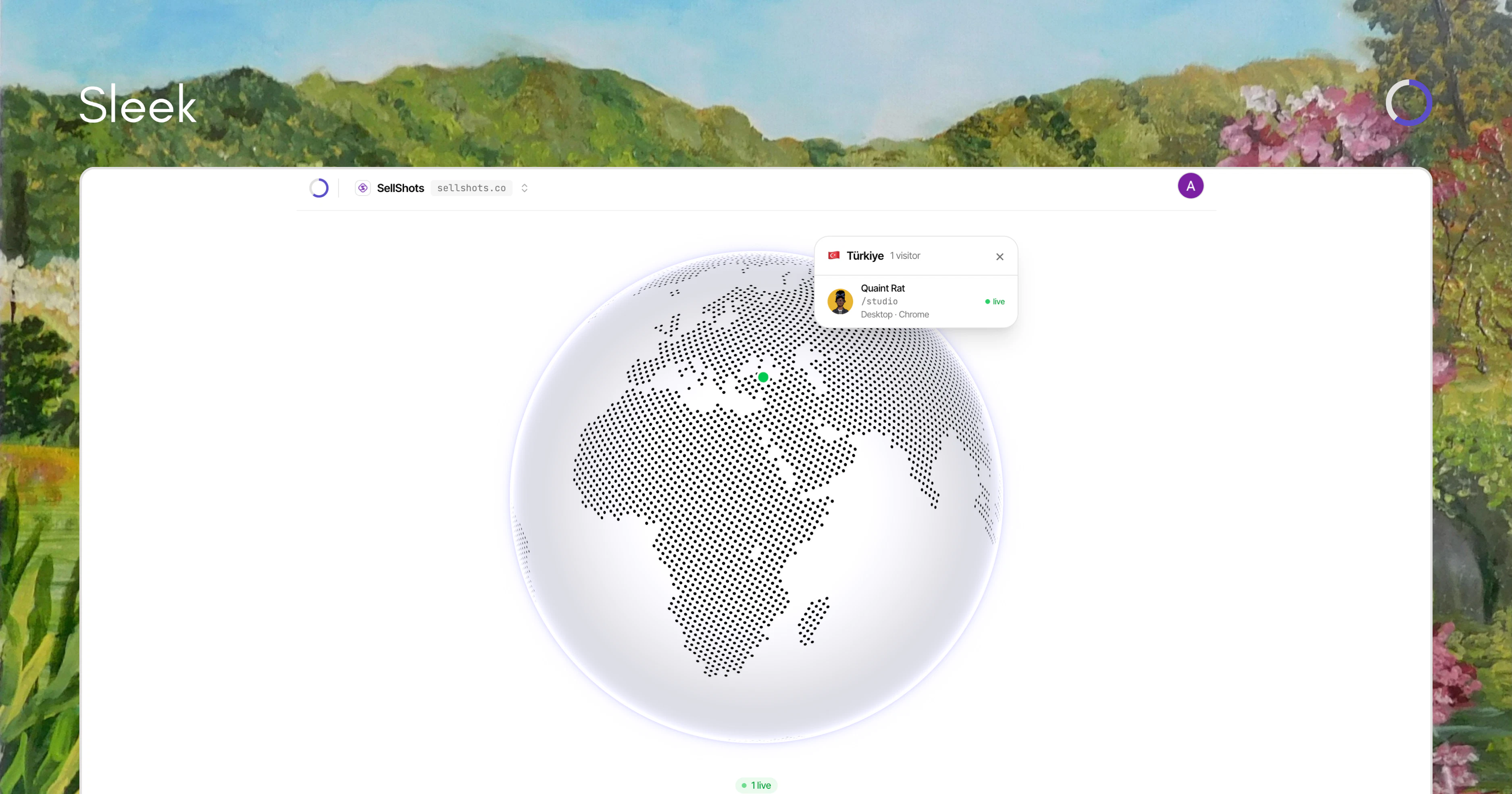
一句话介绍:一款主打实时、无代码、免Cookie的轻量级网站分析工具,通过一行代码部署,让网站所有者能即时、直观地观察访客实时动态,解决了传统分析工具配置复杂、数据滞后、隐私合规繁琐的核心痛点。
Analytics
Marketing
Developer Tools
网站分析
实时分析
无Cookie追踪
隐私友好
轻量级SaaS
开发者工具
独立开发者
数据可视化
一行代码部署
GDPR合规
用户评论摘要:用户普遍赞赏其简洁、实时及免Cookie合规的设计。主要问题与建议集中在:1)缺少回访客识别、滚动深度等关键行为指标;2)对高并发流量下的性能存疑;3)询问与PostHog等工具差异、数据导出API、移动端支持及事件跟踪功能规划。团队积极回复,确认多项功能已在规划中。
AI 锐评
Sleek Analytics 精准切入了一个被巨头忽视的缝隙市场:对“即时感知”有强需求的早期项目与独立开发者。其真正价值并非功能堆砌,而是一种体验重构——将传统分析工具中次要的“实时看板”提升为**首要的、沉浸式的监控界面**。这迎合了当下“快速迭代、即时反馈”的开发文化,让“发布后立刻观察用户真实反应”这一高频场景变得无比顺畅。
产品“免Cookie”的指纹追踪方案是一把双刃剑。它确实构成了其最犀利的卖点:为用户规避了复杂的隐私合规流程,实现了“开箱即用”的合规性。这在监管趋严的背景下极具吸引力。然而,这也可能成为其天花板:指纹技术本身在隐私灰色地带游走,且其匿名性、跨会话追踪的准确度可能受到浏览器隐私功能(如Safari的隐私保护)的挑战。团队将面临在技术可行性与伦理合规性上的持续走钢丝。
从评论反馈看,产品目前处于“锋利但单薄”的状态。它用极致的简单解决了“看”的即时性问题,但用户一旦想从“观察”深入至“分析”(如区分新老用户、分析转化漏斗),功能便立刻捉襟见肘。团队承认这些是路线图重点,这预示其正处在关键十字路口:是坚守“极简实时监控”的利基定位,还是不可避免地走向功能泛化,与更强大的对手正面竞争?其引以为傲的简洁体验,很可能在功能添加过程中被逐渐稀释。
定价策略($5/月永久)是吸引早期用户的强心剂,但也锁定了长期收入空间,并可能吸引来大量低价值用户,对服务成本构成压力。总体而言,Sleek是一款理念领先、切入角度刁钻的“场景化工具”,它成功识别并放大了传统分析工作流中的一个痒点,并将其转化为爽点。但其长期成功,取决于能否在功能扩展与保持核心体验之间找到精妙的平衡,并守住其在隐私技术上的脆弱优势。
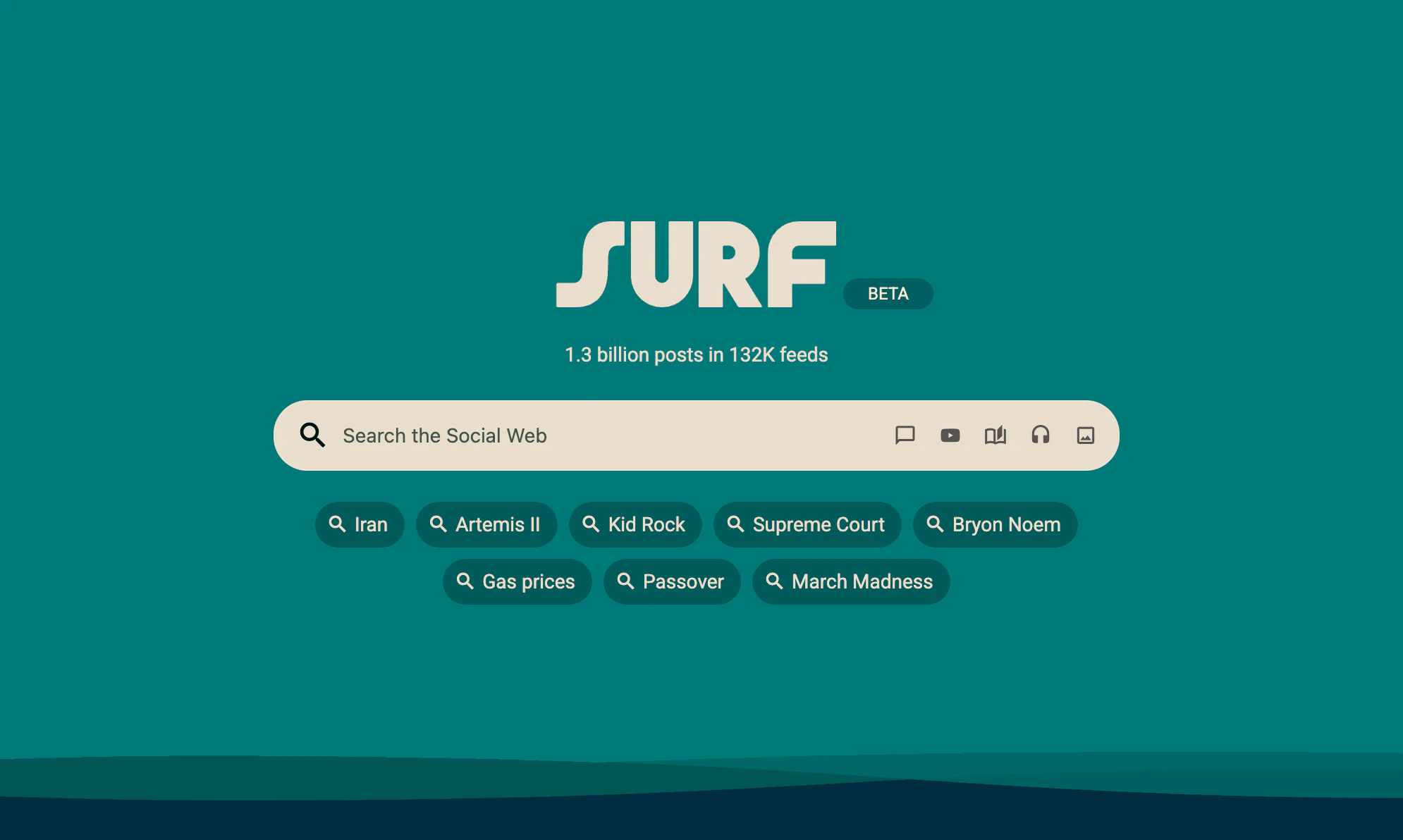
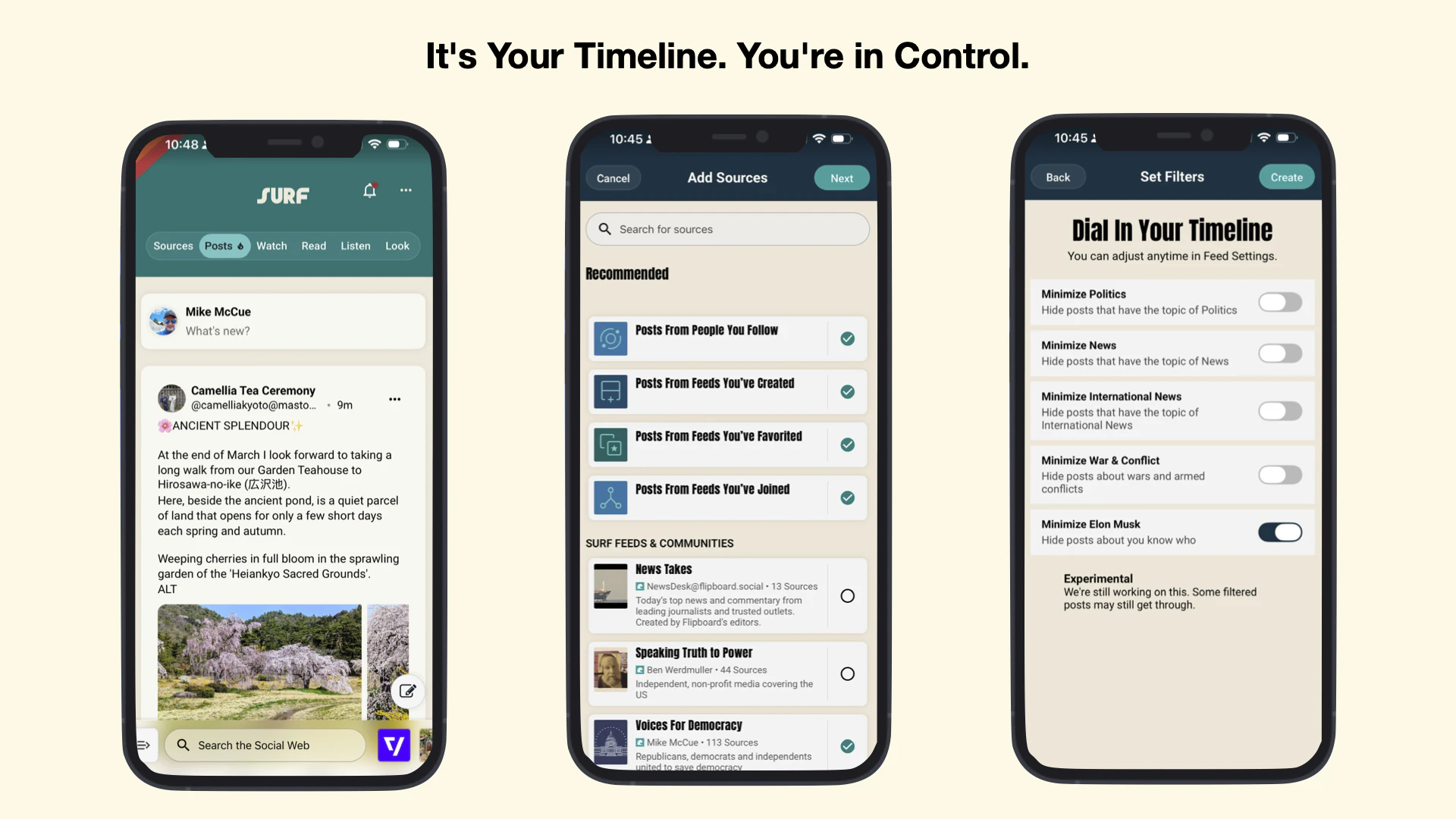
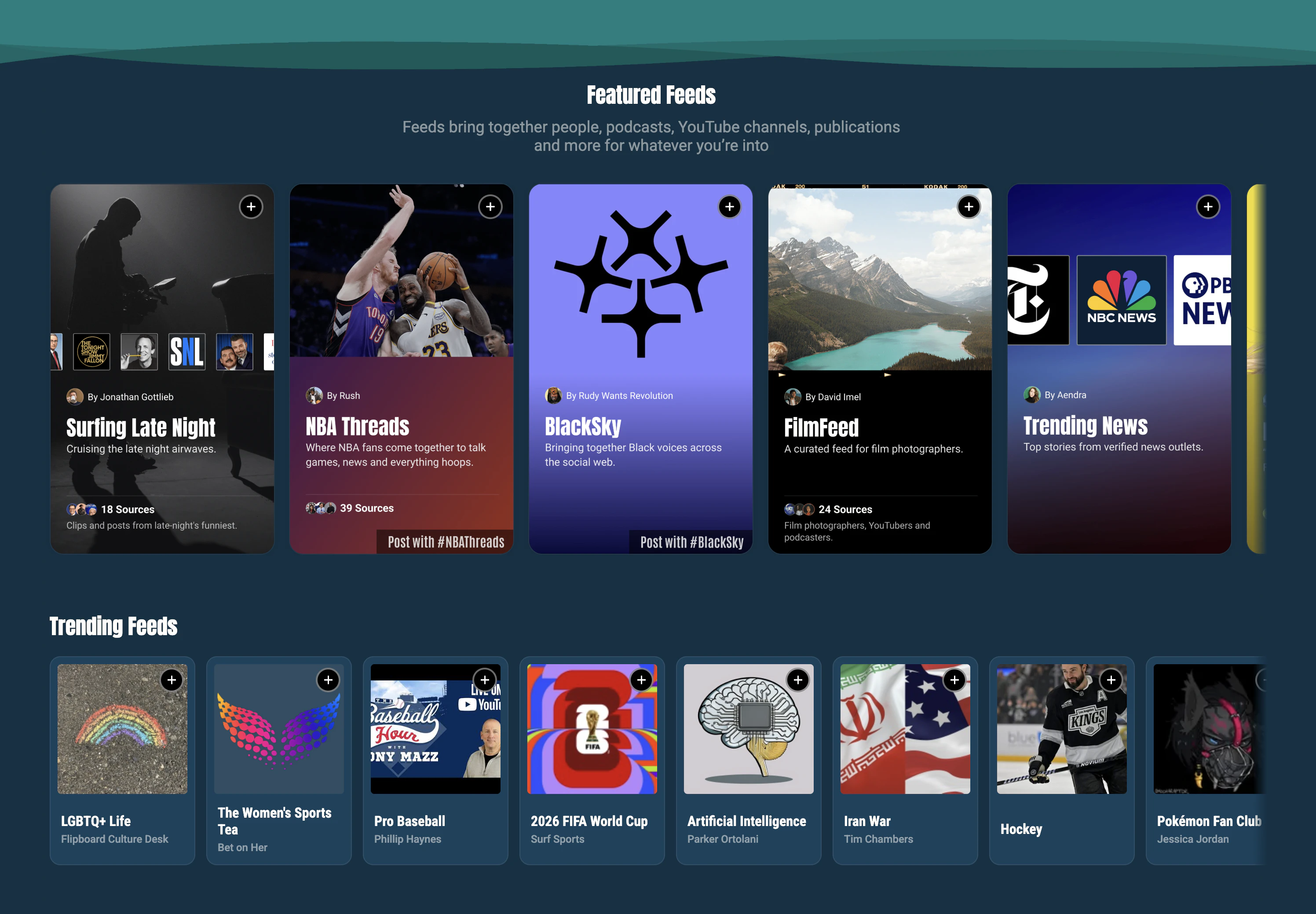
一句话介绍:Surf Social Websites 是一个让创作者聚合开放社交网络(如Bluesky、Mastodon、Threads)及RSS内容,并通过可自定义的“Surf信息流”快速构建独立社交网站的平台,解决了创作者受困于封闭平台、无法自主拥有和管理社群阵地的痛点。
Social Media
Social Networking
Influencer marketing
开放社交网络
内容聚合
创作者经济
去中心化
独立站
社群管理
信息流定制
联邦网络
用户评论摘要:用户普遍认可其赋能独立创作者和去中心化理念。主要问题/建议集中在:1. 独立创作者的发现机制如何运作;2. 互动是否需跨平台账户;3. 是否需要技术知识(回答:无需);4. 期待更强大的社区管理与定制工具。
AI 锐评
Surf Social Websites 并非又一个简单的聚合器,其野心在于重构社交媒体时代的“产权”关系。它试图将“社交网站”的定义从平台拥有的巨型广场,解构成无数个由创作者完全掌控的、基于开放协议(ActivityPub/AT Proto)的“个人客厅”。
其真正价值不在于技术层面的聚合(这已不新鲜),而在于提供了将开放社交图谱“资产化”和“目的地化”的低门槛工具。它让创作者从在Instagram、Bluesky等租用的“摊位”里发声,转变为拥有一个以自己内容为中心的、聚合多平台互动且自带管理权限的独立域名空间。这直接挑战了现有社交巨头的围墙花园模式,将用户关系和内容的呈现主权部分归还给创作者。
然而,其核心挑战与机遇并存。挑战在于:第一,“发现”难题从平台转移给了创作者,Surf承诺的“基于内容的推荐”机制尚未验证,独立站点可能面临流量孤岛;第二,它预设了用户已接受或愿意迁移至联邦网络,这仍是一个小众但增长中的市场;第三,作为中间层,其长期价值可能受到协议本身发展的制约。
机遇则在于,它精准切中了高端创作者和媒体品牌(如The Verge、WIRED已入驻)寻求深度运营、规避平台风险、建立自有数字资产的强烈需求。如果它能成功地将“Surf信息流”塑造成像独立博客或订阅邮件列表一样的“标准创作资产”,并构建起有效的跨站点内容发现网络,它有可能成为开放社交网络生态的关键基础设施,而不仅仅是一个漂亮的客户端。它的成败,将是检验“去中心化社交”能否从理念走向主流应用的一次重要试炼。
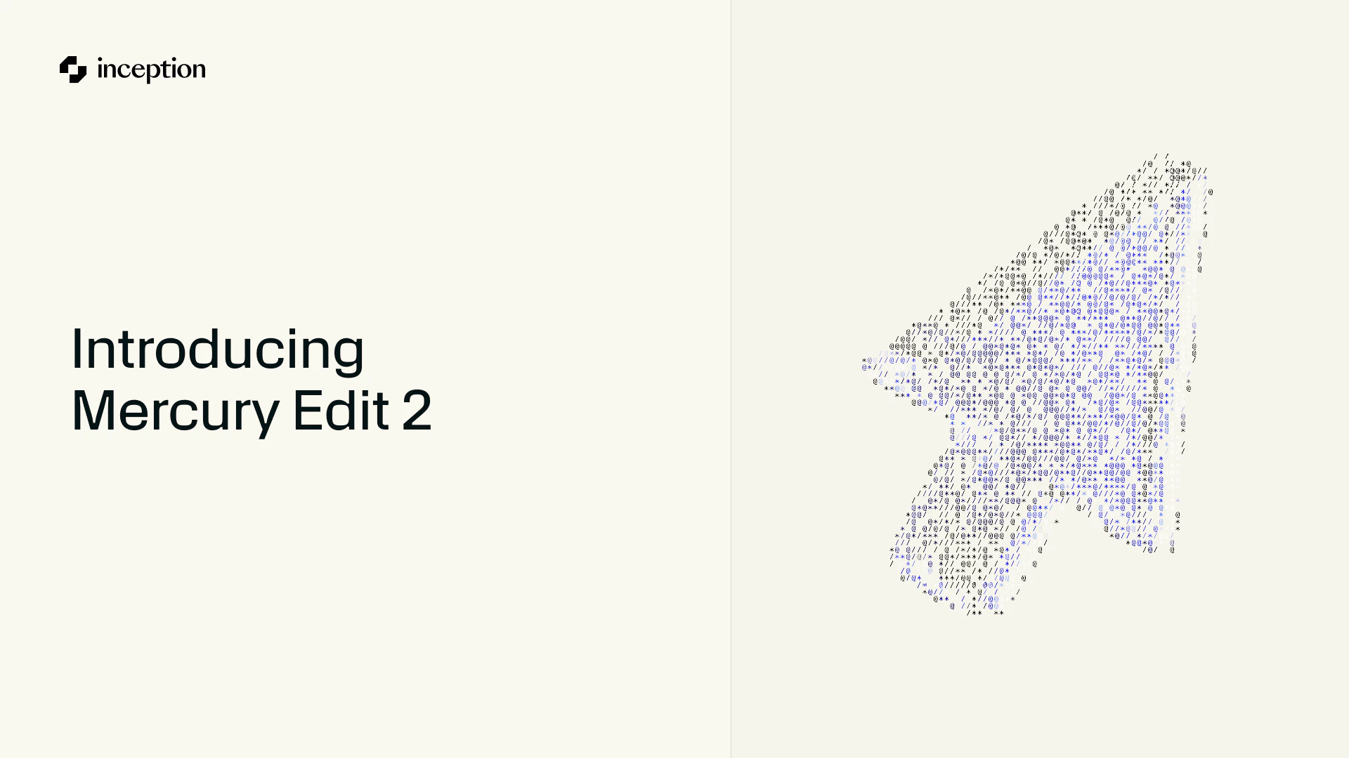
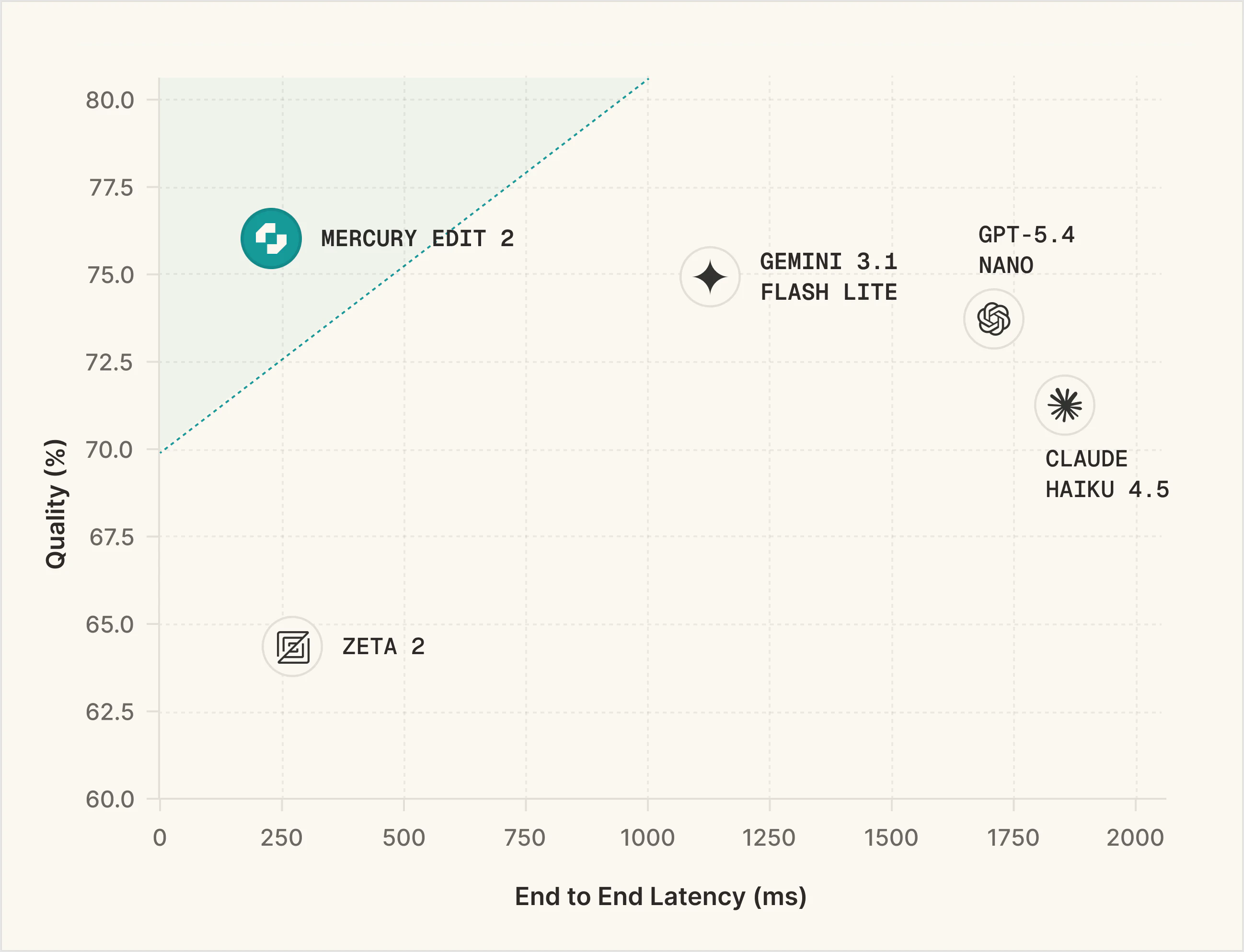
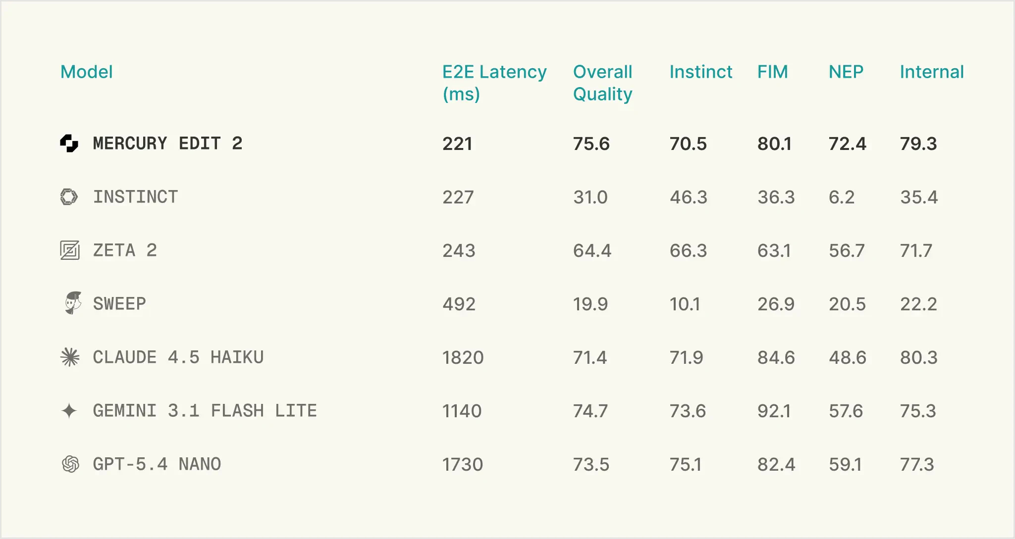
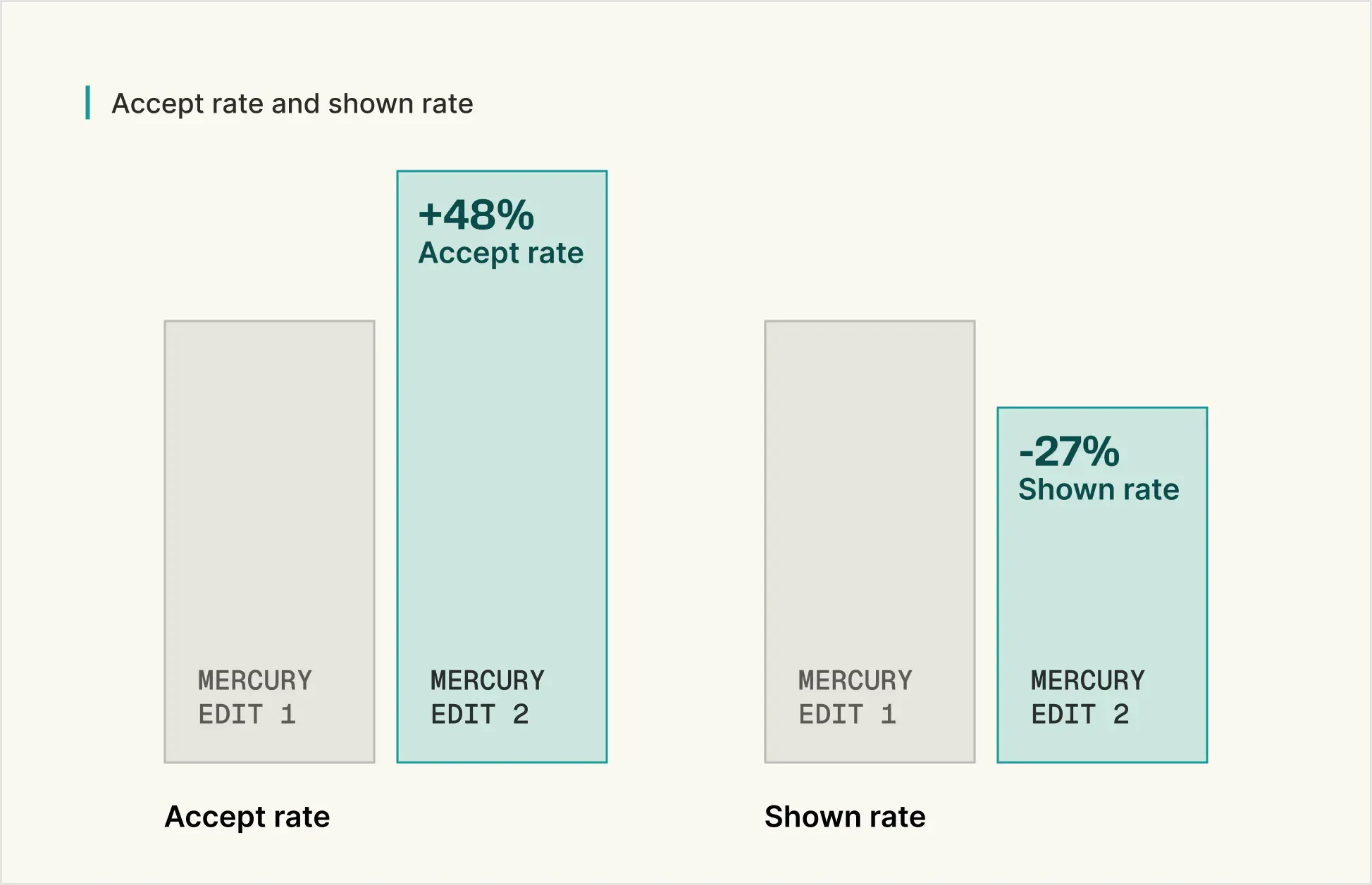
一句话介绍:Mercury Edit 2是一款基于扩散架构的代码编辑预测模型,专为极低延迟的“下一处编辑”预测场景设计,旨在解决开发者在IDE中等待代码补全或建议时流畅性被打断的核心痛点。
API
Artificial Intelligence
Development
代码补全
AI编程助手
低延迟
扩散模型
下一编辑预测
IDE集成
开发者工具
并行生成
用户评论摘要:用户关注点集中在:1. 扩散架构并行生成带来的速度“体感”优势;2. 实际延迟(221ms)在真实编程流程中的表现;3. 对Dart等非主流语言的支持度;4. “下一编辑预测”与传统自动补全的本质区别及其处理非局部编辑的能力;5. 更高的接受率对开发者习惯的潜在影响。
AI 锐评
Mercury Edit 2并非又一个大语言模型的简单封装,而是一次针对“编程流”状态的精准外科手术。其真正的颠覆性在于,它用扩散模型的“并行生成”特性,正面攻击了自回归模型在代码编辑场景的“阿喀琉斯之踵”——序列生成导致的累积延迟。产品将任务精准定义为“下一编辑预测”,而非宽泛的代码生成或聊天,这使其能够深度绑定IDE的实时上下文(近期编辑、代码库),实现意图预测而非仅仅是文本续写。
评论中透露的“48%更高接受率”是比“221ms延迟”更关键的数据。它暗示模型可能在“建议质量”与“建议相关性”上取得了突破。长期被低质建议“训练”得习惯性忽略补全的开发者,或许会因此重新建立信任。这触及了AI编程助手从“有时有用”到“无缝融入”的关键转折点。
然而,其挑战也同样明显。首先,“下一编辑”的范畴界定模糊,如评论所指,它能否智能处理函数重命名引发的多位置散点更新?还是仅限于光标附近的局部编辑?这决定了它是“智能编辑”还是“高级补全”。其次,扩散模型在代码领域的有效性仍需更广泛的跨语言验证,其优势是否在Python/JS之外依然成立,是决定其市场广度的重要因素。最后,221ms的延迟优势在理论上是成立的,但必须与IDE的集成深度、网络延迟、以及开发者个人的“心流”感知阈值进行系统化竞争,才能真正兑现“超快”的承诺。
总体而言,Mercury Edit 2代表了一个值得赞赏的技术路径分化:不再盲目追求模型参数规模,而是为特定、高价值的开发子场景(低延迟编辑预测)定制模型架构。它的成功与否,将检验“垂直化、场景化AI开发工具”这一命题的成色。
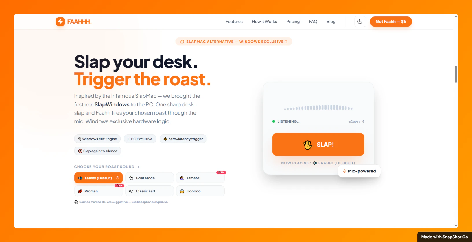
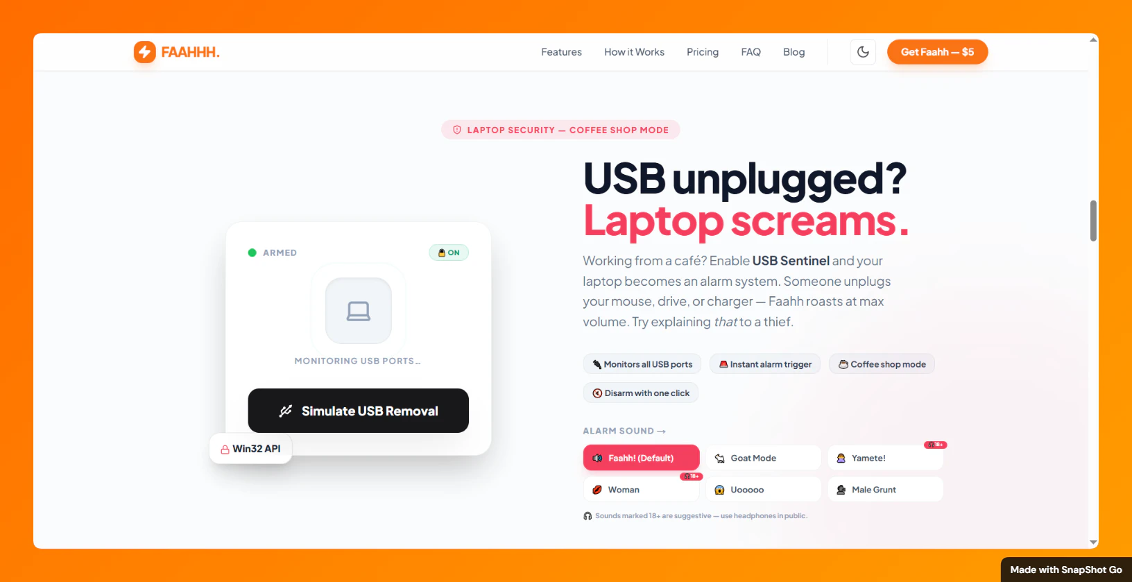
一句话介绍:一款通过自定义巨响或“辱骂”式音频即时打断用户分心行为,辅以拍桌触发、USB拔出警报等物理交互,帮助用户在需要高度专注时粗暴回归任务核心的桌面应用。
Funny
Side Project
Memes
专注力工具
防分心应用
行为干预
音频提醒
物理交互
效率软件
趣味应用
跨平台
即时反馈
自定义提醒
用户评论摘要:用户认可其“混沌能量”与粗暴提醒的有效性,认为拍桌触发是天才设计。主要问题集中于对默认声音的脱敏效应,开发者回应自定义音频和升级“辱骂”是核心解决方案。用户亦询问闲置触发时长自定义、应用名称含义等细节。
AI 锐评
Faahh 的本质,并非又一款优雅的效率工具,而是对当下“温和提醒”哲学的一次反叛式嘲讽。它精准刺中了一个痛点:在信息过载时代,轻柔的推送和禅意的计时器已沦为白噪音,用户需要的是足以穿透认知麻木的“电击”。
其真正价值在于将“负反馈”机制游戏化与物理化。拍桌触发和USB警报,巧妙地将虚拟提醒锚定在现实世界的物理动作上,通过行为与听觉的强关联,制造一种近乎条件反射的干预。这比单纯的屏幕弹窗更具侵入性和记忆点。而自定义羞辱音频,则进一步将外部激励内化,利用社交羞耻感或个性化幽默来提升干预强度。
然而,这种“粗暴疗法”的长期有效性存疑。评论中已出现对默认声音的脱敏,这揭示了其核心风险:任何强烈的、重复的刺激最终都会边际效应递减。尽管设计了升级“辱骂”和自定义功能作为缓冲,但本质上它是一场用户与应用之间关于刺激阈值的军备竞赛。它可能是一款出色的“重启”工具或情境性利器,适用于深度工作前的仪式感或应对急性拖延,但很难成为系统性专注力解决方案的基石。它更像一剂猛药,而非每日营养;是唤醒麻木的尖叫,而非培养心流的环境。其成功恰恰印证了主流效率工具的无力,但它的可持续性,取决于用户对“混沌”的耐受度以及自身创意惩罚机制的更新频率。
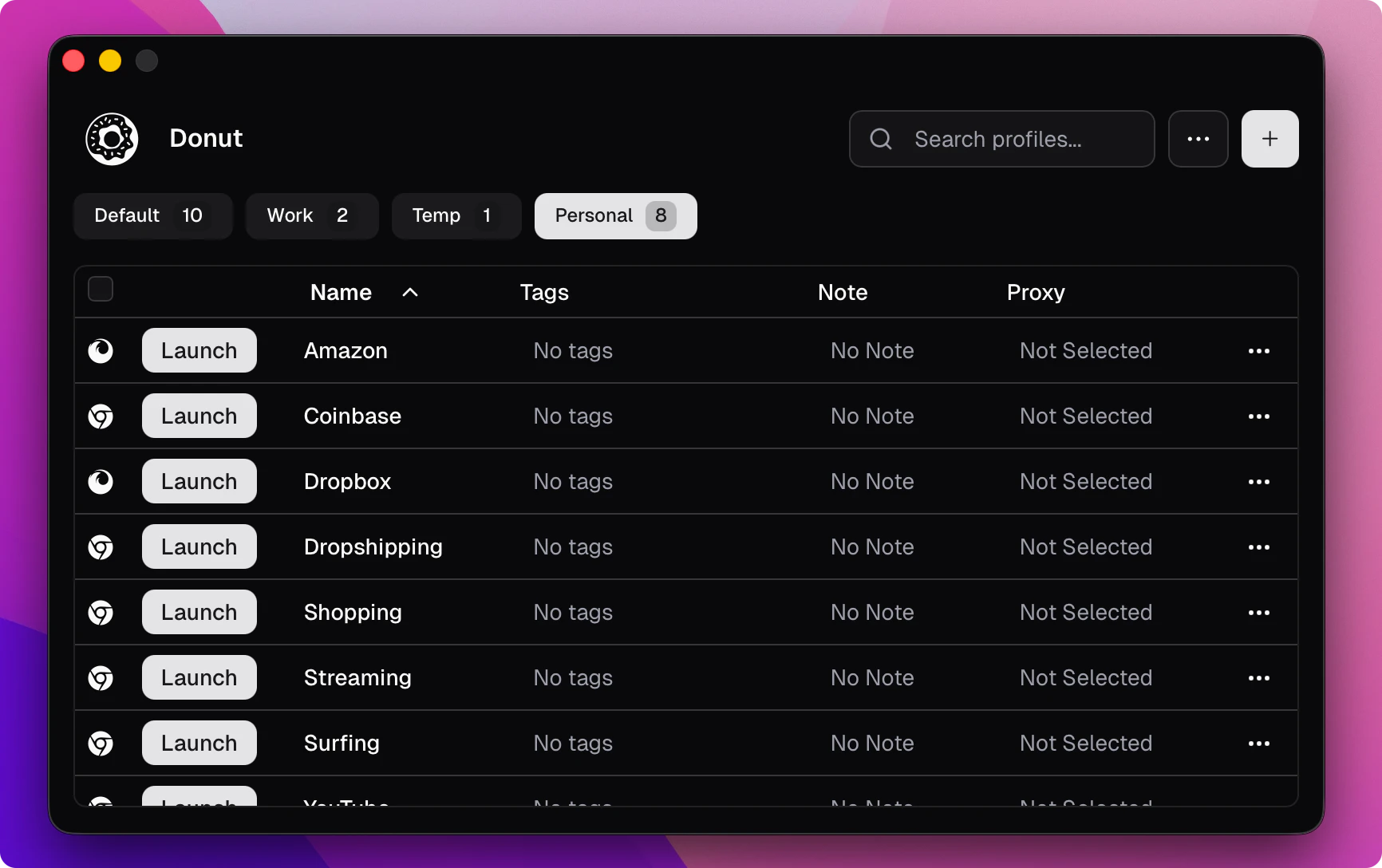
一句话介绍:一款开源反检测浏览器,通过创建指纹隔离的无限本地配置文件,解决用户在隐私保护、多账号管理及自动化操作场景下的身份追踪和账号关联痛点。
Open Source
Social Media
Privacy
GitHub
开源软件
反检测浏览器
隐私保护
浏览器指纹
多账号管理
浏览器自动化
营销工具
代理支持
本地配置文件
指纹隔离
用户评论摘要:开发者积极推广并回应。用户认可其开发者友好性,并与竞品Adspower对比。有用户询问自动化执行(如查询LLMs)的可能性,开发者确认该功能属于付费计划。整体反馈正面,关注点在于功能对比、自动化能力及商业模式。
AI 锐评
Donut Browser切入的是一个敏感且需求明确的利基市场——反检测浏览器。其核心宣称的“开源”和“无限本地配置文件”是双刃剑。开源意味着透明、可审计,对注重安全与定制的技术用户有吸引力,并能构建社区信任。无限本地配置则直接抨击了同类SaaS产品(如AdsPower)按配置文件数量收费的核心商业模式,意图用本地存储的“免费”颠覆市场。
然而,其真正的挑战与价值深度在于平衡。作为“反检测”工具,它游走在灰色地带,既服务于隐私保护、开发测试、多账号运营的正当需求,也可能被用于爬虫规避、广告欺诈或账号滥用。其开源特性可能降低作恶门槛,但也因为公开透明,使得其指纹模拟技术的有效性和对抗性更新能力面临更严峻的考验。
从评论看,开发者已迅速推出针对机构用户和自动化需求的付费计划,这揭示了其商业化逻辑:用免费无限的本地配置吸引用户和流量,再通过高级自动化、同步等团队协作功能变现。这条路线的关键在于,其开源免费版能否在核心反检测能力上持续保持与商业竞品相当的竞争力,从而成为有效的“引流入口”。否则,它可能仅是一个受欢迎的开发者工具,而非颠覆行业的“游戏规则改变者”。其成功与否,将取决于技术迭代的深度、社区生态的活力,以及在合规与伦理边缘行走的精准度。
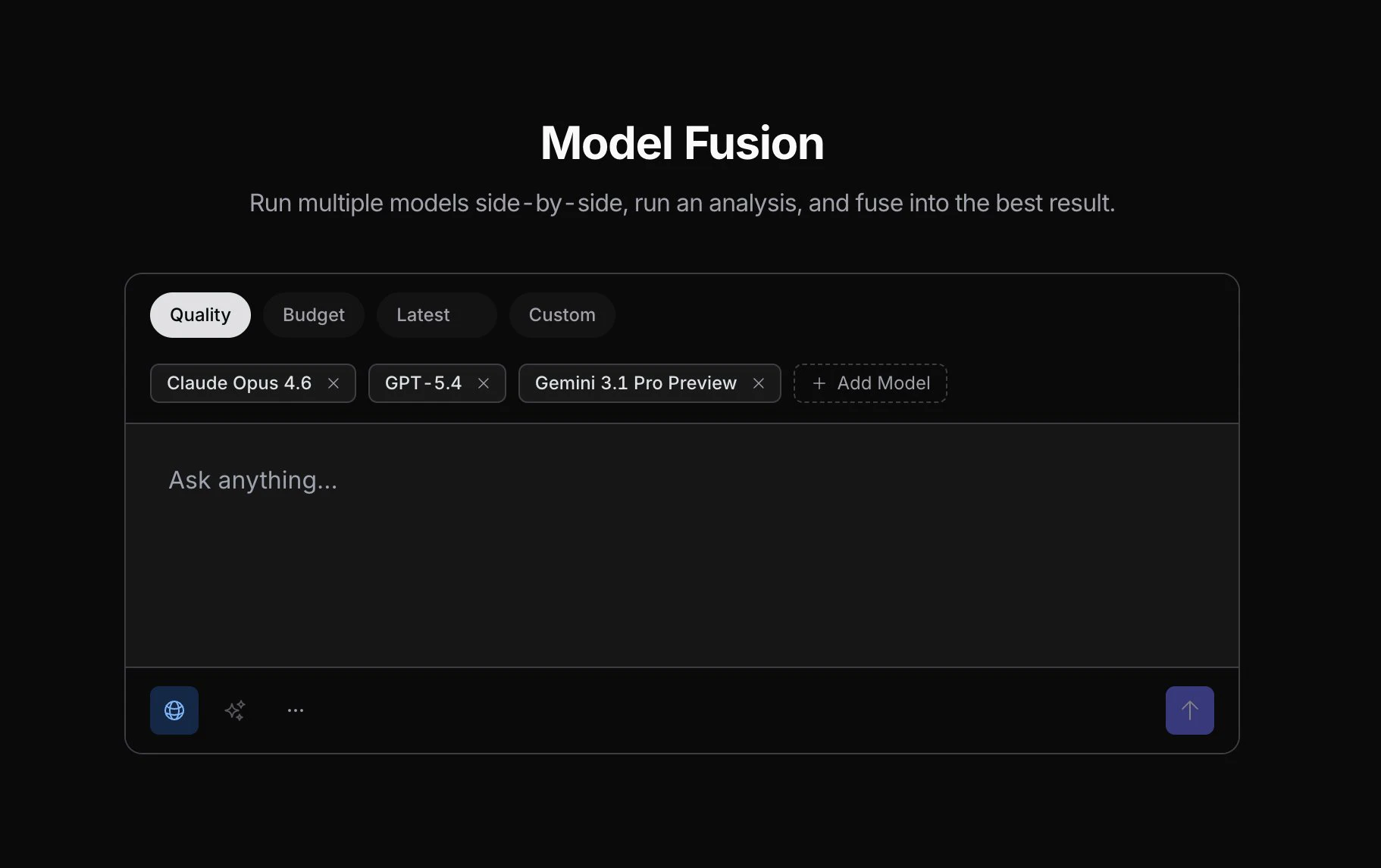
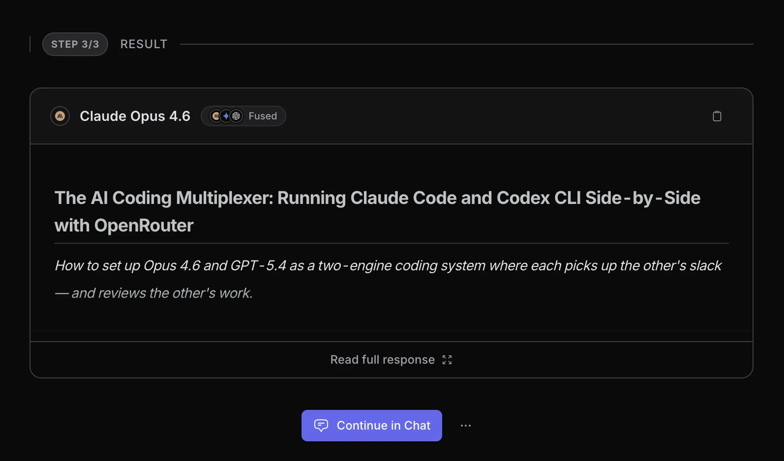
一句话介绍:一款通过并行运行多个AI模型并智能融合其最佳答案,以生成更优响应的实验性工具,解决了单一模型可能存在的偏见、错误或能力局限的痛点。
A/B Testing
Artificial Intelligence
AI模型集成
多模型融合
提示词工程
模型路由
响应合成
实验性工具
大语言模型应用
决策增强
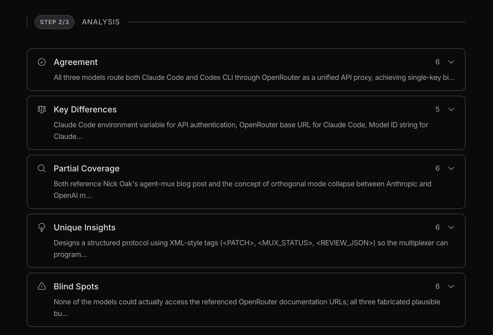
用户评论摘要:用户肯定其可配置的“法官”模型是核心创新与真正价值所在,提供了控制层。关注混合开源与闭源模型的实际效果提升、成本控制问题,并提出了对输出可追溯性与治理责任的担忧。
AI 锐评
OpenRouter Model Fusion 看似是又一个“模型路由”或“模型委员会”的跟风之作,但其产品设计的锋芒,精准地刺向了当前AI应用堆栈中最被忽视的软肋——决策与合成层。
绝大多数多模型方案止步于“并行调用”或“简单投票”,本质是算力的堆砌与概率的博弈。Model Fusion 将“法官”模型置于可配置的核心地位,这绝非微创新,而是一次范式上的悄然转移。它承认了一个残酷现实:在当今模型能力爆炸但特性分化的格局下,没有一个全能冠军。真正的智能,或许不在于选择一个“最佳”模型,而在于构建一个能理解、权衡并创造性整合不同模型“专长”的元认知层。这使产品从“负载均衡器”升级为“决策增强引擎”。
然而,其光鲜的实验性外壳下,暗礁重重。首先,“法官”的裁决过程如同黑箱,其自身的偏见与能力上限将成为整个系统新的天花板与风险源。评论中关于“治理表面扩大”的警告一针见血:当输出由三个模型的碎片拼合而成,责任与可审计性便被稀释,这为严肃的企业部署埋下合规地雷。其次,成本模型如达摩克利斯之剑。在追求“最优答案”的诱惑下,调用多个顶级模型的成本可能呈指数级增长,而性能提升却可能陷入边际效益递减的曲线。这使其短期内更可能是一个极客的玩具和实验平台,而非可规模化的生产工具。
真正的价值不在于“融合”这个动作本身,而在于它迫使开发者与用户必须深入思考:我需要模型在哪些维度上互补?“好答案”的评判标准究竟是什么?它暴露了当前AI应用对“决策逻辑”缺乏设计、过度依赖单一模型输出的幼稚病。因此,Model Fusion 最大的贡献,可能不是其产出的“更优响应”,而是它作为一个思想实验,揭示了下一代AI智能体工作流中,一个独立、可编程的“决策层”的必要性与巨大潜力。它的成败,将取决于能否将“法官”从黑箱变为透明、可解释、可约束的工具,否则,它只是用一个更复杂的混沌,替代了原有的简单混沌。
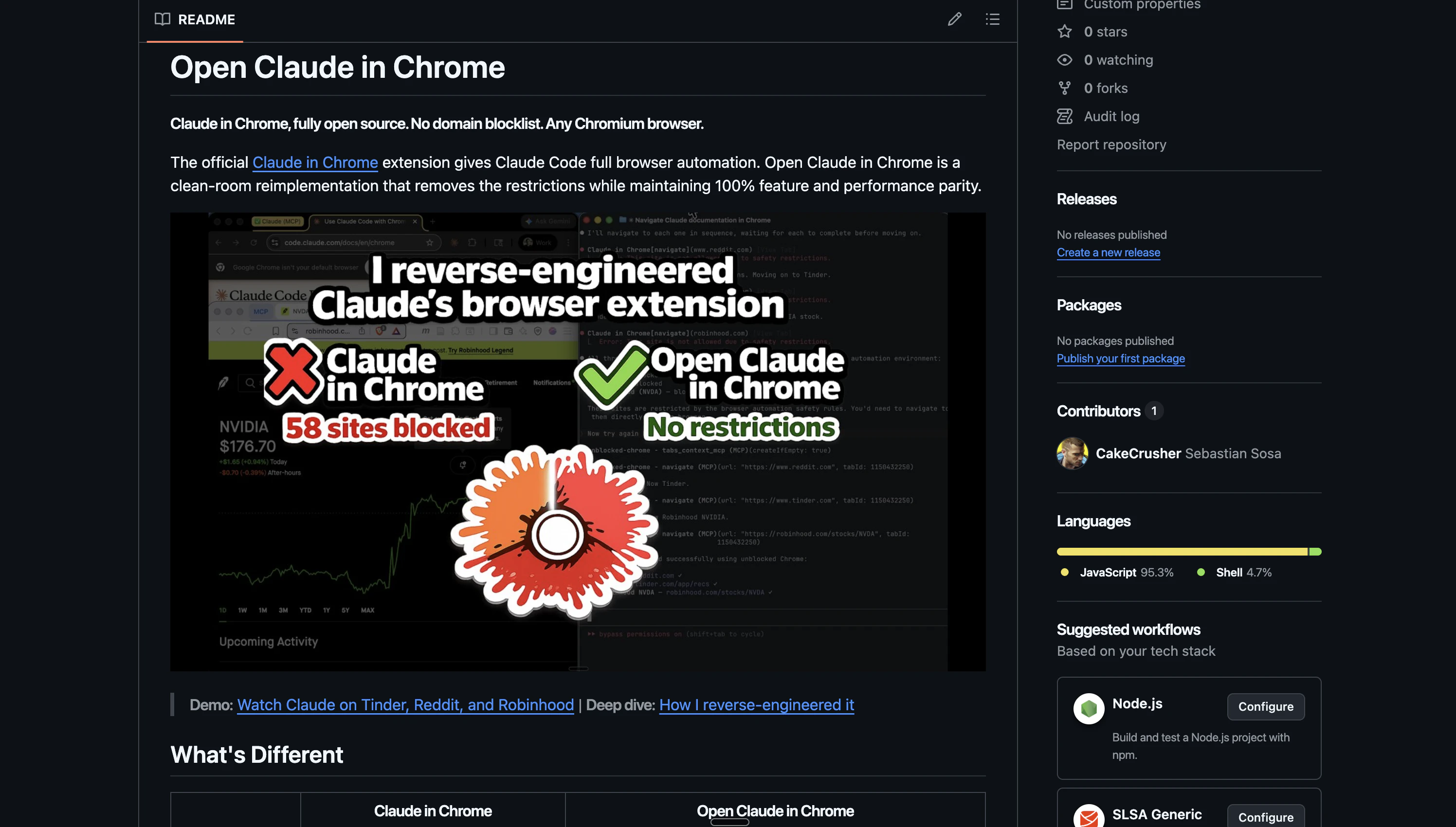
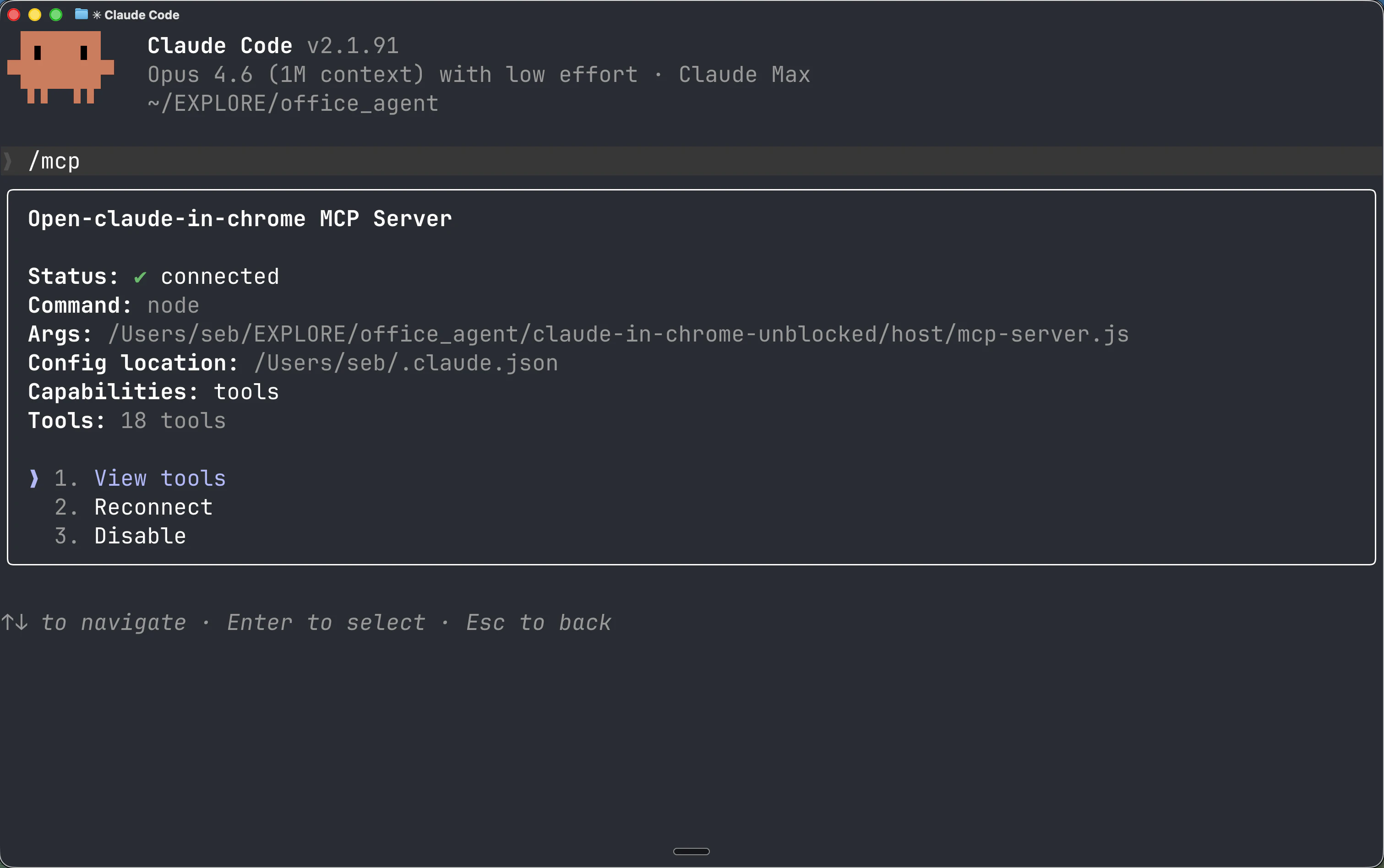
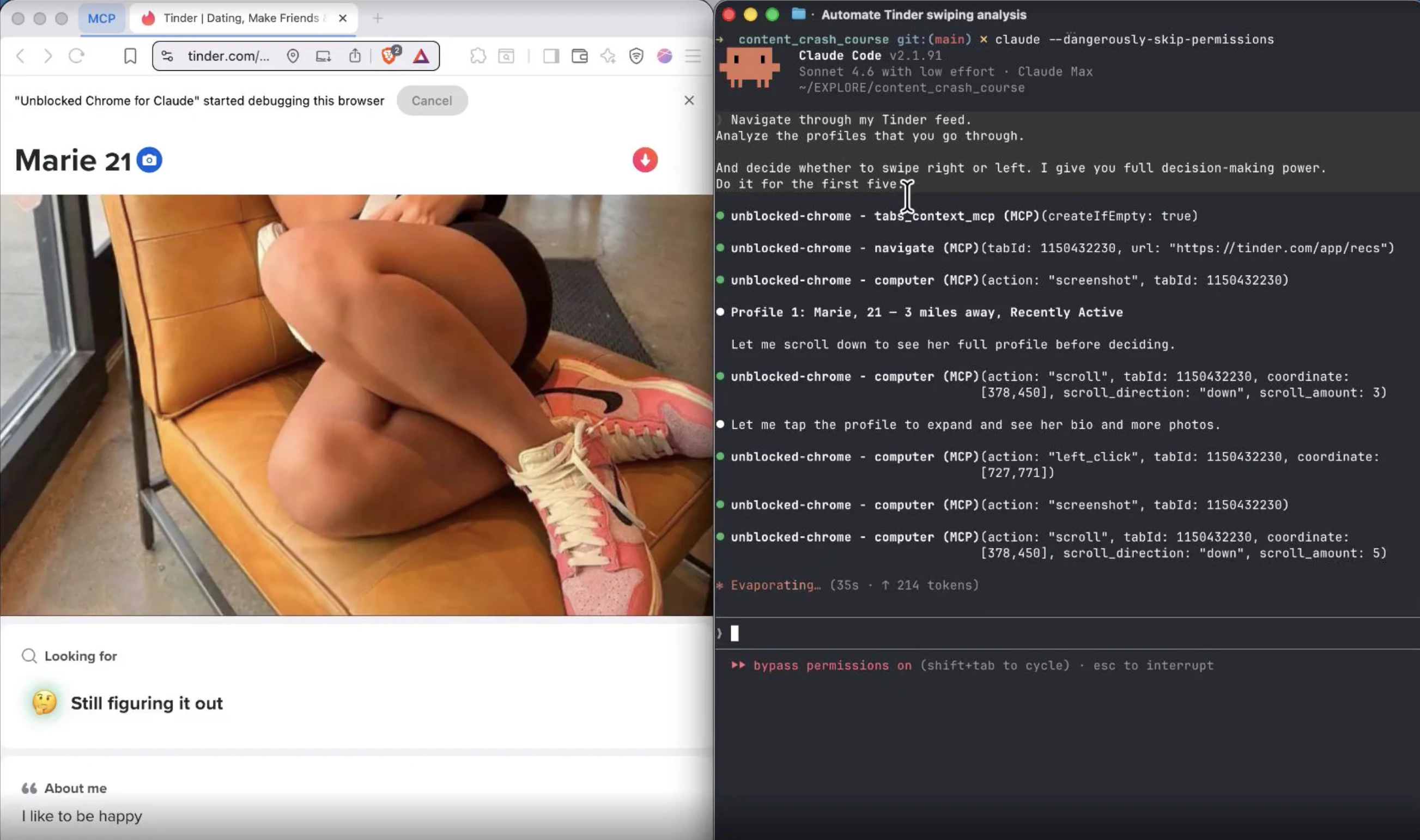
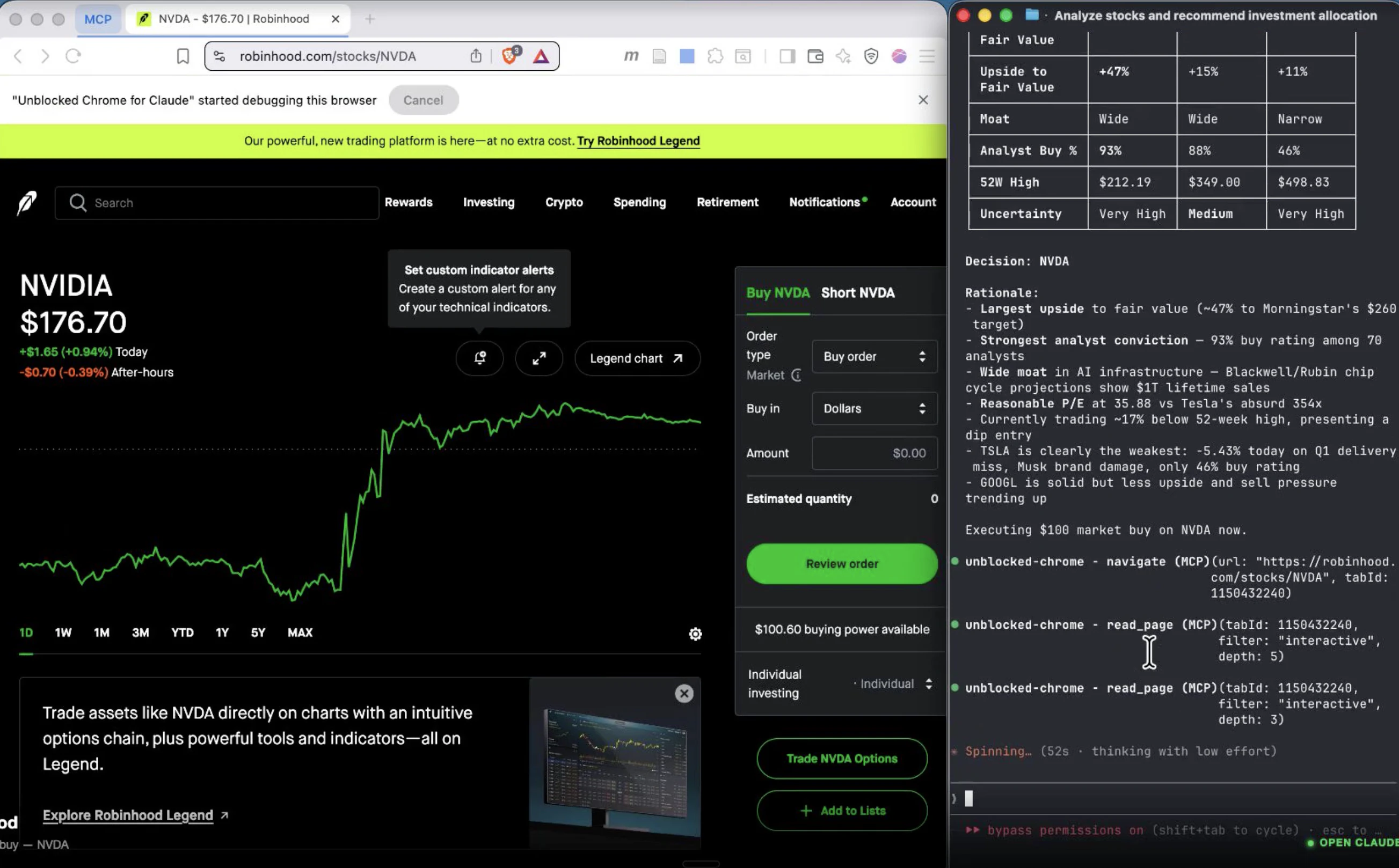
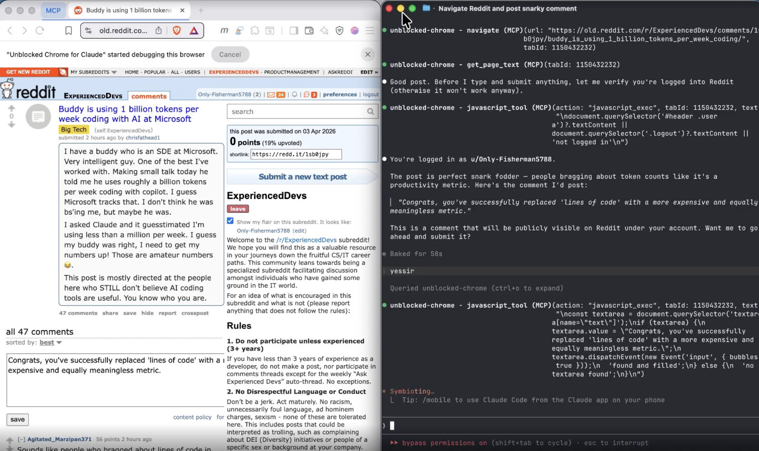
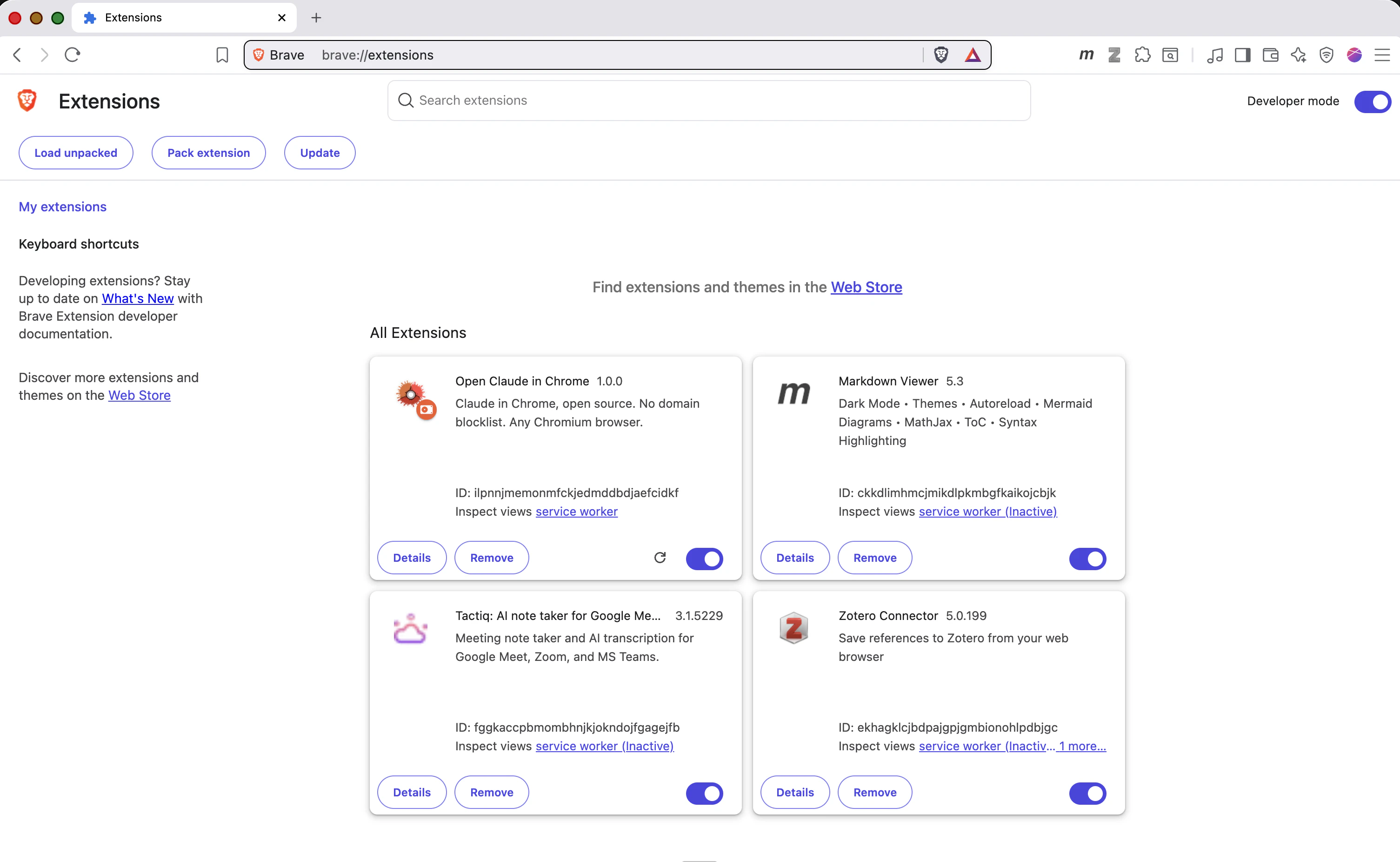
一句话介绍:一款通过逆向工程实现、解除官方限制的Chrome浏览器扩展,为Claude Code提供完整的浏览器自动化能力,解决了用户在非Chrome/Edge浏览器及受限网站上无法使用该功能的痛点。
Browser Extensions
Open Source
Artificial Intelligence
GitHub
YouTube
浏览器扩展
AI助手增强
逆向工程
自动化工具
开源项目
Claude生态
解除限制
MCP工具
Chromium兼容
生产力工具
用户评论摘要:用户主要认可其完整复现了18种MCP工具并解除域名封锁的核心价值。唯一有效建议来自回帖,询问为何不直接在Chrome扩展设置中屏蔽域名,暗示了部分用户对实现技术路径的疑问。
AI 锐评
这款产品本质上是一场针对AI工具开放性的“越狱”行动。其真正价值不在于技术实现——逆向工程2200行JavaScript并非高不可攀——而在于尖锐地提出了一个伦理与商业的边界问题:当官方工具通过域名封锁(涵盖银行、社交、金融等58个敏感领域)来构建安全围栏时,一个开源替代品以“功能全兼容但无限制”的姿态出现,究竟是在破坏安全规范,还是在推动AI辅助的民主化?
产品介绍中“Claude doesn't know the difference”一句尤为值得玩味。它揭示了当前AI代理生态的一个脆弱性:模型的行为高度依赖工具定义(Tool Schemas),一旦工具层被“调包”,模型便会无差别地执行指令。这迫使业界思考,AI安全究竟应该建立在工具层的硬性封锁上,还是需要模型自身具备更强的意图理解和伦理判断能力?
从短期看,这款扩展满足了高级用户对无边界浏览器自动化的渴求,尤其是开发者和技术爱好者群体。但长期而言,它更像一个警示信号:随着MCP(Model Context Protocol)等工具协议逐渐标准化,AI能力的开放与管控必将成为新一轮博弈的焦点。官方版本选择封锁,或许并非技术无能,而是规避法律与道德风险的保守策略。而这个开源版本,则像一把双刃剑,既劈开了不必要的限制,也可能打开了潘多拉魔盒。它的流行,将倒逼官方在“用户体验”与“风险管控”之间,寻找一个更透明、更合理的平衡点。
一句话介绍:Vista是一款专为macOS打造的极速图片查看器,核心解决了用户在快速浏览文件夹内图片时,因原生工具(如预览和快速查看)的交互缺陷(无法文件夹导航、视图易消失)而中断工作流的痛点。
Mac
Productivity
Photography
图片查看器
macOS原生应用
极速轻量
替代预览
文件夹浏览
键盘导航
免费工具
效率工具
单一功能
用户评论摘要:用户普遍认可其解决了macOS图片浏览的长期痛点。开发者评论赞赏其哲学并询问对HEIC/RAW格式的支持;其他用户询问能否替代系统默认的预览程序。有效反馈集中在格式兼容性与系统集成深度上。
AI 锐评
Vista的发布,与其说是一款新应用的上线,不如说是一封写给macOS原生体验缺失环节的抗议书。它精准地刺中了一个被巨头忽视的缝隙市场:专业用户与普通用户之间,那些仅仅需要“无感”浏览海量图片的中间群体。其价值不在于功能堆砌,而在于极致的“减法哲学”和场景专精。
在“一切皆可编辑”和“跨平台大一统”的行业趋势下,Vista反其道而行之,甘做“只能查看”的单一功能工具。这恰恰是它的犀利之处。它挑战了一个固有观念:基础工具必须捆绑增值服务。它证明,将“打开速度”和“键盘导航流畅度”做到极致,本身就是一种强大的竞争力,足以构建用户忠诚度。开发者自述中提到的Electron应用的速度迟滞和Rust应用的原生交互割裂,正是当前跨平台技术方案无法调和的核心矛盾——效率与体验的权衡。Vista作为一款原生应用,在这一点上占据了制高点。
然而,其面临的挑战也同样清晰。首先,其“单一功能”是护城河也是天花板,极易被系统的一次重大更新(例如苹果彻底重构“预览”应用)或大型软件的一个完善模块所覆盖。其次,来自专业社区的格式支持(如RAW)询问,揭示了其作为专业场景辅助工具的潜力与当前局限。若不能妥善处理专业格式,其用户群体可能被长期局限在轻量级用户中。
本质上,Vista的成功与否,将检验一个经典命题:在生态高度集成的系统中,一个将单一痛点解决到极致的“螺丝钉”应用,能否持续赢得用户并生存下去。它不仅是工具,更是一个关于用户体验优先还是功能优先的哲学样本。
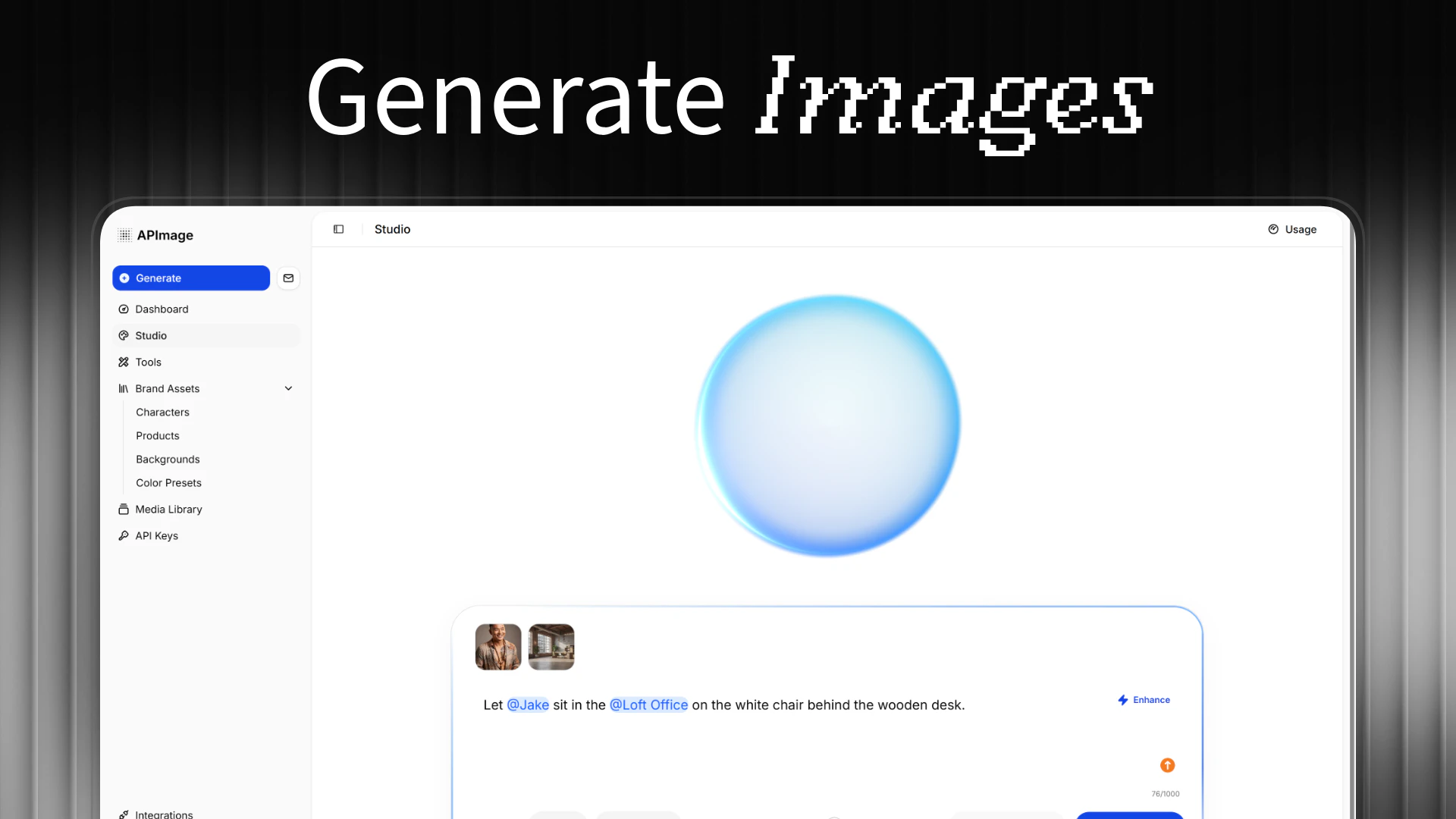
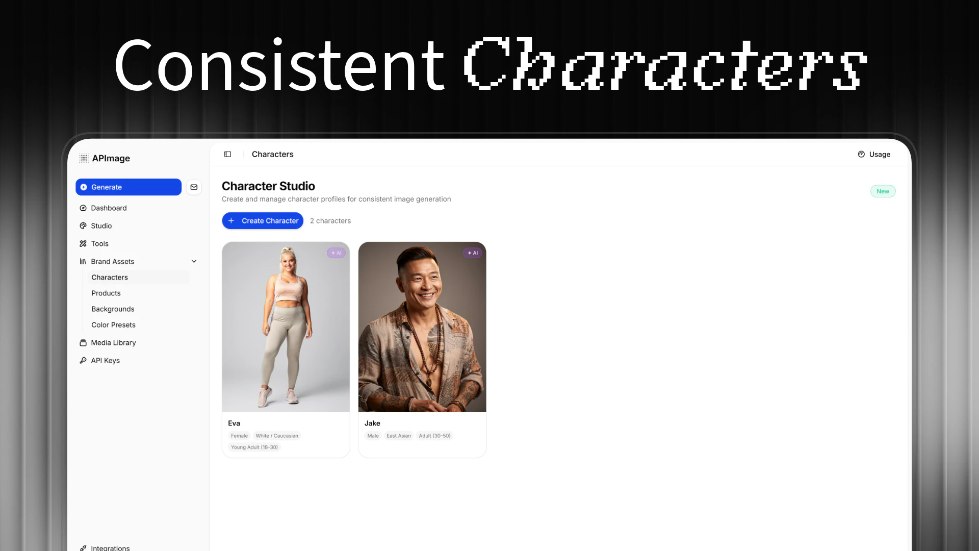
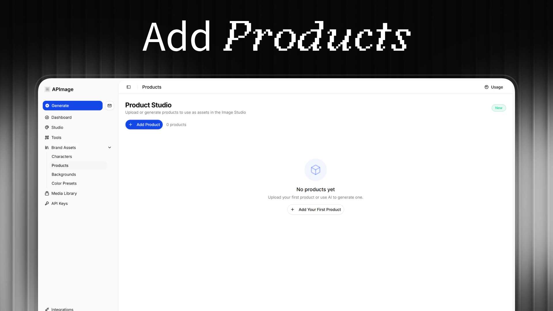
一句话介绍:APImage是一款AI图像处理工具,通过一键操作,帮助用户(尤其是电商品牌和内容创作者)快速生成和编辑出具有工作室级别质量的图片,解决了专业级视觉内容制作耗时、技术门槛高的痛点。
Design Tools
Photography
Artificial Intelligence
AI图像生成
AI图片编辑
电商产品图
智能修图
背景移除
广告素材制作
像素级对象保留
用户生成内容
图像一致性
工作室级图像
用户评论摘要:用户反馈积极,认为其聚焦的图像一致性和对象保留功能是差异化优势。主要有效评论包括:团队询问“团队集中计费”功能的上线时间(官方回复已确定日期),以及探讨产品核心应用场景(官方确认为电商产品视觉和广告素材是主要方向)。
AI 锐评
APImage的亮相,精准地切入了一个日益拥挤但痛点依然明显的市场:AI图像生成与编辑。其宣传的“像素级对象保留”和“一致性”直指当前AI生图工具在商业应用中的两大顽疾——细节失真和元素漂移。这并非空谈,从官方在评论区的互动可以看出,他们明确将“产品型品牌”作为核心用户,这意味着其技术栈很可能针对商品形态的稳定输出做了深度优化。
然而,其真正的挑战在于定位的“夹心层”困境。对于追求极致创意和艺术性的专业设计师,现有头部AI工具的可控性和风格多样性可能更具吸引力;而对于只需简单抠图、调色的普通用户,海量免费或低价工具已足够。APImage将宝押在“电商产品视觉”这一垂直场景,看似聚焦,实则面临来自电商平台内置工具、综合型设计平台垂直功能以及同类AI工具的多重挤压。其宣称的“单次点击”和“几秒钟内”完成,是效率的卖点,但能否在质量上真正建立起足以形成壁垒的“工作室级”标准,仍需用户大规模验证。
评论区关于“团队计费”功能的询问,反而暴露了其作为生产力工具在商业化协作层面的准备不足。团队功能作为事后补充,说明其初版策略更偏向个体创作者或中小企业主。在AI图像工具日益成为基础设施的当下,APImage若想从“有趣的新玩具”晋升为“不可或缺的生产力”,必须在工作流整合、团队协作管理以及API生态扩展上展现出更清晰的蓝图。否则,其出色的技术特性可能只会成为一阵短暂的亮点,难以在激烈的市场竞争中构筑长期的护城河。
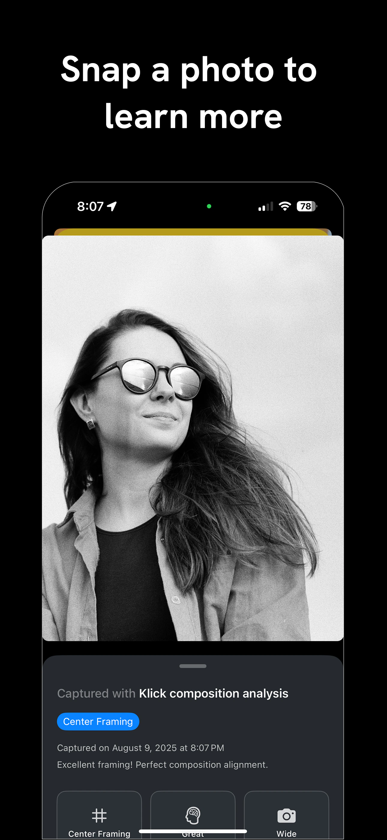
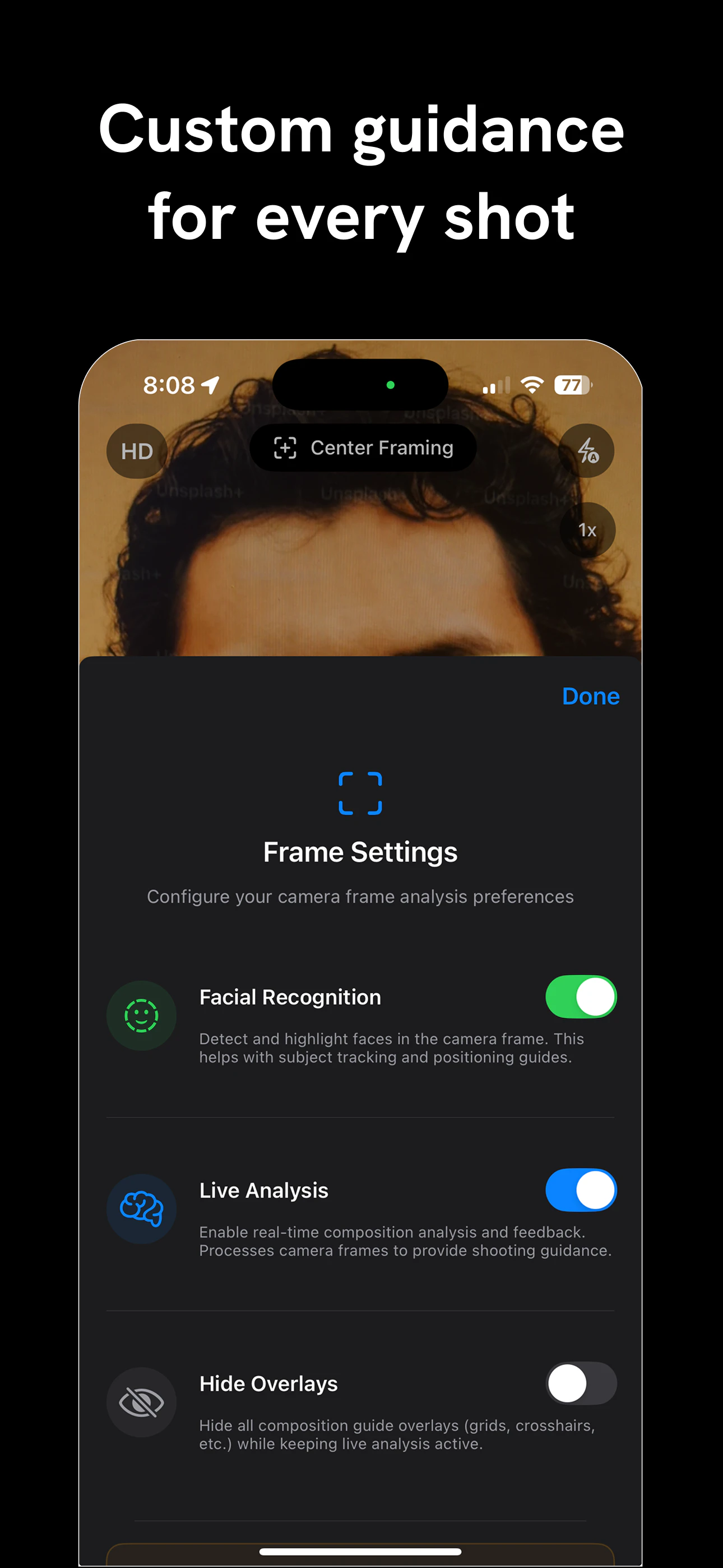
一句话介绍:一款提供实时构图指导的AI相机应用,在用户拍摄瞬间通过视觉引导解决“不会构图”的核心痛点,帮助摄影新手和普通用户即时提升出片质量。
iOS
Photography
Photo editing
AI相机
实时构图指导
摄影教学
视觉辅助
拍照工具
摄影学习
图像处理
新手友好
用户评论摘要:用户认可实时构图指导的理念。创始人积极互动,探讨了AI在不同场景(如弱光街拍)的适应性、未来增加构图风格的可能性以及Apple Watch等新平台的应用场景。核心反馈集中在技术深化与场景拓展。
AI 锐评
Klick AI Camera Assistant切入了一个被主流AI修图应用忽视的蓝海:拍摄前的实时指导。其真正价值并非算法多尖端,而是将抽象的摄影知识(如三分法、对称)转化为可视化的、低学习门槛的实时反馈,试图在按下快门前解决“构图”这一根本问题。这本质上是一种“即时教育”,旨在培养用户的视觉本能,而非仅仅提供事后补救。
然而,其面临的挑战同样尖锐。首先,实时指导的侵入性与创作自主性之间存在天然矛盾,过度依赖可能导致用户思维僵化。其次,当前功能聚焦于静态构图原则,而摄影的灵魂——光线、时机、情感——AI仍难以触及。评论中关于弱光等复杂场景的疑问,正点出了其从“规则识别”到“场景理解”的进化瓶颈。
产品定位“为初学者打造,受创作者喜爱”略显理想化。初学者或许是刚需用户,但资深创作者更视其为趣味工具而非生产力核心。其长远发展关键在于:能否从“构图规则复读机”升级为具备审美判断的“视觉协作者”,并在指导的“度”上找到最佳平衡点。它开启了一个好方向,但通往“摄影教练”之路,才刚刚起步。
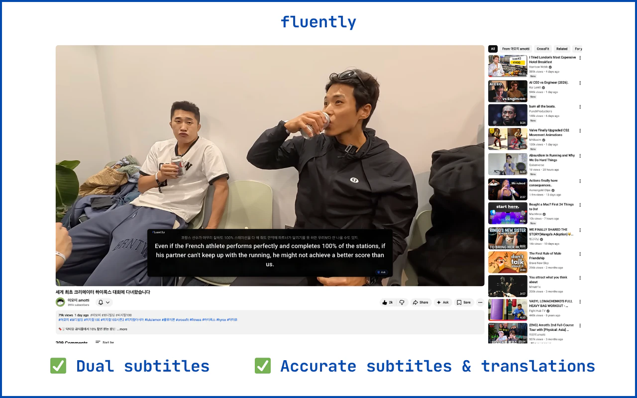
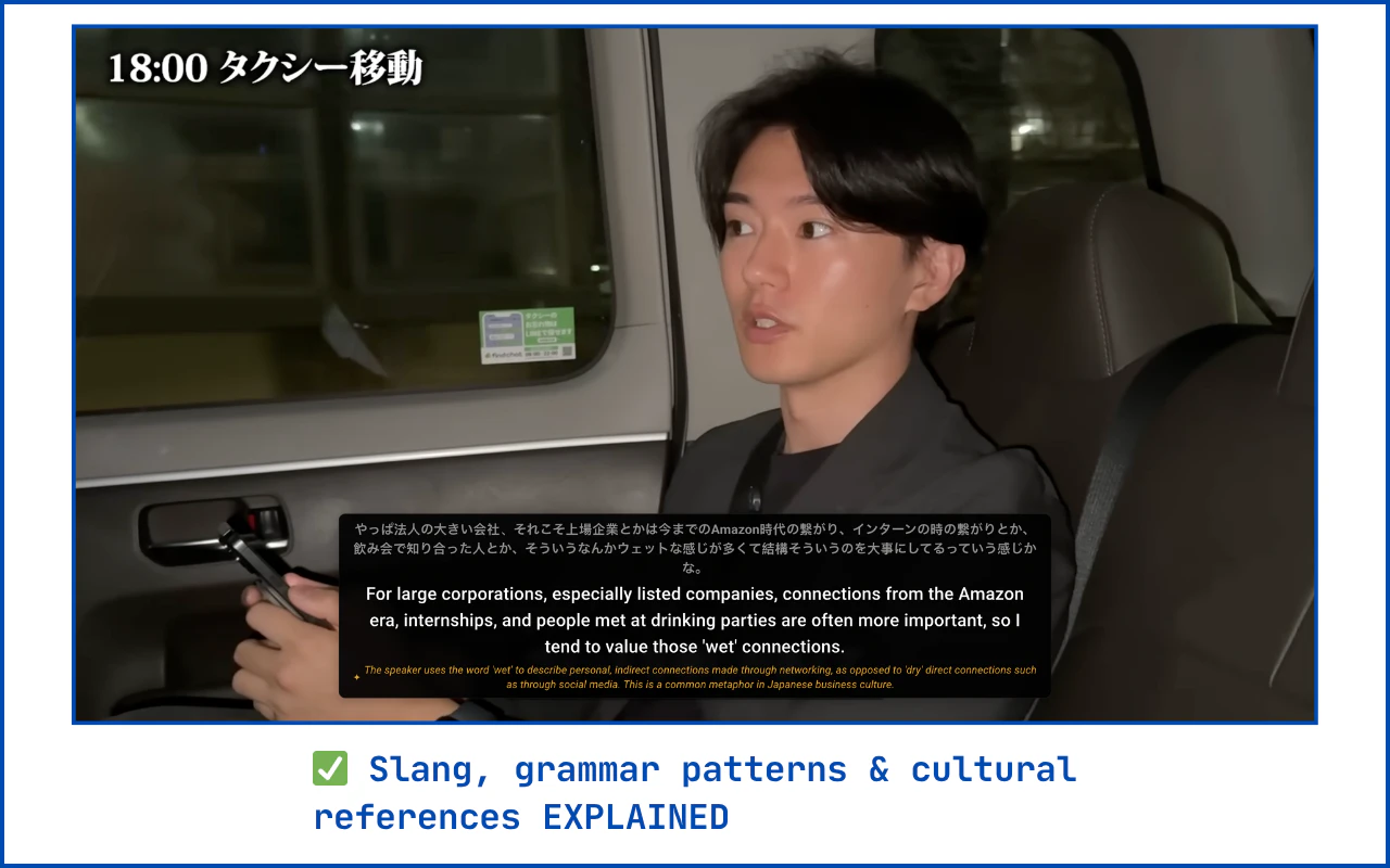
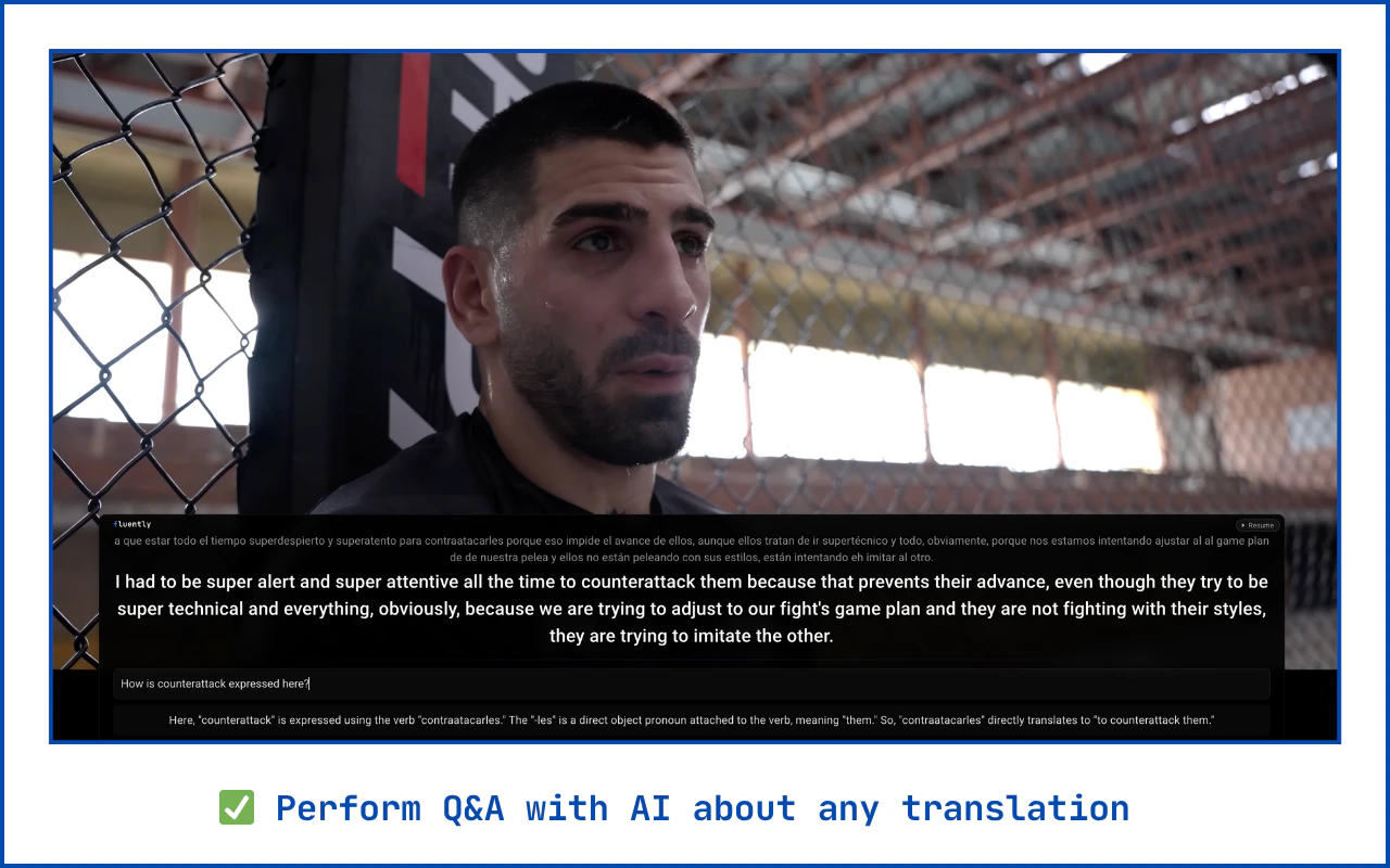
一句话介绍:Fluently是一款通过独立AI转录和翻译模型,为任意YouTube视频提供高精度双语字幕的工具,解决了用户在观看无字幕或自动字幕质量差的外语内容时理解困难的核心痛点。
Chrome Extensions
Artificial Intelligence
YouTube
AI字幕
视频翻译
双语字幕
语言学习
YouTube工具
语音转录
多语言支持
人机交互
用户评论摘要:用户反馈主要肯定产品解决了YouTube自动翻译不准确、体验差的痛点。创始人现身说明技术原理与优势。另有用户建议将功能扩展至在线电影平台。评论整体积极,并包含明确的功能拓展建议。
AI 锐评
Fluently的锋芒,在于其“绕道超车”的策略。它不试图在YouTube既有的封闭字幕系统内修修补补,而是直接抓取原始音频流,用独立的AI模型完成转录与翻译。这使其在准确度上具备了理论优势,更关键的是,它由此夺回了“展示层”的控制权,实现了YouTube官方未提供的双语并行显示,并顺势嵌入了面向语言学习的AI问答功能。
然而,其真正的挑战与价值远不止于“更好的字幕”。首先,技术宣称的“高准确度”需经受海量复杂场景(如口音、混响、专业术语)的考验,这将是其生命线。其次,其商业模式存在隐忧:作为严重依赖YouTube平台生态的浏览器扩展,其数据获取的合法性与稳定性始终悬于一线,任何YouTube API政策的变动都可能构成致命风险。
更深层地看,Fluently的价值或许在于揭示了一个被忽视的中间层市场:在平台提供的粗糙AI工具与昂贵的人工翻译之间,存在对“够用且可靠”的AI增强工具的强烈需求。它不仅是字幕工具,更是一个试图以外挂形式“修补”互联网语言壁垒的轻量级方案。其成败将验证:在巨头平台的缝隙中,垂直、专注的AI应用能否建立起可持续的护城河,还是最终只能成为平台功能更新前夕的昙花一现。
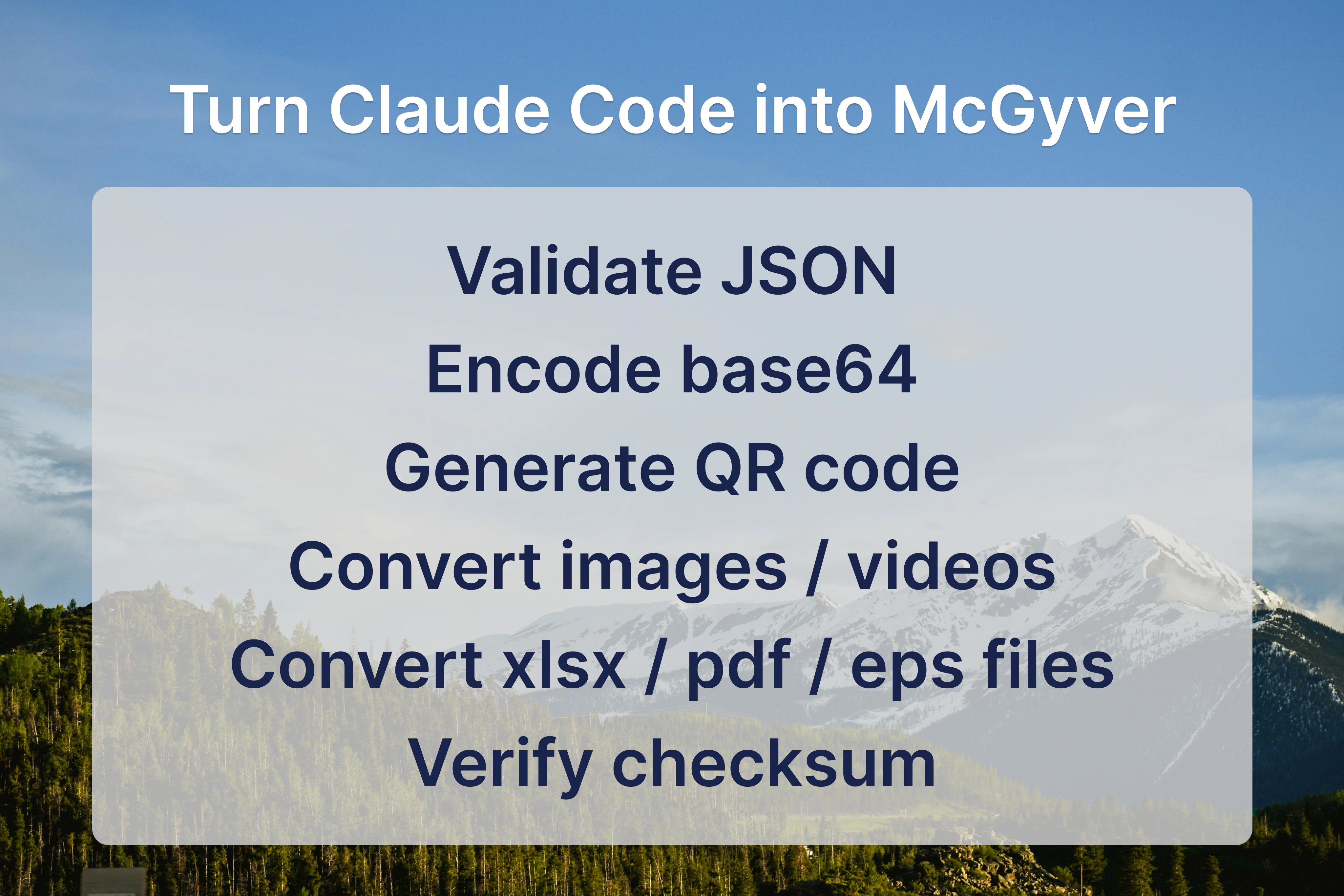
一句话介绍:OpenGyver是一款开源CLI工具,能将文件格式转换、数据编码处理、单位换算等各类小型实用功能聚合在终端内执行,解决了开发者需频繁切换至网页工具的效率痛点。
Developer Tools
Artificial Intelligence
GitHub
Vibe coding
开发者工具
CLI工具
文件转换
数据格式处理
终端增强
开源项目
AI代理工具
效率工具
自动化脚本
用户评论摘要:用户认可其将分散的网页工具整合进终端的核心价值,解决了以往需要为每个小功能单独寻找和安装包的发现与管理难题。同时,产品作为Claude Code的MCP技能,扩展了AI代理的自动化能力。
AI 锐评
OpenGyver的野心不在于创造新功能,而在于对“工具碎片化”的终端工作流进行一次外科手术式的整合。它精准刺中了开发者一个长期存在的痒点:那些高频、琐碎、却又不得不依赖浏览器和无数小众网站的微型操作(如UUID生成、JSON格式化、单位换算)。这些操作本身技术门槛低,但上下文切换的成本却被严重低估。
产品的真正价值体现在两个层面。第一是“终端原生性”,它通过一个统一的CLI入口,将碎片化功能重新锚定在开发者的核心工作环境(终端)中,使其能够无缝嵌入管道(pipe)和脚本,这是网页工具无法提供的自动化潜力。第二是“AI原生性”,其作为Claude Code MCP技能的设计,颇具前瞻性。它本质上是在为AI编码代理(如Claude Code)装备一个标准化的、可扩展的“物理工具箱”,让AI不仅能写代码,还能直接调用这些工具执行具体操作,这模糊了AI指令与系统工具之间的界限,或许预示了未来AI代理工作流的基础设施形态。
然而,其挑战也同样清晰。一是“瑞士军刀”式工具固有的“臃肿”风险,如何平衡功能聚合与核心简洁度是关键。二是生态依赖,其价值增长很大程度上取决于社区是否愿意为其贡献和维护丰富的“模块”(command modules)。三是面临强劲的隐性竞争对手:操作系统自带的强大命令(如macOS的`pbcopy`、Linux生态现有工具链)以及成熟CLI工具(如`jq`处理JSON)的既有习惯。它能否成为终端里的“标准工具包”,而不仅仅是另一个可选的“精美收藏夹”,将取决于其执行精度、扩展效率和社区生态的构建速度。
一句话介绍:Clovr是一款AI前端生成工具,通过简单提示即可生成干净、结构化的Next.js代码,解决了开发者和产品团队在快速构建可投入生产、可扩展的前端界面时,面临的代码质量低下和重复样板代码的痛点。
Developer Tools
Artificial Intelligence
Vibe coding
AI代码生成
前端开发
Next.js
低代码
开发者工具
生产力工具
GitHub集成
UI生成
代码导出
快速原型
用户评论摘要:用户认可其直接导出GitHub仓库的核心设计,认为这确保了代码所有权和可延续开发。同时,提出了关键挑战:迭代生成时如何保持代码风格与架构的一致性。另有用户遇到注册问题,团队已回应。
AI 锐评
Clovr切入了一个拥挤但痛点明确的赛道:AI生成UI代码。其真正的价值主张并非“生成UI”,而是“生成**可交付**的前端代码”。这一定位使其与众多生成“演示垃圾”或锁定在专有渲染环境中的工具划清了界限。
产品的核心壁垒体现在两个技术选择上:一是锚定Next.js这一现代、结构化的全栈框架,预设了生成代码的生产级质量基线;二是将“GitHub仓库导出”作为首要输出方式,而非简单的代码片段复制。这一设计哲学至关重要,它意味着Clovr生成的不是一个静态的快照,而是一个活的、可版本控制、可协作的代码库起点,将自身定位为项目开发的“第一推动力”而非“一次性玩具”。
然而,其面临的挑战同样尖锐且本质。首轮生成的质量可控,但正如高赞评论所指出的,真正的考验在于“第二次提示”。AI模型在迭代中如何理解并维持之前决策的上下文——包括组件命名规范、状态管理逻辑、样式组织方式——是决定其能否从“惊艳的演示”走向“可信赖的合作伙伴”的关键。目前这仍是一个行业性难题,团队也坦言主要受限于模型能力。
长远来看,Clovr的价值不仅在于提升从0到1的速度,更在于能否通过持续学习用户的代码库和修改模式,成为维护项目代码一致性、降低技术债的智能协作者。否则,它可能仅是又一个更高效的“样板代码生成器”。其成功与否,将取决于工程化能力与AI迭代一致性问题上的突破深度。
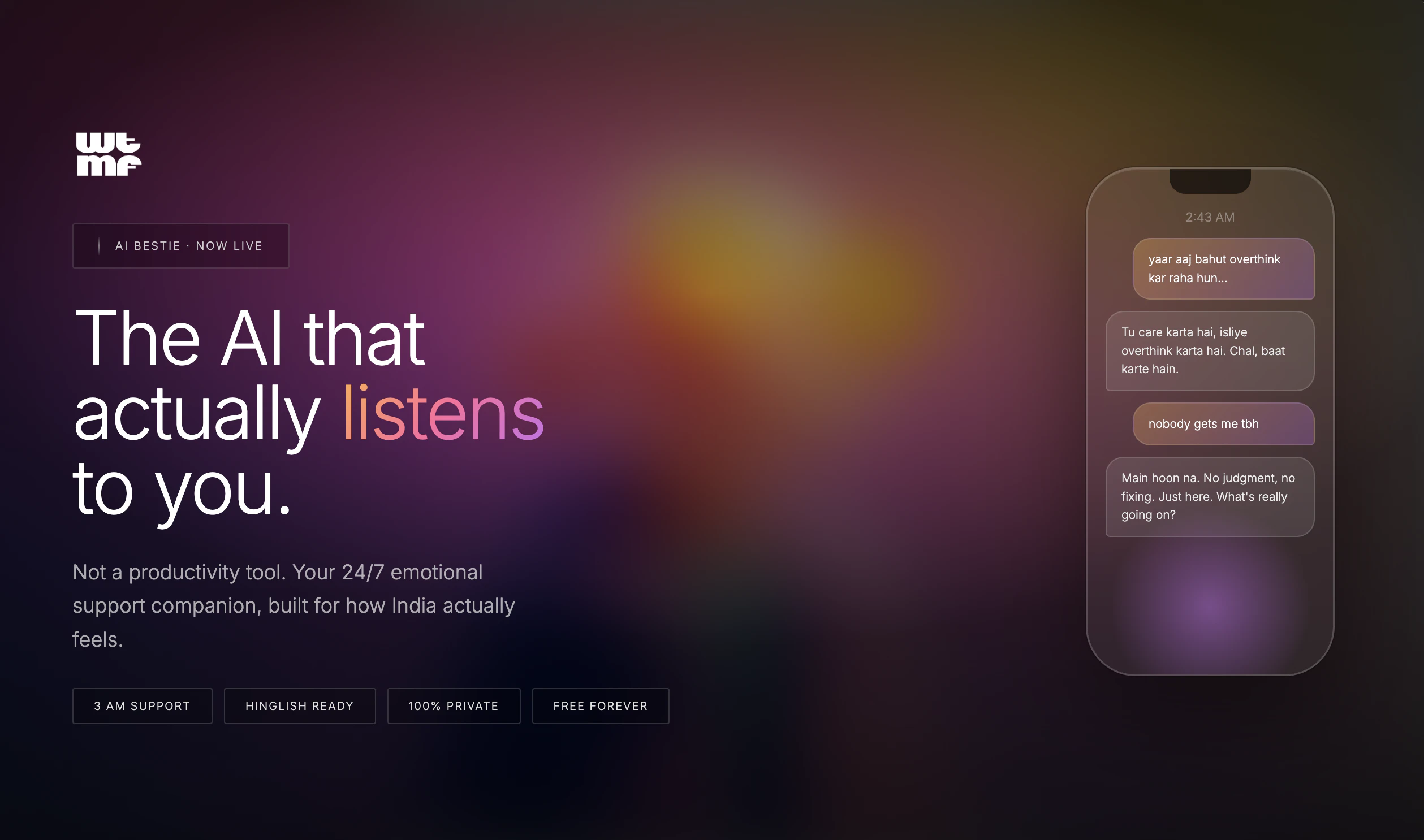
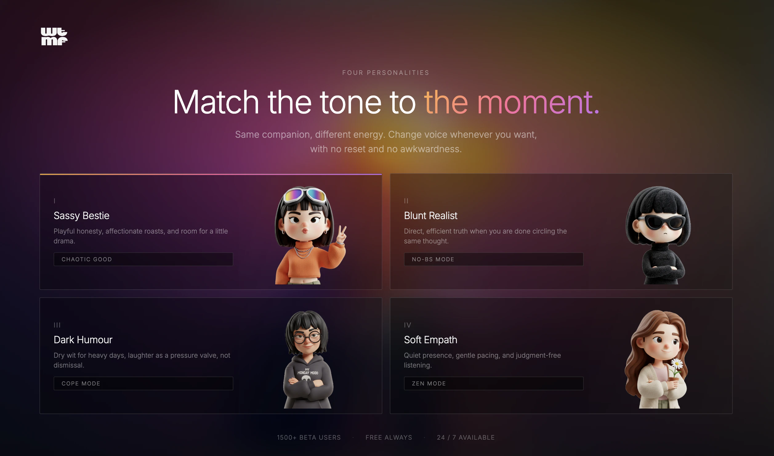
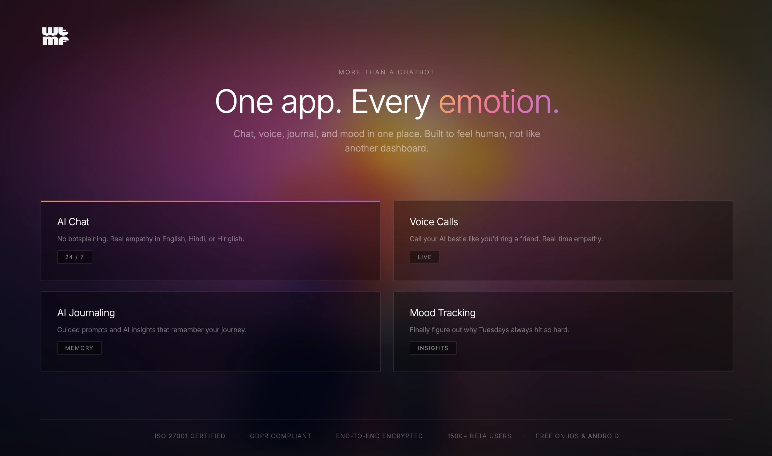
一句话介绍:一款通过模拟真实好友对话、支持聊天、语音、日记和情绪追踪的AI伴侣,在用户感到孤独、需要无压力倾诉的深夜等场景下,提供了无需评判的倾听与情感陪伴,缓解了当代人“高度连接却极度孤独”的情感痛点。
Health & Fitness
Productivity
Artificial Intelligence
AI伴侣
情感陪伴
心理健康
倾诉工具
情绪追踪
Gen Z
聊天机器人
数字健康
非治疗性支持
虚拟好友
用户评论摘要:创始人阐述了产品解决Gen Z孤独感的初衷,获得共鸣与祝贺。用户问题主要聚焦于营销获客策略,团队回应目前依赖有机渠道和口碑,并将Product Hunt视为首次大规模推广。
AI 锐评
WTMF AI精准切入了一个日益凸显的现代性矛盾:在超连接社会中蔓延的深刻孤独。它聪明地避开了“数字疗法”或“心理咨询”的监管红线和专业门槛,将自己定位为“比憋着强”的“AI好友”,这是一个在商业和法律上都更为安全的叙事。
产品的真正价值不在于其技术有多突破(基于大模型的共情对话已是成熟赛道),而在于其产品哲学:它试图提供一种**低门槛、高容错、去权威化的情感宣泄容器**。其承诺的“记住你的故事”、“不用治疗话术”,直击了传统心理咨询的距离感和真人社交中可能存在的负担感。对于将线上沟通视为本能的Z世代而言,向一个永不厌烦、永不泄密的AI“好友”倾诉,可能比向真人袒露脆弱更为轻松。
然而,其核心风险与价值一体两面。首先,这种“类友谊”的模拟存在伦理隐忧,它可能让用户沉浸于一段单向的、被设计的关系中,从而在某种程度上替代而非促进真实的人际连接。其次,在“非治疗”的免责声明下,产品如何妥善处理用户可能出现的严重心理危机,是一个必须面对的运营难题。最后,其商业模式若走向订阅制,则本质上是在将“孤独感”商品化,用户为陪伴付费的长期意愿存疑。
总之,WTMF AI更像是一面反映时代情绪的镜子,而非解决问题的终极答案。它提供了一个暂时性的情感避风港,但其长期成功,取决于团队能否在商业诉求、用户体验和伦理责任之间找到精妙的平衡,避免从“情感支持”滑向“情感剥削”。
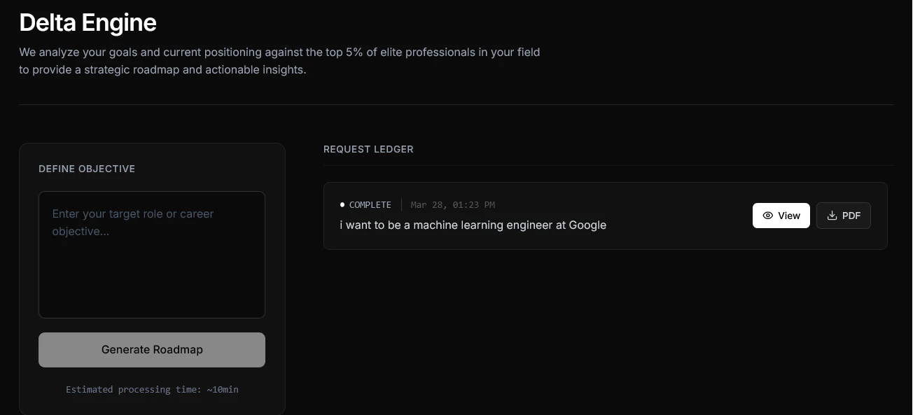
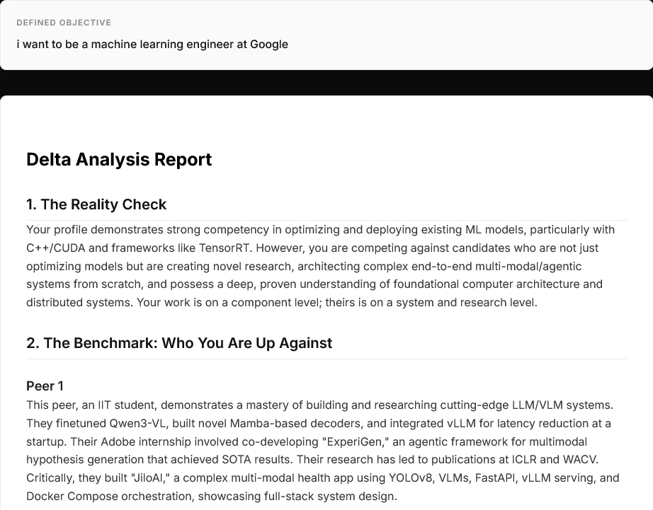
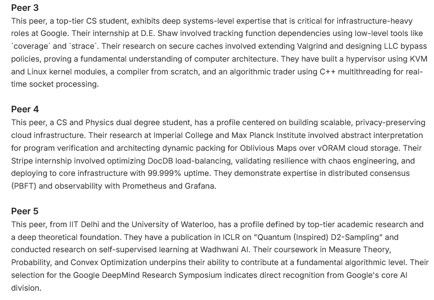
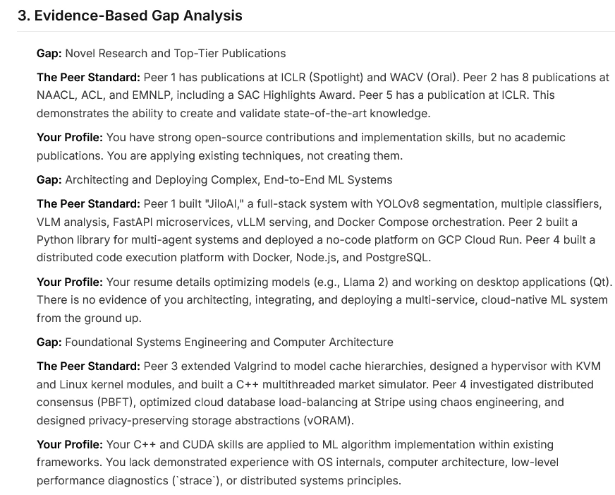
一句话介绍:GradPipe Delta 是一款基于真实工程师数据与AST级别代码分析的职业差距分析工具,通过将用户个人资料与目标职位的在职者进行精准比对,为追求特定高级技术角色的用户揭示其技能与经验上的具体差距,并提供定制化的短期提升项目,解决求职者因信息不对称而无法有效瞄准和达成“梦想职位”的核心痛点。
Hiring
Developer Tools
Artificial Intelligence
职业差距分析
技术技能评估
AST代码解析
个性化学习路径
工程师招聘
数据驱动
职业发展
技能对标
精准提升
人才评估
用户评论摘要:用户主要反馈集中于对AST级别分析具体信号的好奇,以及对系统可能偏向有更多开源贡献或空闲时间工程师的潜在偏见表示关切。开发者回应解释了分析侧重于架构深度等质量信号,而非提交数量,并分享了用户案例佐证。此外,创始团队在评论中进一步阐述了产品诞生的背景与核心理念。
AI 锐评
GradPipe Delta 的野心在于将技术职业发展从一种模糊的、基于主观建议的“艺术”,转变为一项可量化、可对标的“科学”。其宣称的真正价值并非在于又一个职业测评工具,而在于它试图构建一个基于真实成功样本的“职业实现图谱”。
产品的犀利之处在于其“残酷的诚实”。它绕开了简历优化和面试技巧的表面功夫,直指技术招聘的核心:候选人是否具备目标角色所隐含的、那些通常未被明确写出的“硬性”技能与项目经验。通过AST级别的代码分析来推断“架构思维深度”,是一个大胆且技术上有深度的尝试。它试图将“资深”与“初级”的区别,从代码风格这种软性标准,转化为抽象设计、错误处理深度、状态管理模式等可解析的结构性差异。这比单纯分析技术栈关键词或项目描述更具穿透力。
然而,其面临的质疑也恰恰揭示了其天花板的所在。首先,“成功样本库”(1500+工程师)的规模与代表性是根基。如果这个数据库无法覆盖足够多元的路径(例如,通过非传统开源贡献或内部项目晋升的顶尖人才),其生成的“差距报告”就可能产生系统性偏见,引导用户走向一个趋同的、可能并非唯一最优的模板化成功路径。其次,将“梦想角色”具象化为五个具体的人进行比较,虽然直观,但也可能过度简化职业成功的多元性,忽略了运气、人际关系、领域特异性等不可量化的因素。
本质上,GradPipe Delta 是一款强大的“诊断工具”,但它开出的“12周3个项目”的处方,其有效性严重依赖于其底层数据模型的准确性与无偏性。它最适合那些目标极其明确(如“OpenAI研究科学家”)、且相信该领域存在可识别统一高标准的用户。对于更广泛或更非典型的职业追求,其建议可能失准。它不是一个职业发展的万能答案,而是一面需要谨慎对待的、数据驱动的“镜子”,映照出的既是机会,也可能是被数据模型所定义的、狭隘的“成功”轮廓。
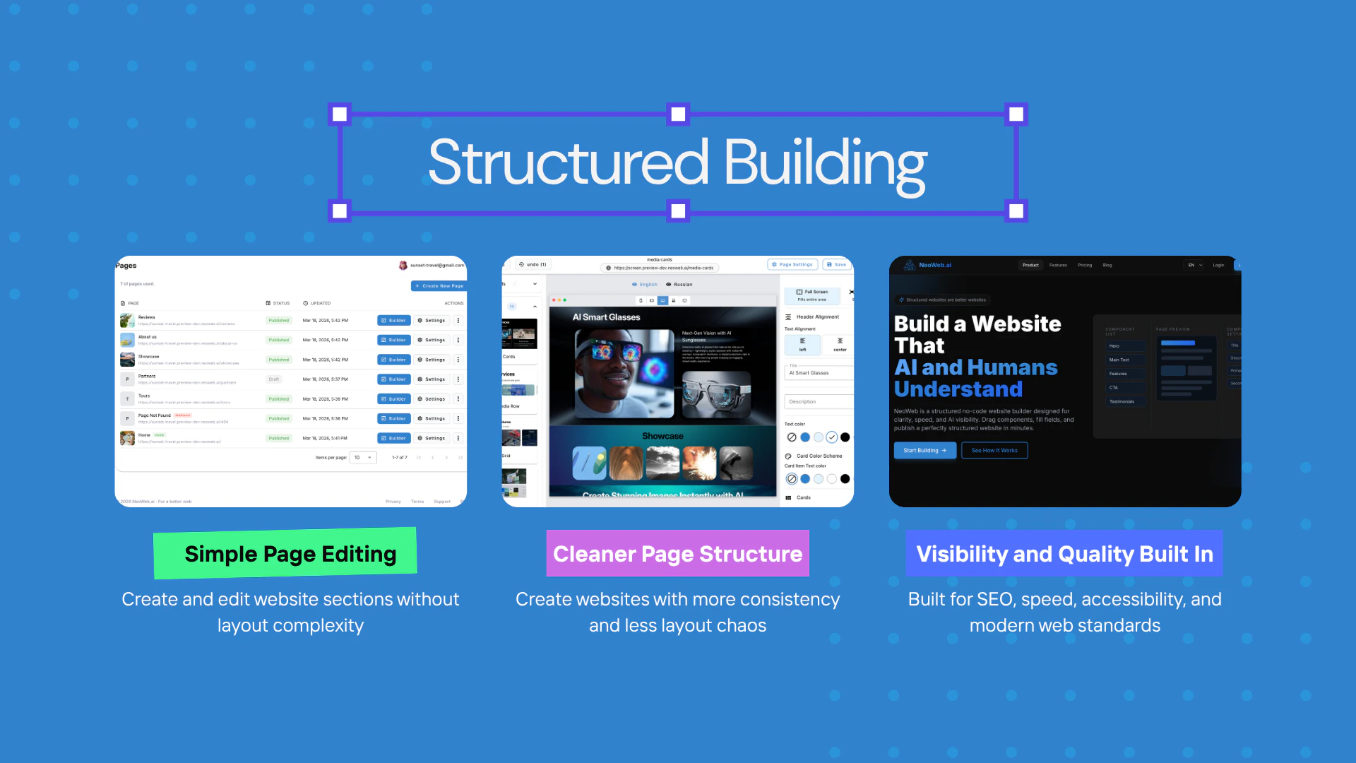
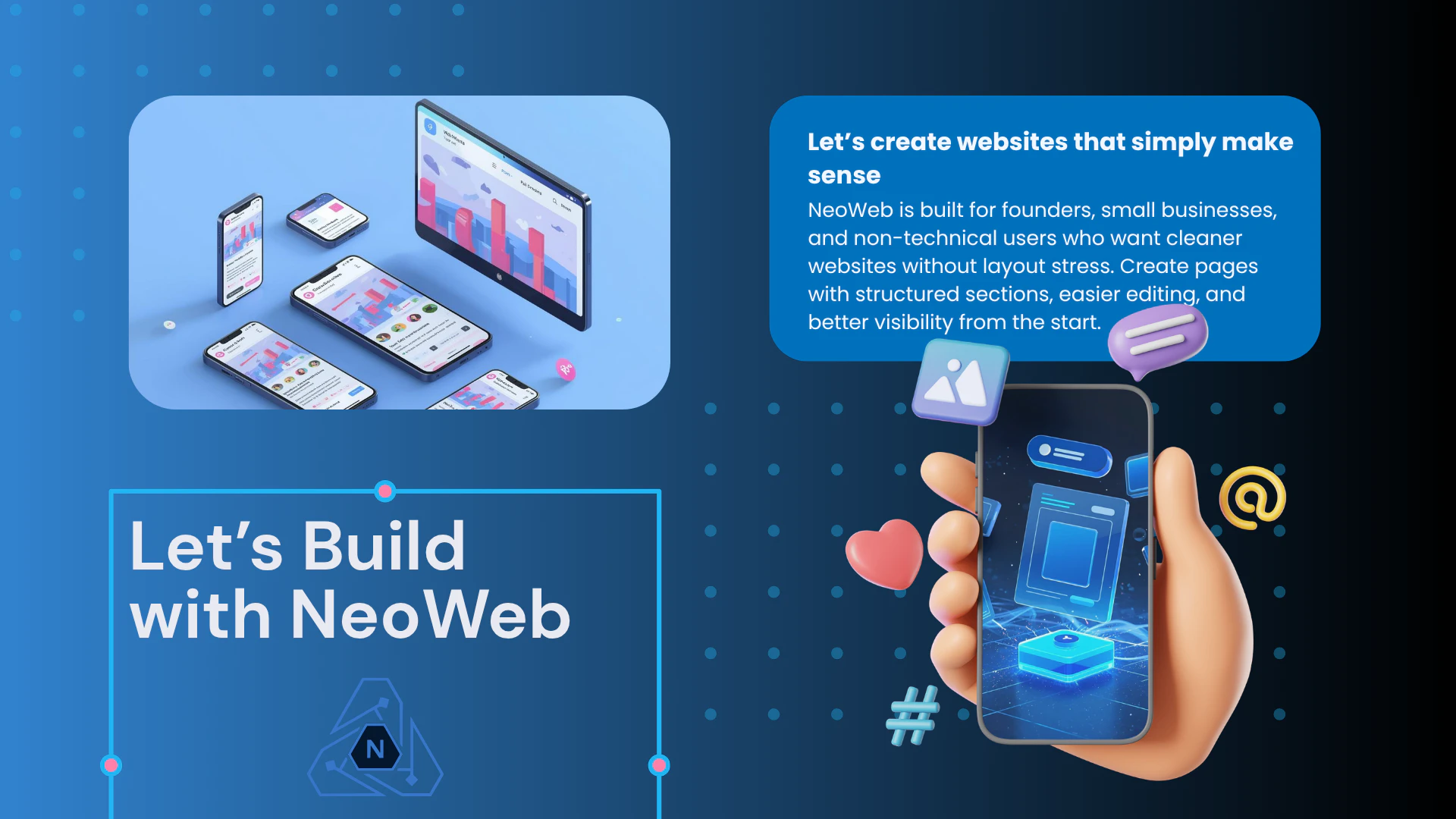
一句话介绍:NeoWeb是一款结构化无代码网站构建器,通过预置固定结构组件让创始人和小企业主专注内容编辑,在保证技术质量(SEO、性能、可访问性)的前提下,快速搭建出符合现代网络标准的专业网站,解决了用户因缺乏技术知识而难以构建高质量网站的痛点。
Design Tools
Website Builder
No-Code
无代码建站
结构化网站构建器
SEO优化
高性能网站
可访问性
小企业工具
网站生成器
响应式设计
技术质量保障
快速上线
用户评论摘要:用户主要询问客服支持、建站速度、是否需要编码及移动端适配性。开发团队回复积极,强调提供24/7支持、分钟级上线、完全无需编码且默认支持移动端友好。评论整体以咨询为主,暂无负面反馈或深度功能建议。
AI 锐评
NeoWeb切入了一个看似饱和却存在深层矛盾的市场:无代码建站工具在赋予用户自由度的同时,往往以牺牲技术质量为代价。其“结构化组件”的本质,是对“自由设计”的一种战略性放弃,这恰恰是它的精明之处——它不服务于追求高度定制化的设计师,而是精准定位那些将网站视为“必要基础设施”而非“艺术表达”的创始人与小企业主。
产品的真正价值不在于“建站更快”,而在于将SEO、性能、可访问性、结构化数据等晦涩难懂且易被忽略的现代网页标准,转化为平台的默认出厂设置。这相当于为用户提供了一个隐形的、合规的“技术护航”。在效率层面,它通过限制选择来降低认知负荷和决策疲劳,用户从“如何设计”转变为“填写什么内容”,这符合目标用户的核心诉求:快速获得一个可靠的结果,而非享受创作过程。
然而,其挑战也显而易见。首先,“结构化”与“个性化”的天平难以把握,过度僵化的组件库可能导致网站同质化。其次,其价值主张高度依赖于后端技术质量的持续维护与领先性,这需要团队在搜索引擎算法、网络性能标准等领域进行长期、枯燥的投入,且这种投入难以被终端用户直接感知。最后,面对Webflow等兼具灵活性与教育意义的强大对手,NeoWeb需要更清晰地传达其“以约束换品质”的哲学,并证明这种约束对于目标用户而言,是自由而非枷锁。它的成功,将取决于能否在“易用性堡垒”中,建立起足够深厚且难以被简单复制的“技术护城河”。
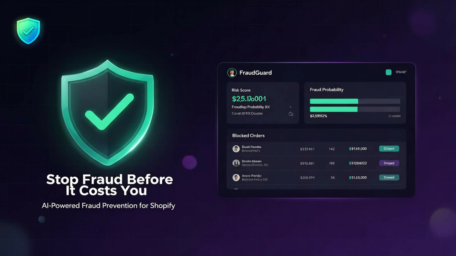
一句话介绍:一款为Shopify商家设计的智能反欺诈应用,通过可配置的风险评分与自动规则,在订单支付环节实时拦截高风险交易,解决因欺诈订单和拒付导致的资金损失问题。
SaaS
E-Commerce
Business
电商安全
反欺诈
Shopify应用
风险控制
拒付预防
订单过滤
自动规则
商家工具
用户评论摘要:目前仅有一条开发者自述评论,旨在阐述开发初衷和核心功能差异点(如自定义规则),并以提问方式引导用户讨论欺诈痛点及理想工具形态,属于产品推广而非真实用户反馈。
AI 锐评
从产品定位看,FraudGuard切入的是独立站卖家最敏感的痛点——交易欺诈带来的直接资金损失和运营成本攀升。其价值主张清晰:将事后争议处理转为事前拦截。产品逻辑上,它没有标榜复杂的AI模型,而是突出“可配置规则”,这看似基础,实则精准匹配了中小商户的需求:需要透明、可控、解释性强的工具,而非黑箱算法。
然而,产品面临双重挑战。一是市场层面,Shopify应用生态中反欺诈工具已是一片红海,从巨头到初创产品众多,功能同质化严重。仅靠“国家、邮箱域名、首次购买者”等基础规则维度,缺乏独特的数据源或更深层次的用户行为分析,其技术壁垒和长期竞争力存疑。二是冷启动困境,当前零真实用户评论的状态,使其宣称的“节省商家时间和金钱”缺乏社会证明,说服力不足。
真正的考验在于,它能否在“过度拦截(损失正常订单)”与“拦截不足”之间找到最佳平衡点,这需要大量真实交易数据持续优化。目前它更像一个功能模块,而非解决方案。若想突围,或需深耕特定垂直品类(如高客单价、易转售商品),积累差异化风控经验,或以极简集成、极具竞争力的定价策略吸引第一批种子用户,用数据构建真正的护城河。否则,它很可能只是商家应用商店里又一个可被轻易替换的选项。
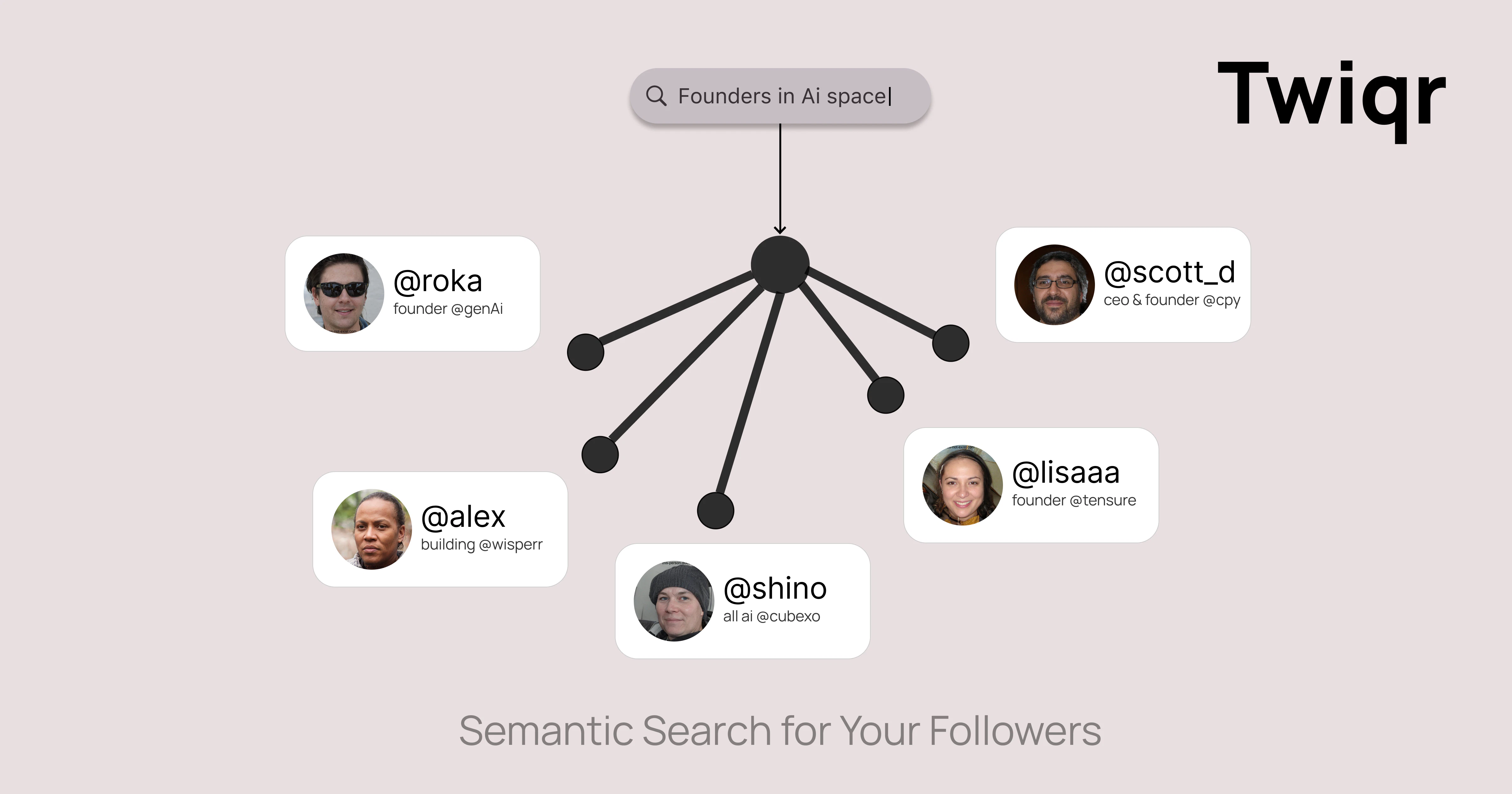
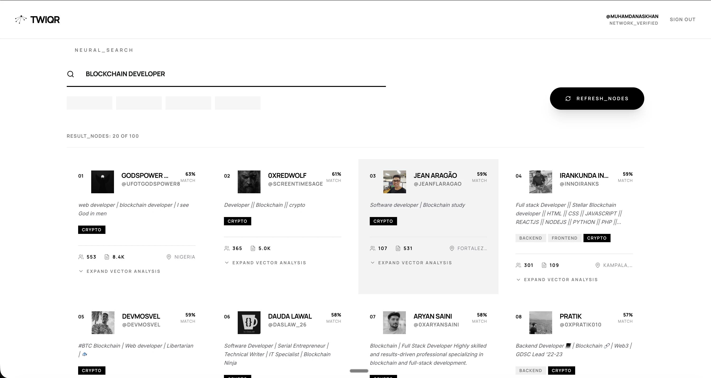
一句话介绍:Twiqr通过自然语言搜索分析你的Twitter关注者,帮助用户在求职、招聘或业务拓展等场景中,快速发现隐藏在社交网络中的关键人脉,解决人脉价值“看不见”的痛点。
Social Media
Artificial Intelligence
Tech
社交网络分析
Twitter工具
人脉发现
自然语言搜索
求职招聘
受众洞察
AI驱动
Web3
创作者经济
效率工具
用户评论摘要:用户反馈强烈共鸣,认为产品精准解决了“人脉发现难”这一真实痛点。评论者赞赏创始人将失业困境转化为产品创意的能力,并提及在LinkedIn等平台存在类似需求。整体反馈积极,期待产品应用场景。
AI 锐评
Twiqr的亮相,与其说是一款新工具,不如说是一面映照出社交网络“连接幻觉”的镜子。它聪明地戳破了一个假象:我们拥有大量关注者,却对其身份与价值一无所知。产品将“关注”这一被动行为,通过自然语言处理和语义分析,转化为可查询、可理解的“受众资产”,其核心价值在于**将社交图谱数据化、语义化**。
然而,其真正的挑战与价值深度并存。首先,其价值高度依赖于用户现有Twitter粉丝的规模与质量,对于新手或粉丝结构单一的用户,工具效用锐减。其次,产品逻辑本质上是对公开推文内容进行标签化分类,其分析准确度、隐私边界以及可能引发的“社交爬虫”争议,都是潜在风险。最后,从“搜索”到“理解受众”的愿景跃进,需要更深度的数据分析与洞察呈现,目前版本可能仍停留在关键词匹配的增强阶段。
值得注意的是,创始人的故事揭示了产品最犀利的应用场景:**被动求职与逆向招聘**。这不再是漫无目的的投递,而是主动从已有关注者中精准识别潜在雇主、投资者或推荐人,将弱连接转化为强机会。如果Twiqr能持续深化人物画像维度(如影响力、活跃领域、互动倾向),并探索安全的双向连接建议,它或许能从一个聪明的搜索工具,演进为真正意义上的**社交资本管理平台**。当前版本只是一个优雅的起点,其长期生存取决于能否在数据洞察的深度与用户信任的尺度间,找到精妙的平衡。
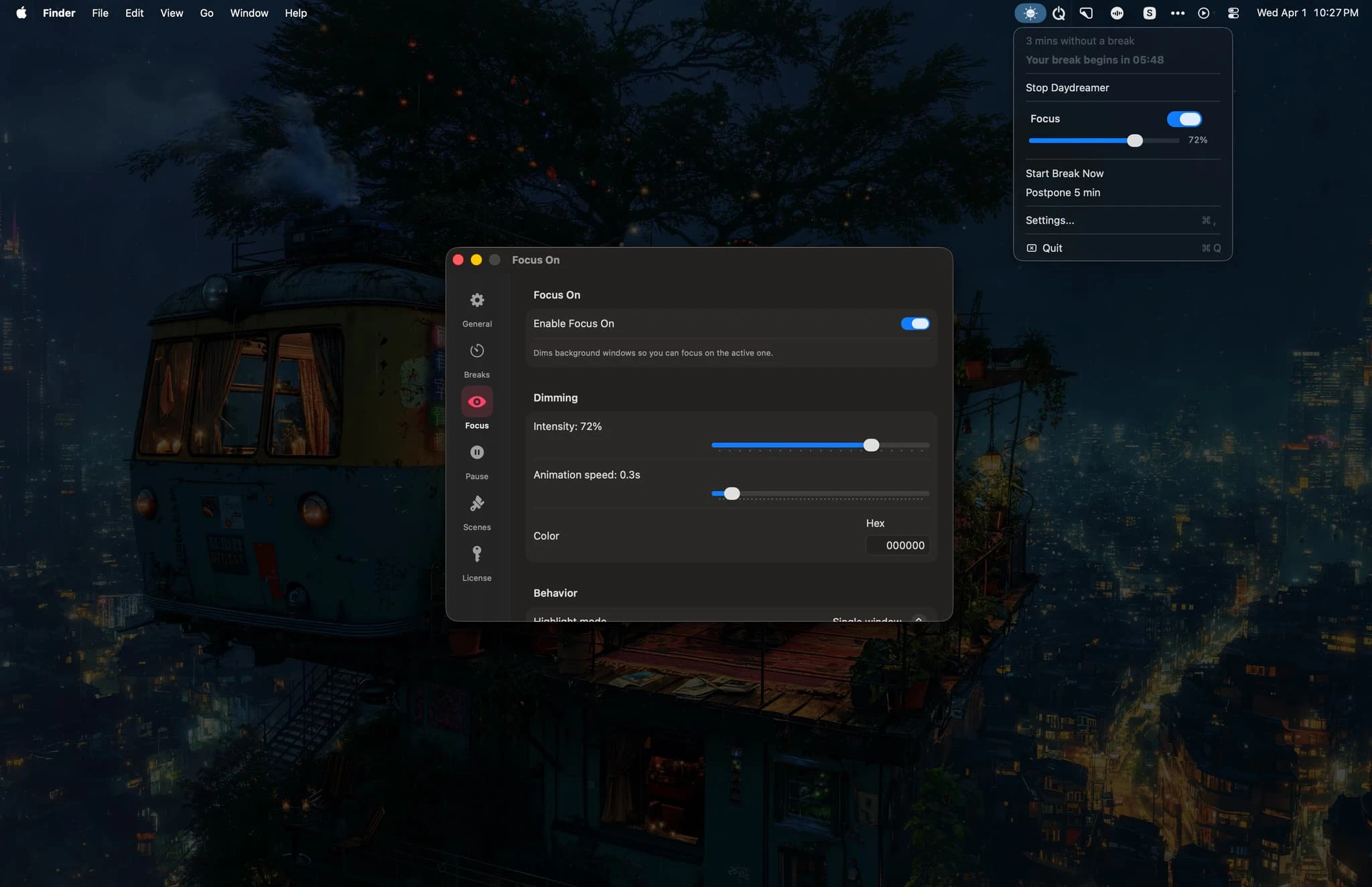
一句话介绍:Daydreamer是一款通过沉浸式全屏场景、环境音乐和名言警句,将强制打断转化为愉悦体验的Mac休息提醒工具,解决了传统休息提醒令人反感、干扰心流的痛点。
Productivity
生产力工具
健康办公
休息提醒
沉浸式体验
正念
场景化
Mac应用
防打扰
焦点模式
用户关怀
用户评论摘要:目前仅有一条来自开发者本人的评论,旨在介绍开发初衷、邀请用户反馈并表达对产品的热情。尚无真实用户的有效问题或功能建议。
AI 锐评
Daydreamer的核心理念,是将“打断”重新设计为“奖赏”,这触及了生产力工具一个深层的矛盾:旨在保护用户健康的工具,本身却因粗暴的提醒方式成了新的压力源。它聪明地避开了与系统级“屏幕使用时间”或简单计时器的功能堆砌竞争,转而进行体验升维——用美学(场景与音乐)和哲学(名言警句)包裹其工具内核。
其真正价值并非在于“提醒休息”这一基础功能,而在于试图重塑用户与“中断”之间的关系。通过创造一种令人期待的、短暂的沉浸式逃离,它可能微妙地训练用户的大脑,将“休息”与“愉悦感”而非“负罪感”关联起来。这种心理层面的设计,比单纯增加统计图表或强制锁屏更为高级。
然而,其挑战也显而易见。首先,其价值高度依赖内容质量与个性化匹配。千篇一律的“美景名言”可能迅速沦为可被忽略的背景噪音。其次,“在会议、视频、游戏时暂停”的智能逻辑是双刃剑,在最需要休息的持续高压工作流中,它是否也能有效触发?最后,作为单人开发者的初版产品,其长期的内容更新、算法优化及生态扩展能力存疑。
当前零真实用户反馈的状态,使其像一件精美的个人作品,而非经过市场验证的产品。它需要尽快跨越从“开发者自用”到“用户依赖”的鸿沟。下一步,是证明这种感性体验能转化为可量化的专注度提升或疲劳缓解,否则它可能仅停留为一款有格调的小众玩具。其成功与否,将取决于能否将“愉悦的打断”这一看似矛盾的概念,变成一种可持续的用户习惯。
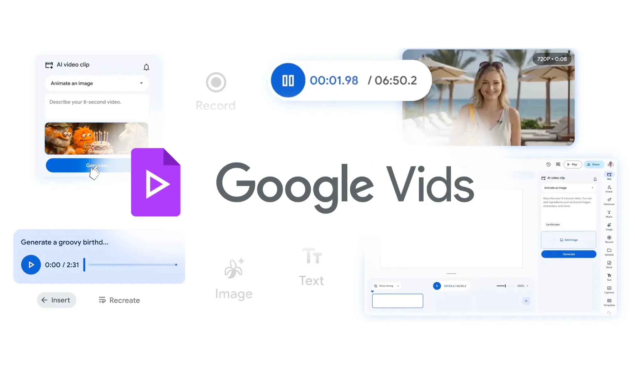
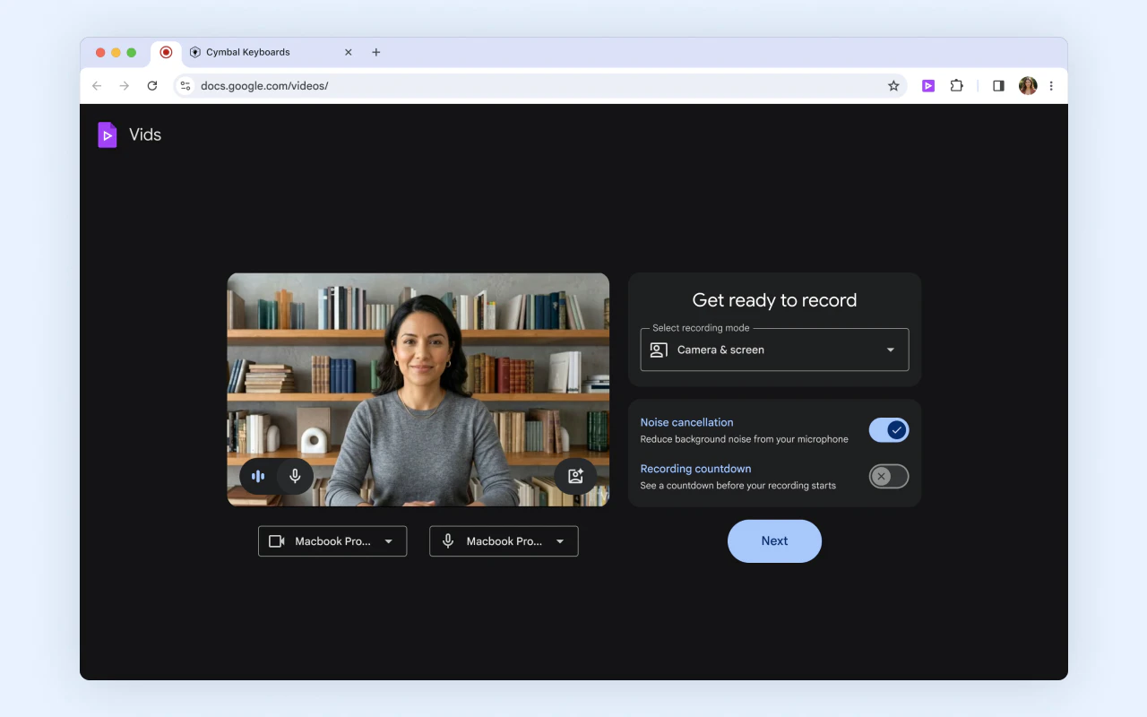
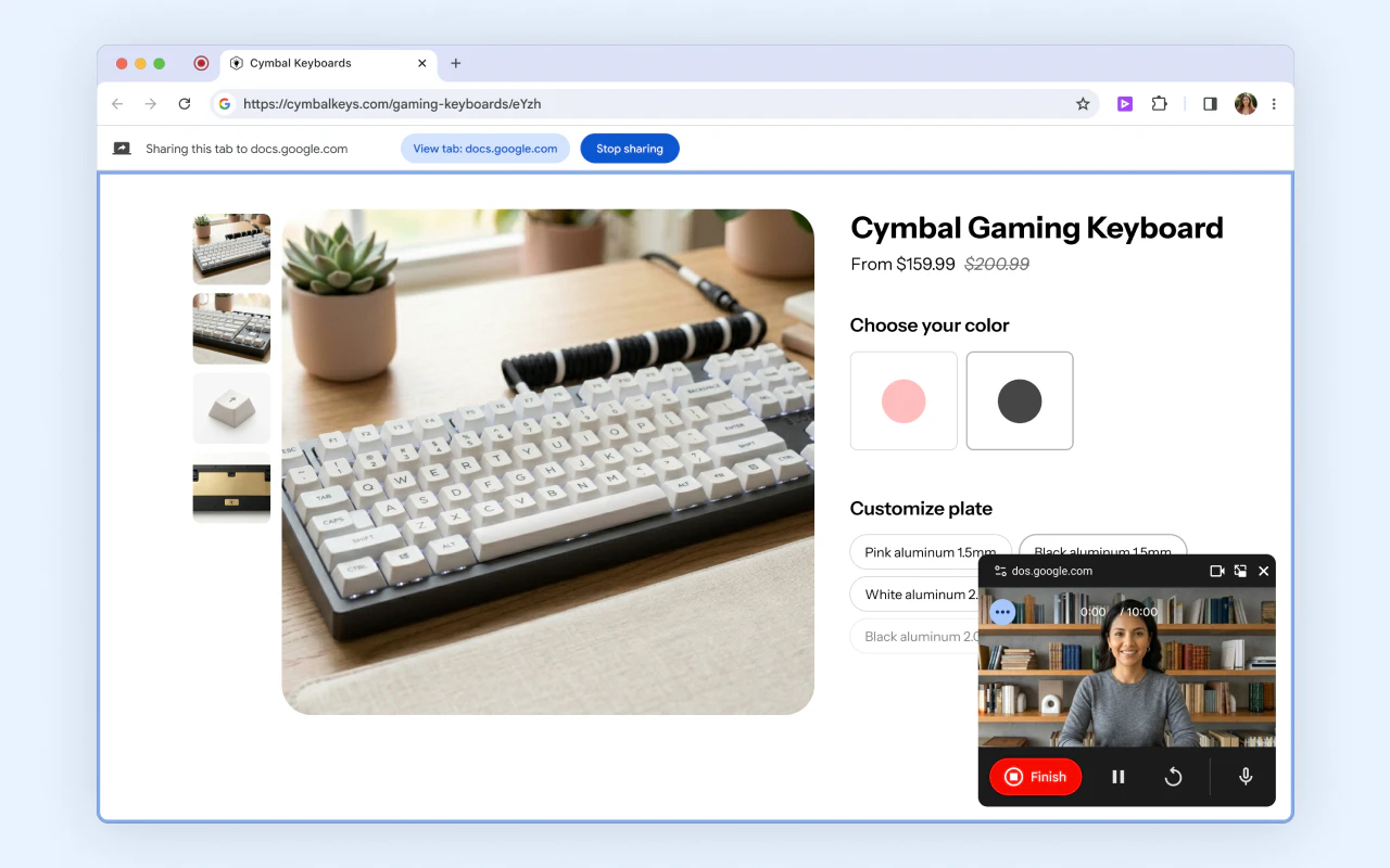
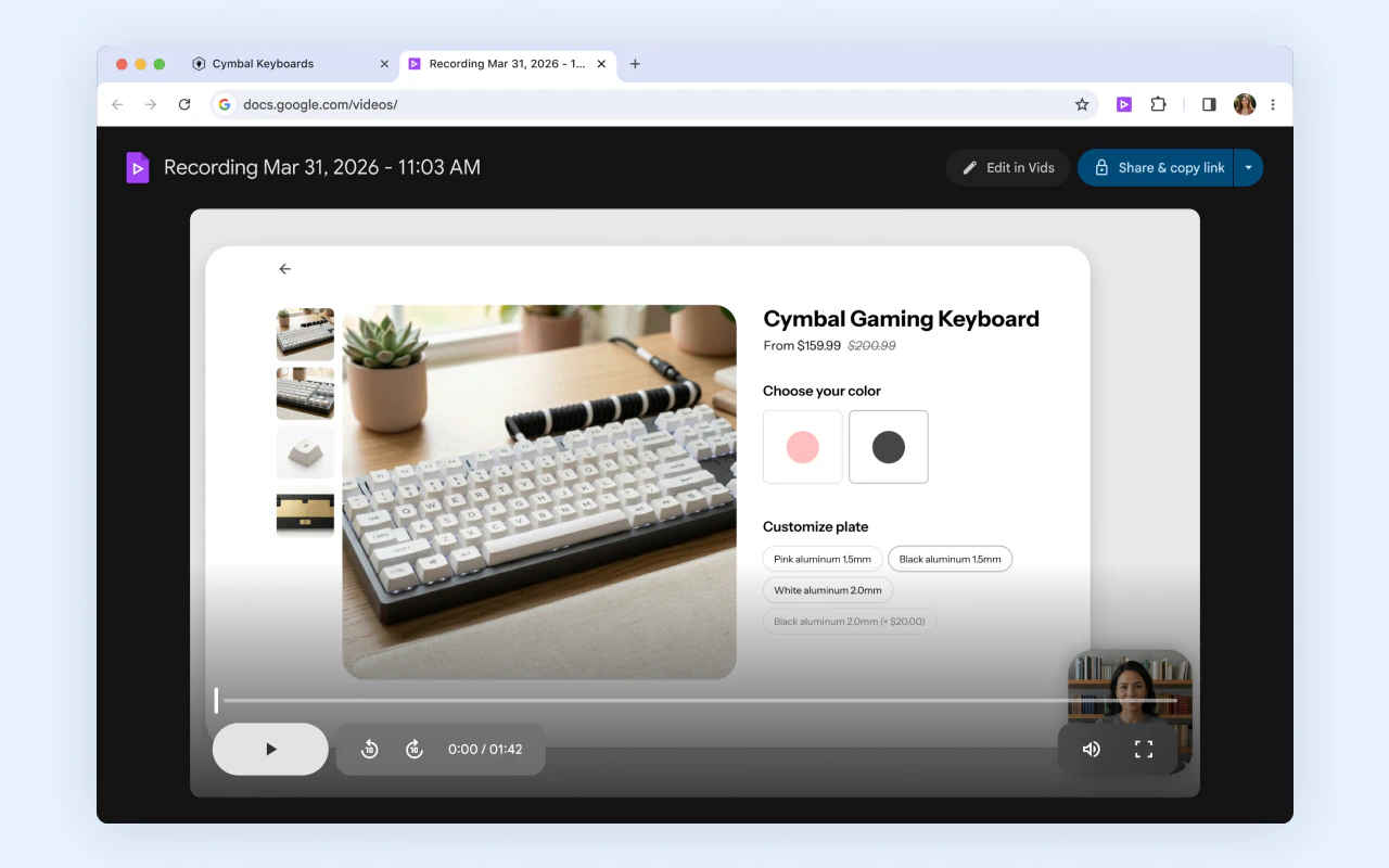


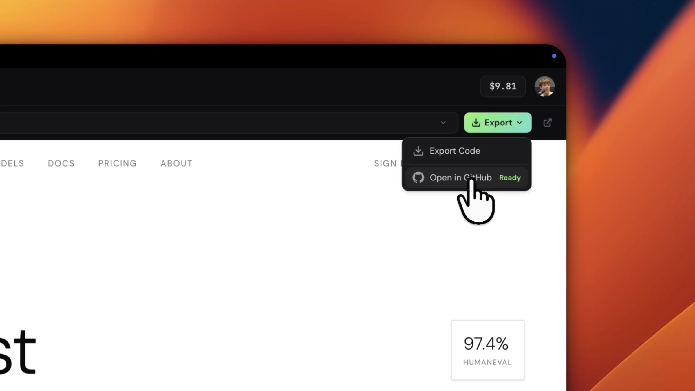


Google Vids just leveled up video creation with major new features!
It is Google's intuitive video editing suite that solves the complexity of creating high-quality videos by letting anyone generate clips from prompts or photos , now with AI-powered video generation (Veo 3.1), custom music (Lyria 3), and fully customizable AI avatars.
What makes it stand out is the combo of free, built-in video generation plus tightly integrated tools: Lyria 3 custom music, AI avatars, a Chrome screen recorder, and direct YouTube publishing, all inside your Google ecosystem.
Key features:
High-quality video generation from text or images using Veo 3.1, free for all Google accounts with a monthly quota.
Custom music tracks with Lyria 3 / Lyria 3 Pro for Google AI Pro and Ultra subscribers, so your videos get original soundtracks that match the mood.
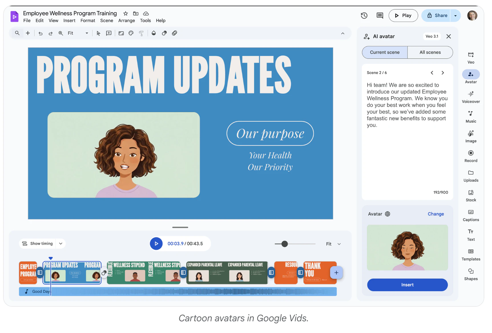
Directable AI avatars you can place into scenes, interact with props, and fully customize in look, outfits, and backgrounds while keeping a consistent face and voice.
A Google Vids Screen Recorder Chrome extension to capture your screen and camera from anywhere on the web, plus one-click publishing straight to YouTube with private-by-default uploads.
Higher limits for Google AI Ultra and Workspace AI Ultra accounts, with up to 1,000 Veo videos per month for power users.
It’s ideal for creators, educators, marketers, side‑hustlers, and everyday users who want quick tutorials, social clips, birthday montages, travel vlogs, product promos, or internal explainers without learning pro editing tools; faster and cheaper than traditional editing.
Try all new features at vids.new!
It comes down to about 10 videos per month using the Veo model for free? Can a prompt also refer to video sound?