Product Hunt 每日热榜 2026-05-24

PH热榜 | 2026-05-24

#1
Stitch 3.0 by Google
Generate and iterate UI screens with AI on a live canvas
406
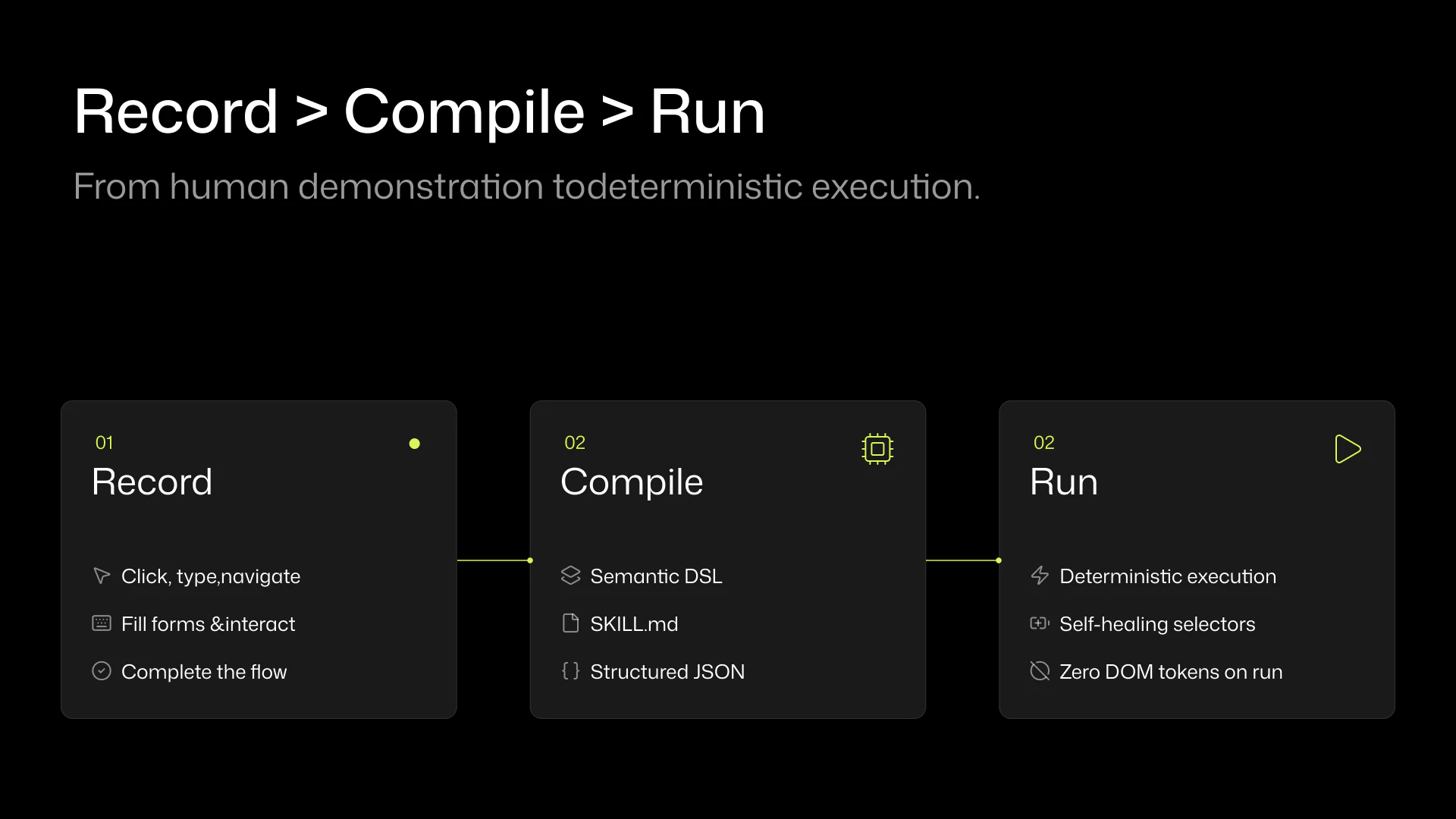
一句话介绍:Stitch 3.0 是一款通过文本提示在实时画布上生成并迭代移动端和 Web UI 界面的 AI 工具,解决了产品设计师和开发者快速原型设计时缺乏上下文感知、无法与现有代码库或设计系统衔接的痛点。
Design Tools User Experience Artificial Intelligence
AI设计工具 UI生成 Figma导出 原型设计 Google 代码同步 MCP DESIGN.md 实时编辑 产品开发
用户评论摘要:用户高度认可 DESIGN.md 上下文导入功能,认为其解决了生成工具“背景失忆”的顽疾;主要疑问是该文件能否从现有代码库自动生成。有用户抱怨切换到 Gemini 3.1 后出现不一致问题,并比较 Claude Design 与开源替代方案;另有人反馈动画功能疑似被移除,且组件一致性与设计系统推理能力存疑。
AI 锐评

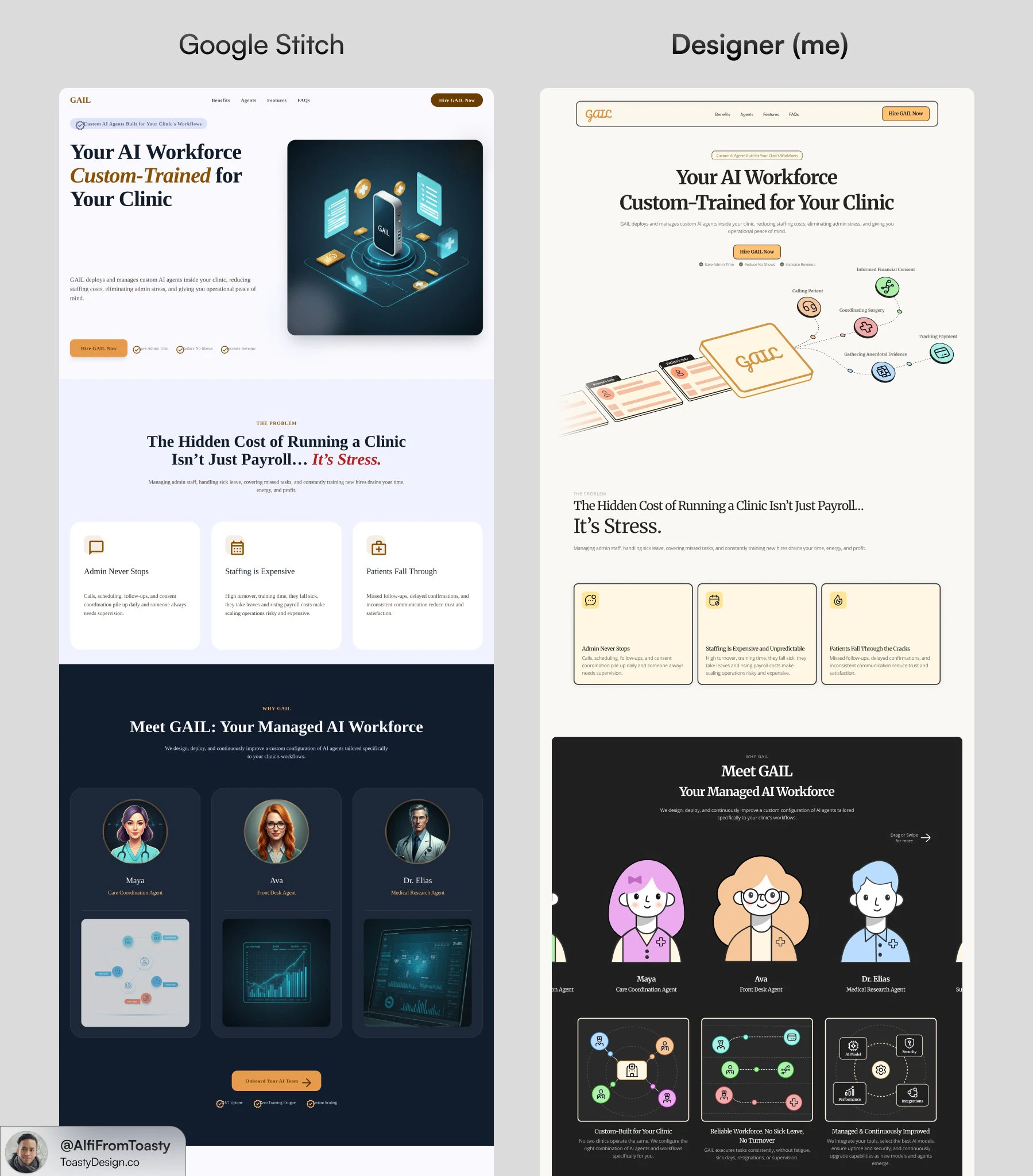
Google 这次拿出的 Stitch 3.0,最聪明的改动不是生成速度,而是“有记忆”。大多数 AI 生成工具在设计师眼里像失忆症患者——每次给出的东西都跟现有产品毫无关系,沦为昂贵的草图机。Stitch 引入的 DESIGN.md 标准,相当于给 AI 的创造力套上了品牌锚点:你不需要在生成几十个版本后手动挑选与视觉语言匹配的那个,AI 一开始就知道你的颜色、组件和间距逻辑。

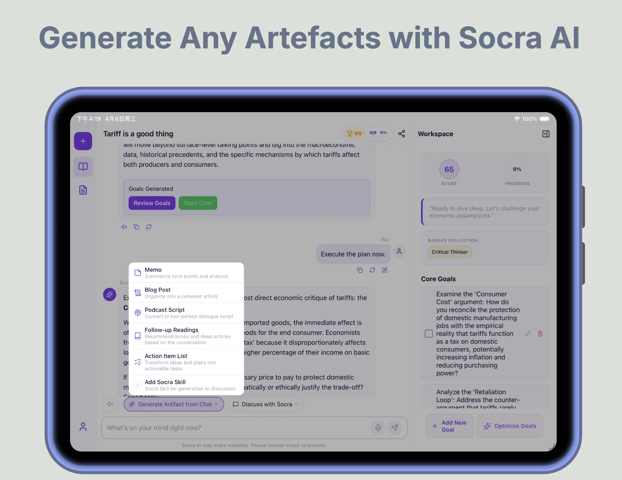
从产品策略看,这显然是从“AI 替代设计师”向“AI 连接设计流程”的关键转身。与其和 Figma、Lovable、Netlify 等工具抢饭碗,不如做一个聪明的中间层。一个 MCP 协议打通了视觉到代码的闭环,让设计修改不仅能看,还能直接同步回代码仓库。这对那些在 AI Coding Agent 和传统设计工具间反复横跳的开发者来说,是一种痛苦的终结。

但别急着封神。评论区的隐忧十分尖锐:当 Stitch 采用不同的底层模型(从 Gemini Pro 3.0 到 3.1),质量竟然出现了明显滑坡,这暴露了作为“工具”对 AI 模型状态的高度依赖。一旦 Google 自家模型迭代翻车,整个设计产出的稳定性就随之崩坏。另外,DESIGN.md 究竟是自动提取还是人工维护?没有一个清晰的方案,这又成了高门槛的“元设计”任务,对非技术设计师并不友好。

Stitch 3.0 提供了一个难得的正确方向——用标准约束 AI 的疯狂想象,但它目前的地位更像是“高级的糊弄模板”,而非可落地的设计系统。一个工具的价值,取决于它离真正的生产环境有多近。从这个角度看,3.0 迈出了一大步,但仍有几步要走。对于普通快速原型,它够用;对于严肃设计团队,它只能算个聪明的起点。

查看原始信息
Stitch 3.0 by Google
Stitch generates UI screens for mobile and web from text prompts, with streaming edits, in-place AI changes, and one-click export to Figma, Netlify, Lovable, and Bolt. For product designers and developers prototyping fast.

The part of this Stitch update that changes the workflow is the DESIGN.md import, and it doesn't get enough attention in the headline features.

Generative design tools have a consistent blind spot: they ignore everything you've already built. You prompt them, get a screen that looks nothing like your product, and spend the next hour reconciling tokens and components. Stitch now reads your existing codebase, Figma file, or live website before it generates anything, extracting your design language via an open standard called DESIGN.md. The output starts from your context, not from scratch.

Paired with the rest of the I/O update:

  • Streaming generation with live steering before the screen is finished

  • In-place edits for element-level changes without full regeneration

  • HTML-native canvas with real animation and interactive state previews

  • MCP-based codebase sync to push visual edits back to your code via an agent

  • Export to Figma, Netlify, Lovable, and Bolt in one click

Built for developers and product builders using AI coding agents who need a design layer that connects to their codebase rather than creating a parallel one.

Free in Google Labs with generation limits. Give it a go at stitch.withgoogle.com.

P.S. I hunt the latest and greatest launches in tech, SaaS and AI, follow to be notified @rohanrecommends

13
回复

@rohanrecommends 

The DESIGN.md approach is interesting — it solves the "context blindness" problem most generative design tools have.

Out of curiosity: does Stitch generate the DESIGN.md file automatically from an existing codebase, or does the developer need to write/maintain it manually?

Either way, this + the MCP export finally makes AI-generated design usable in real projects. Smart update.

0
回复
Is 3.0 as good as Claude Design?
5
回复

@lakshminath_dondeti not even close

1
回复

@lakshminath_dondeti Claude design uses so much credits, I recommend using open design, it is locally run and unlimited

0
回复

I like how Stitch MCP works with Antigravity - I can finally get consistent design done.

2
回复
hello
0
回复

Did you remove the ability to make animations?

1
回复
hello
0
回复

Curious how Hatter handles component consistency when the sketch input is ambiguous — does it infer a design system automatically, or does the user need to define tokens upfront?

1
回复

I cancelled hiring a web designer and a front-end developer- but I do have my visual identity and brand assets carefully and intentionally designed

1
回复
hello
0
回复

It's great to see stitch becoming better. I started my career from design and started using stitch time after time, since it launched.
I really liked the tool until it was on Gemini Pro 3.0 and when it started using 3.1, there were issues and inconsistencies and that's when i moved to claude design.

I'll give it a go again and hope for the best, congrats to the whole team!

1
回复
hello
0
回复

tried a few generations and the speed is impressive. I can see this being genuinely useful for rough ideation, especially when you want to explore layouts quickly even for zero UI/UX experience user.

1
回复

Already used Stitch for one of my websites and honestly had zero UI UX experience going in. The results were good enough that people actually complimented the design without knowing it was AI generated. Version 3.0 with live canvas and in-place edits sounds even better. This is the kind of tool that makes you look like you know what you are doing even when you don’t.

1
回复
#2
ModelHub
The missing menu bar app for local LLMs on Mac.
263
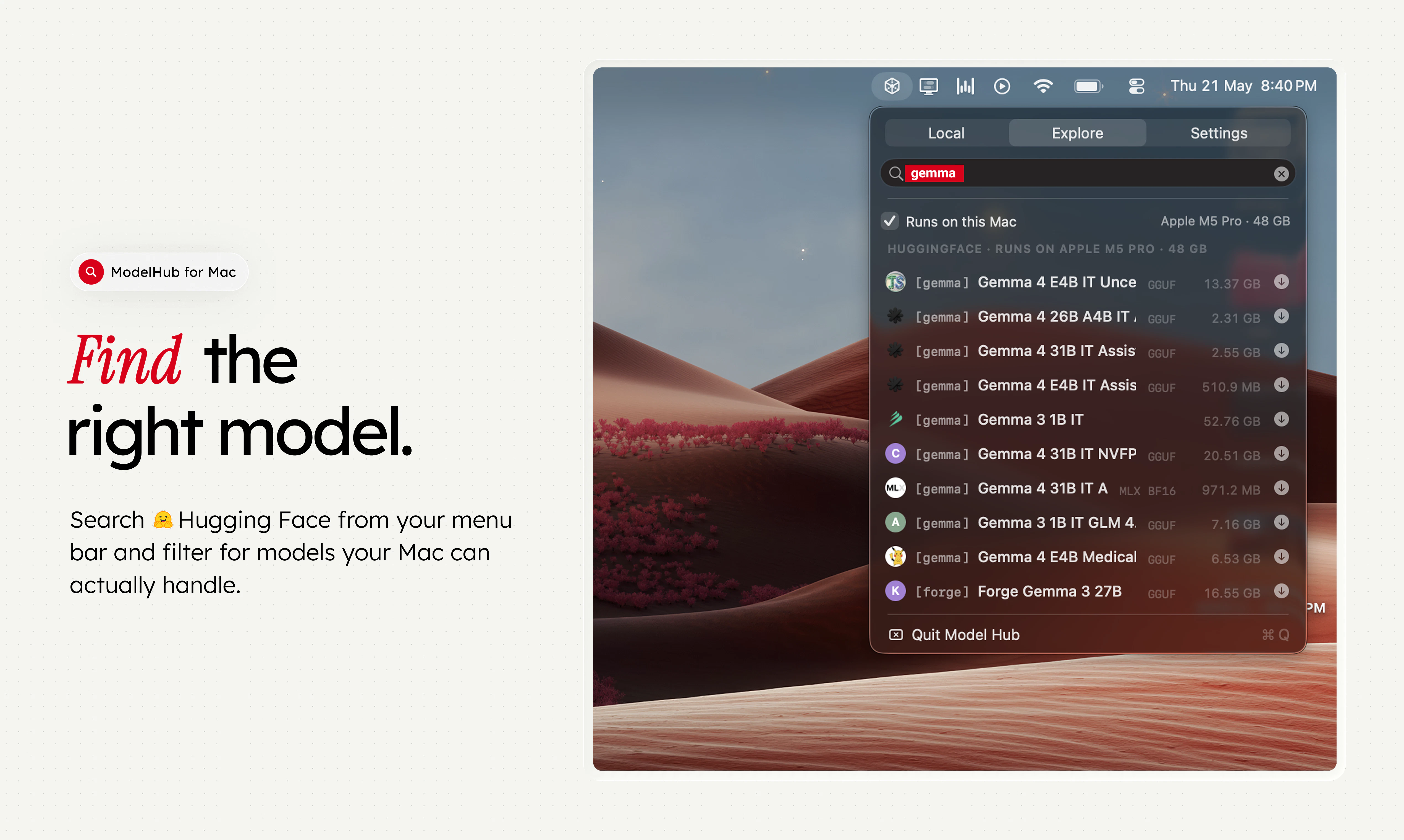
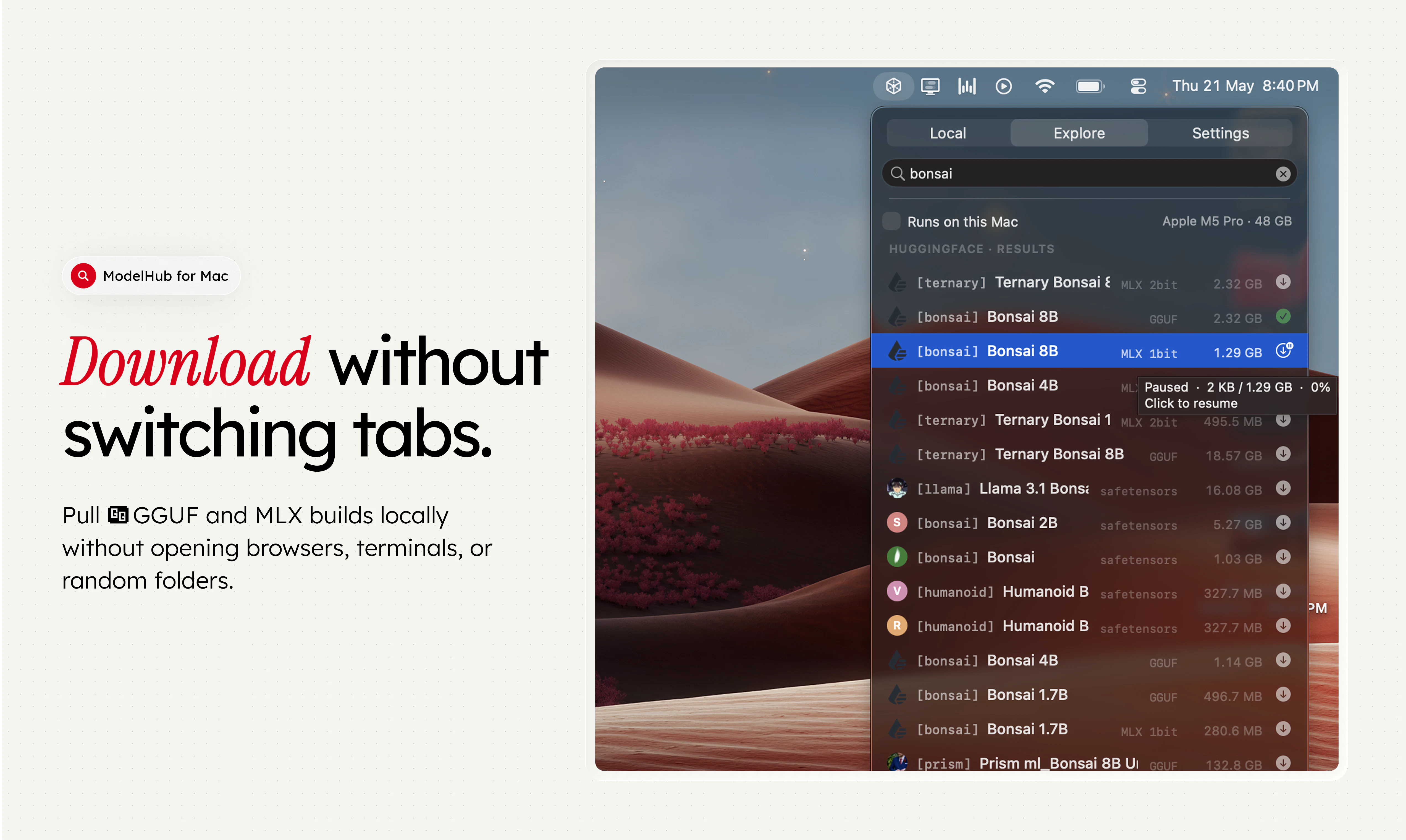
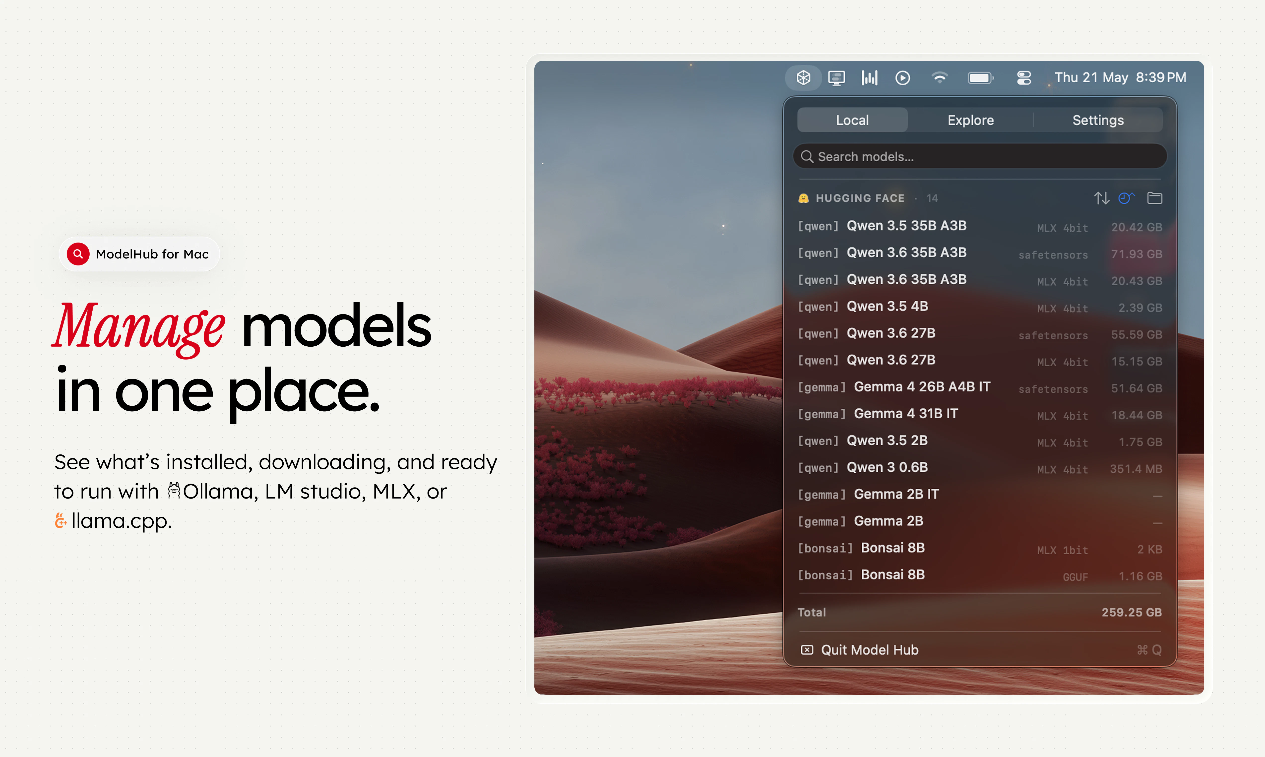
一句话介绍:ModelHub 是一款 macOS 菜单栏应用,专为开发者设计,用于在本地管理 Hugging Face 上的大语言模型,解决模型发现、下载、格式管理以及与 Ollama、MLX、LM Studio 等工具间流程碎片化、需要频繁在浏览器和终端间切换的痛点。
Open Source Developer Tools GitHub Menu Bar Apps
macOS菜单栏应用 本地LLM管理 Hugging Face集成 模型发现与下载 模型库管理 Ollama MLX LM Studio llama.cpp AI开发工具
用户评论摘要:用户普遍肯定“Runs on this Mac”硬件兼容性检查的实用性。核心需求包括:下载前显示许可证、上下文长度、VRAM占用等元数据;模型去重;跟踪使用频率以清理旧模型;记录模型的使用参数和表现;按量化格式/商业许可过滤;希望增加针对Mac硬件的模型推荐功能。
AI 锐评

ModelHub 切中了一个微妙但真实的痛点:本地大模型生态的“工具链虽好,但无中枢”。Ollama、MLX、LM Studio 各自为政,模型文件散落在 Hugging Face Cache 和本地文件夹中,开发者往往沦为“模型搬运工”。ModelHub 的聪明之处在于,它没有试图再造一个“引擎”,而是扮演一个调度与管家的角色,这在工具爆炸的 AI 时代是极具商业逻辑的切入——控制“层”比控制“点”更有价值。

产品目前的核心价值在于“聚合与筛选”,尤其是“Runs on this Mac”这样的功能,精准击中了 Mac 用户受限于显存和芯片差异的焦虑。然而,它的价值天花板取决于执行力。评论中提到的“许可证过滤”、“模型去重”、“量化格式智能推荐”并非简单功能,而是对底层模型元数据的结构化解析能力。如果 ModelHub 只停留在“模型文件夹预览器”的层面,那么它很快就会被 Ollama 或 LM Studio 自身的增强功能所覆盖。

其真正的护城河在于两点:一是成为“本地模型的行为数据入口”,能追踪用户运行了哪个模型、用了什么参数、表现如何(如评论中用户要求的“做笔记”),进而演变为一个基于本地回路的“模型推荐引擎”;二是建立起跨工具的运行调用协议,让用户无需关心模型在 Ollama 还是 MLX 下运行,实现真正透明的“一次下载,多处运行”。目前的产品仍处于“工具”阶段,距离“平台”还有距离。建议团队优先解决最尖锐的“空间管理”(去重、清理)和“信息预判”(许可证、规格)问题,这是让用户愿意每次都从菜单栏点开它的关键。否则,它可能只是一个好看的书签。

查看原始信息
ModelHub
ModelHub is a native macOS menu bar app for developers working with local LLMs. It helps you discover models from Hugging Face, download the right local build, manage your model library, and use Hugging Face models with Ollama, MLX, LM Studio, llama.cpp, and the tools you already have without bouncing between browser tabs, terminal commands, model cards, and local folders. Ollama, MLX, and LM Studio are great tools. ModelHub is the missing discovery and management layer around them.
Hey Product Hunt 👋 We built ModelHub because local AI on Mac is getting good fast but the workflow around models still feels scattered. Ollama makes running local models simple. MLX makes Apple Silicon a stronger platform for inference. LM Studio gives people a great local model workspace. Hugging Face has the model ecosystem. But as developers, we kept running into the same problem: Finding the right model, checking the right format, downloading it, remembering what was installed, switching between Ollama, MLX, LM Studio, Hugging Face, and local folders, and keeping everything organized still involved too many tabs, terminal commands, and disconnected tools. So we built ModelHub: a native macOS menu bar app for discovering, downloading, and managing local LLMs from Hugging Face, then using them with Ollama, MLX, LM Studio, llama.cpp, and the tools you already use. It is not trying to replace Ollama, MLX, LM Studio, or llama.cpp. It is meant to sit beside them. Think of it as the missing model manager for your local AI setup. We’d love feedback from: - Developers running models locally on Mac - Ollama users - LM Studio users - MLX / Apple Silicon builders - People testing coding models locally - Anyone who has too many model files sitting in random folders Specific feedback we’re looking for: 1. What model metadata matters most before downloading? 2. Should we prioritize Ollama, MLX, LM Studio, or all workflows equally? 3. What would make this useful enough to keep in your menu bar app every day? Thanks for checking it out. We’ll be in the comments all day.
8
回复

Congrats on the launch! Having one place to manage across Ollama, MLX, and llama.cpp is something I've been doing by hand for too long. Gonna give this a try.

4
回复

@fberrez1 Awesome - do try us and let us know how you like it! Happy to hear feedback!

0
回复

The 'Runs on this Mac' feature for checking if a model can run on the hardware that I have is my favourite part! That's usually the first thing I want to know before downloading some huge model.

Two things I'd love to see: more pre-download details like license, context length, and RAM estimate, and a quick way to open the original Hugging Face model card from inside the app.

3
回复

@mdsahilak Oh you can click the model on explore tab to get to HF right away! We are thinking about adding stats like # of downloads / RAM estimate etc here. Thanks for your feedback!

1
回复

@mdsahilak +1 to the license point especially - we've seen a lot of users get bitten by downloading a model and then realising it's non-commercial only. planning to flag that upfront on the card itself, probably alongside context length and quantization. open question for you: would you want a hard filter for it ("only show models I can use commercially") or just info displayed?

2
回复
@deepanshi_mamgain yes, i think a similar filter next to the ‘runs on this mac’ would be good. So i can filter by both criteria.
1
回复
I have lmstudio already and Unsloth and would like to share models across. What does this do then? Does this solve for what I am looking for?
3
回复

@lakshminath_dondeti  If you already use LM Studio and Unsloth, ModelHub is not meant to replace them.

The idea is to make the model layer easier to manage across tools.

So instead of models being scattered across LM Studio, Hugging Face cache, manual folders, and different runtime formats, ModelHub helps you discover, download, and manage models in one place while keeping them usable with tools like LM Studio, Ollama, MLX, llama.cpp, etc.

Curious: what are you trying to solve right now?

2
回复
@tushaarmehtaa A few things. 1) I would like to make notes on which model did well for a particular use case. 2) would like to store the context window, system prompt, and other parameters that worked well. 3) want to delete old models that I haven’t used or because a better version maybe available to manage space better Those are some notes off the top of my head. 🙏
1
回复
Now that I’ve said, I might try to build this sometime soon. 😅
1
回复

Quick one on storage - if I've already pulled Qwen 32B via Ollama and then discover it again in ModelHub, do you dedupe against the existing local file? Or do I end up with two copies eating 20GB? Well done guys overall

2
回复

@artstavenka1 hey thanks for using! these are some problems we are actively trying to tackle. ideally - ModelHub should SURFACE issues like these for you to take actions! Thanks for feedback!

2
回复

Congrats on the launch! 🚀 Having one unified menu bar app to manage models across Ollama, LM Studio, and MLX makes organizing and discovering Hugging Face models way cleaner.

The "Runs on this Mac" hardware checker sounds incredibly useful before committing to a massive download. Can't wait to give this a spin!

2
回复

@kevin Excited for you to try it out! Let me know if you there’s some specific feature you want added!

1
回复

@kevin Really appreciate the support! Also glad the 'managing the model layer' framing landed - that's exactly the gap we wanted to fill. Would love your honest take once you try it out!

1
回复

Congrats on the launch!

1
回复

@akhilbvs Thanks! Do try it out and let us know how you like it - happy to hear feedback!

1
回复

Local LLMs via menu bar is the right UX switching between models shouldn't require a browser tab. Does it handle model downloads itself or do you bring your own? Curious about the memory footprint running models in the background.

0
回复

Cool! Congrats on the launch

0
回复

I usually encounter more issues with how to quickly validate whether a model is suitable for your scenario after obtaining it, and whether there is corresponding code that can quickly verify and reduce the time spent trying one by one. I would like to know if your tool has such a function or scenario.

0
回复

Does ModelHub also track which models are actually being used so you can archive the ones you never run?

0
回复

Does ModelHub handle quantization format filtering during discovery — like surfacing only Q4_K_M builds based on available VRAM, or is model selection still manual?

0
回复

I like that this isn’t trying to become another LM Studio or Ollama replacement. Simpler UI to just manage my local LLMs.

Was that an intentional product call from day one? Also, do you see this becoming more recommendation-driven, like “best models for your Mac” based on chip/memory?

0
回复

@mayank_thakur8 yes, it was intentional :)

and i think in the next version we’ll probably add things like best models for your mac, models to try, and trending models.

really liked that approach and the feature suggestions you shared.

1
回复

Hey folks! We built modelhub to manage your cluttered local models! Do check it out and give us valuable feedback! :D

0
回复
#3
Freu AI
Automate any Mac app with $0 recurring run cost
247
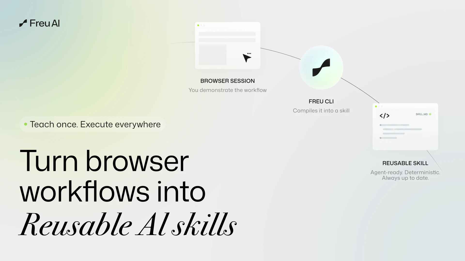
一句话介绍:Freu AI 是一款 Mac 上的 AI 自动化助手,通过“一次录制、零成本重复执行”的方式,让用户用自然语言跨应用操控桌面软件,彻底解决传统 RPA 脆弱和云端 AI token 成本高昂的痛点。
Artificial Intelligence GitHub Business Intelligence Marketing automation
AI自动化 Mac桌面工具 零成本执行 RPA替代 语义UI 视觉Agent 工作流编译 开源CLI 生产力工具
用户评论摘要:用户核心关注稳定性和异常处理:询问工作流中途遇到弹窗、UI布局变化能否自动恢复。创世人回应承认偶发异常会调云模型产生小成本,但强调本地引擎即将解决。多数用户认可“一次编译、本地运行”的高性价比路线,对零执行成本和低延迟表示期待。
AI 锐评

Freu AI 的“AOT编译+语义UI”理论上是个漂亮的架构折中——并不试图让AI每次都“看”屏幕,而是让模型当一次翻译官,把视觉理解固化成本地可执行的DSL。这个设计精准地切中了当前视觉Agent两大死穴:天文数字的token消耗和无法忍受的延迟。一刀砍掉重复性任务的运行成本,对于重度跨应用数据搬运者而言,确实是“游戏规则改变者”。

但必须指出,产品的真实壁垒不在于“聪明的架构”,而在于“执行引擎对UI语义的理解有多稳定”。评论区已经暴露出两大致命问题:一是异常弹窗处理仍需回环到云端,这在公共演示中极易“露怯”;二是“语义UI”能否真正应对重度、高频率的软件更新?创始团队宣称“按钮换个颜色也能识别”,但实际上图标变化、布局重构、甚至App从原生变Electron都会导致语义锚点失效。更现实的情况是,维护DSL的稳定性可能比替换X/Y坐标更复杂——你只是把脆弱性从“坐标”转移到了“语义边界”。

此外,这套逻辑本质上仍是“录制-回放”的增强版,而非真正的自主智能。它擅长规整的、可预测的重复劳动,但面对非结构化、多变的跨软件流程(如处理PDF中非固定格式的字段再填入不同表单),恐怕力不从心。Freu AI 目前最大的价值在于给“哑巴”RPA装上一个聪明的“视觉眼”而不是一个万能大脑。如果它能如期交付本地轻量模型处理异常,并对UI语义建立一套公开的、开发者友好的维护机制,它就有可能成为企业级自动化链条上的关键基础设施。否则,它可能只是又一个演示惊艳但落地磕绊的“聪明玩具”。

查看原始信息
Freu AI
Freu AI is an AI agent for Mac that automates any desktop app with natural language. It “sees” your UI to compile a cross‑app workflow once, then runs it locally via a deterministic DSL—no brittle coordinates/selectors and no recurring token bills. Bonus: we’re open‑sourcing freu-cli (our browser automation engine) today.

Hi Product Hunt! 👋 I'm Charles, founder of Freu AI.

A while back, we teased that we were working on extending our browser automation tech to the entire operating system. Today, we are officially launching Freu AI for Mac—an AI agent that automates any desktop software across your OS using natural language.

The Problem: Vision Agents are Too Expensive & RPA is Too Brittle
We hit a massive wall with current GUI automation. Traditional RPA (AppleScript, rigid X/Y coordinate clickers) breaks the moment you resize a window or an app updates its UI. On the flip side, modern multimodal agents (sending screenshots to cloud LLMs) scale terribly for repetitive tasks.

Right now, most desktop agents operate like interpreters. Every time you ask it to "Extract data from this local PDF and enter it into Excel," it takes a screenshot, sends it to the cloud, reasons about the visual layout, and clicks.

The Traditional Cost: ~10k tokens (Image context) × 5 steps × 10 runs a day = ~500k tokens/day just to navigate the exact same desktop UI, not to mention the unbearable latency.

The Solution: AOT Compilation + Semantic UI (SUI)
Freu AI changes this by introducing Ahead-of-Time (AOT) compilation for OS-level tasks. Instead of the agent analyzing the screen from scratch every single time, you show it the cross-app workflow once.

Freu AI uses a cloud vision-based model to "compile" that session into a deterministic, reusable DSL.

The Freu Cost: You pay the cloud "AI reasoning" token cost once when the agent watches and learns your workflow. But for future runs? The agent simply invokes the pre-compiled DSL command locally. This drops your recurring execution costs to zero and reduces latency from minutes to seconds.

How it works under the hood:
When you record a desktop workflow, our engine doesn't just save a dumb macro. It uses Semantic UI (SUI) to understand the screen:

Perceive: It recognizes buttons, text fields, and icons across any app.

Resolve: It anchors to the semantic meaning of the UI, not rigid coordinates. If Spotify moves their "Play" button, Freu AI still finds it.

Execute: It binds these visual anchor points into our DSL and executes them deterministically.

🎁 The Open-Source Bonus:
While the Mac desktop app is our core product, we are open-sourcing freu-cli today—our underlying DOM-based browser automation engine. You can drop it into your own agents to give them instant "muscle memory" for web tasks. Repo here: https://github.com/freu-ai/freu-cli

🔮 What’s Next: The Local Vision Execution Engine
We are relentlessly upgrading our stack. Very soon, we will launch a capability to run the execution phase using a lightweight, SUI-optimized vision model running entirely locally on your hardware. While we will always rely on powerful cloud LLMs to understand your complex intent during the initial "learning" phase, this upcoming local engine means your day-to-day repetitive executions will cost exactly zero API tokens and keep your real-time screen data 100% private.

We’d love for you to try Freu AI for Mac. I’d love to hear your feedback on our AOT approach or how you're currently handling repetitive cross-app tasks. My co-founders and I will be hanging out in the comments all day to answer your questions! 🚀

5
回复

Quick question, can it handle when things go wrong mid-workflow? Like if a dialog pops up unexpectedly, does it know how to recover or does it just brick?
All the best team

2
回复

@boyuan_deng1 Great question! This is the exact edge case that separates real engineering from demo-ware.

Here is the honest current state: If a random dialog pops up, our engine fails gracefully—it pauses safely instead of blindly clicking X/Y coordinates like traditional RPA. To automatically recover from this right now, it has to temporarily route that unexpected frame to a cloud model to understand the dialog (e.g., clicking "Dismiss"). So yes, handling sudden anomalies does incur a small, extra cloud token cost today.

But this is exactly why we are relentlessly building our local vision engine. Very soon, we will ship a lightweight local model that can understand and dismiss these unexpected popups entirely offline. Once that's live, even the anomaly recovery will drop back to exactly zero API cost.

0
回复

What kinds of apps does it work best with right now, native macOS apps or web apps in the browser?

0
回复

Compiling workflows once via a deterministic DSL and skipping LLM calls at runtime is a smart tradeoff. We've hit exactly this problem at RetainSure: brittle selectors break on every UI update and token costs add up fast. This architectural choice solves both at once. How does freu-cli handle mid-execution interrupts? If a modal pops up, does it replan via LLM or does the DSL have recovery logic baked in?

0
回复

Nice product

0
回复

@madalina_barbu Thank you, Madalina!

0
回复

As someone who spends 2 hours a day moving data between apps, if this actually works I'm installing it right now. The zero-cost execution is the game changer.

0
回复

@abod_rehman This is exactly who we built Freu AI for! 2 hours a day adds up to over 500 hours a year of pure torture.

0
回复

The best part for me is not having the agent re-read the same UI every time. If a workflow is repeated daily, teaching it once and running it locally sounds way more practical and I'd mainly want to see how it handles small layout changes after app updates.

0
回复

@busra_seker1 Spot on! That recurring cost and latency is exactly why we went the AOT route. 🚀

Regarding layout changes—this is where our Semantic UI (SUI) engine shines. Because the compiled DSL doesn't rely on rigid X/Y coordinates or fragile DOM paths, it anchors to the semantic meaning and visual context of the element. So if an app updates and moves a button slightly to the left, changes its color, or shifts a container, the local vision engine still easily resolves it. (Of course, if they completely redesign the entire app workflow, you'd just do a quick re-compile!).

Would love for you to put it to the test!

0
回复

Pretty simple but a very cool approach, also awaiting local vision engine!

0
回复

@abhisheksrivastava Hey Abhishek, thanks so much! "Simple but effective" is exactly what we were aiming for with the AOT compilation. Glad it resonated with you! 🚀

0
回复
#4
WhatCable
Know what your USB-C cable can really do
203
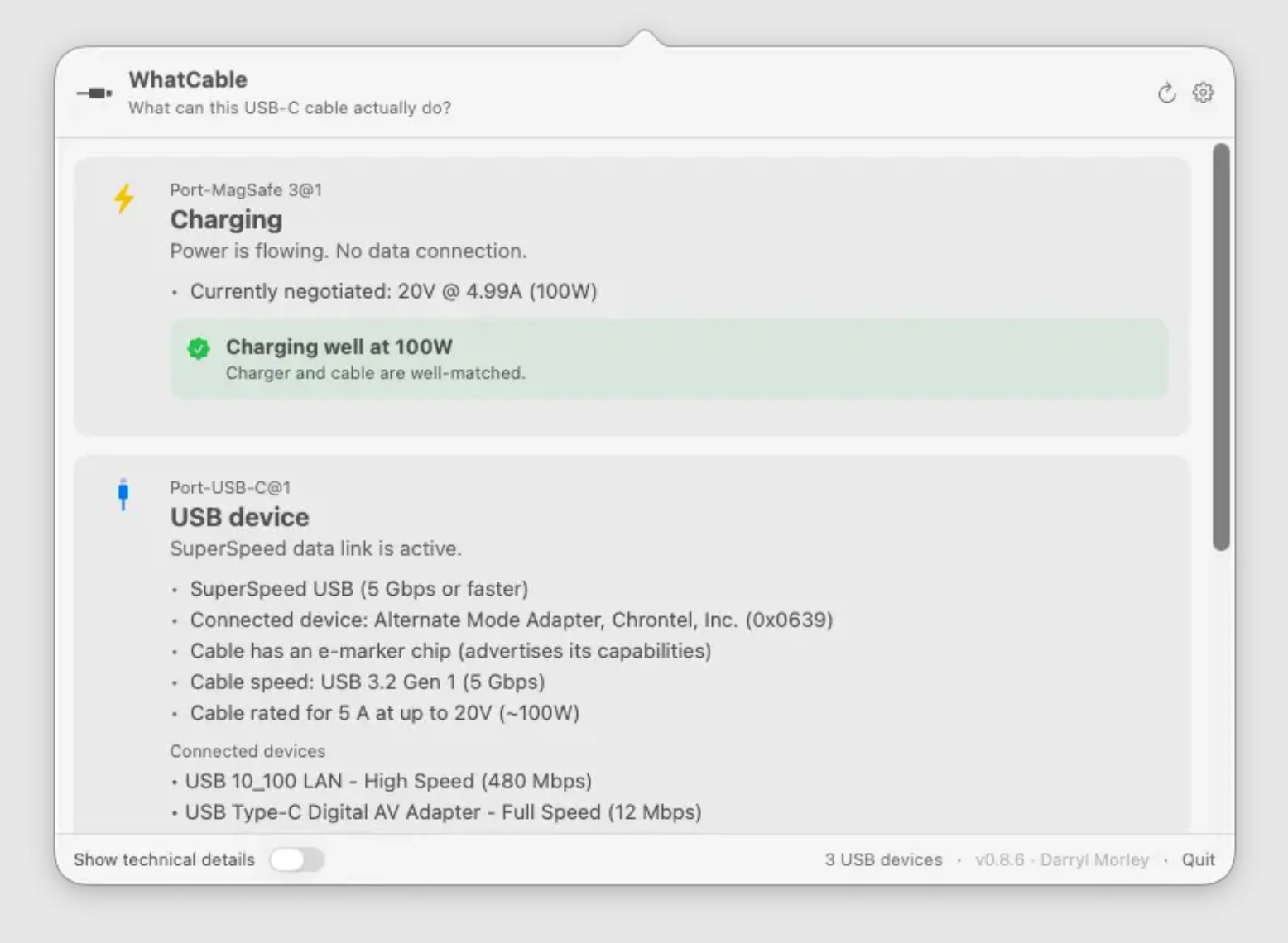
一句话介绍:WhatCable能通过USB-C线缆识别其真实速度、充电功率和e-marker数据,帮你快速排查设备充电慢、外设异常等连接问题。
Hardware Menu Bar Apps Apple
USB-C检测 充电功率测试 线缆速度识别 e-marker数据 Mac工具 连接故障排查 实用工具 开发者利器
用户评论摘要:用户普遍认可其解决USB-C线缆混乱的痛点,建议推出Android和iOS版本;多数评论询问是否仅支持Mac;有用户希望用于iPhone/iPad;反馈正面,认为能终结“猜线”的烦恼。
AI 锐评

WhatCable精准击中了USB-C时代“线缆黑箱”这一隐痛。当接口统一后,用户面对的却是一堆外观相同、性能迥异的线缆,而传统系统对线缆信息的呈现几乎为零。该工具的价值不在于功能复杂,而在于它将底层电子标记数据转化为人类可读的“结论”——直接告诉你瓶颈在充电器、线缆还是设备。

从评论看,核心用户群(开发者、数码爱好者、技术小白)对其需求高度一致,但“仅限Mac”成为明显掣肘。在Windows、ChromeOS甚至Android上,USB-C的混乱同样存在,甚至更甚(厂商对标准执行更不统一)。若只做Mac端,本质上只是填补了苹果系统的信息缺口,而非解决全平台难题。

另一潜在风险是:随着USB-C智能芯片普及与系统级检测增强(如iOS17已能显示充电详情),独立工具的市场窗口或许有限。不过当前阶段,它仍是每个数码爱好者必备的“数字游标卡尺”——不贵、不炫,但极其管用。真正的价值在于:让用户从玄学猜测转向数据判定,而这正是工具类App最朴素的胜利。

查看原始信息
WhatCable
Why is my MacBook charging slowly? WhatCable shows USB-C cable speed, charging power, and e-marker data in plain English so you don't have to guess.

Hi everyone!

Love small practical tools with a very clear pain point.

Every USB-C cable looks the same, but some charge fast, some are slow, some handle displays, and some quietly break your setup.

WhatCable makes that visible in plain English. It basically tells you whether the cable, charger, device, or Mac port is the problem, so you don’t have to guess why your SSD is slow, your dock is acting weird, or your display refuses to work.

Super handy stuff!

7
回复

@zaczuo great 😃 👍

0
回复

Cool project - need this for Android!

2
回复

USB-C cable confusion is one of those problems that sounds trivial until you're trying to figure out why your display isn't working. Every developer has a drawer of mystery cables. Does it work on iOS too or Mac only?

1
回复
Cool! only for mac?
1
回复

That is really cool, Please tell me I can use this for my iPhone and iPad as well, by any chance @daz1uk?

1
回复

I second this, such a tool would be amazing for iPhone.

0
回复

This looks promising. I always have to call my husband to check the cable and figure out stuff. He knows all the USB cables and how fast it charges. To me, they look all the same. haha

0
回复

Definitely going to try it out!

I've got a mess of cables to sort through, with some that are suspect. Now I can find out for sure!

0
回复

Love it! As one of the folks who keeps "known good cables" separately from the rest of the flock.

0
回复
That's a cool idea, I struggled with this issue a few times before and wondered why my device was charging slower than usual.
0
回复
#5
Edgee Fallback Models
Claude Code that never stops
161
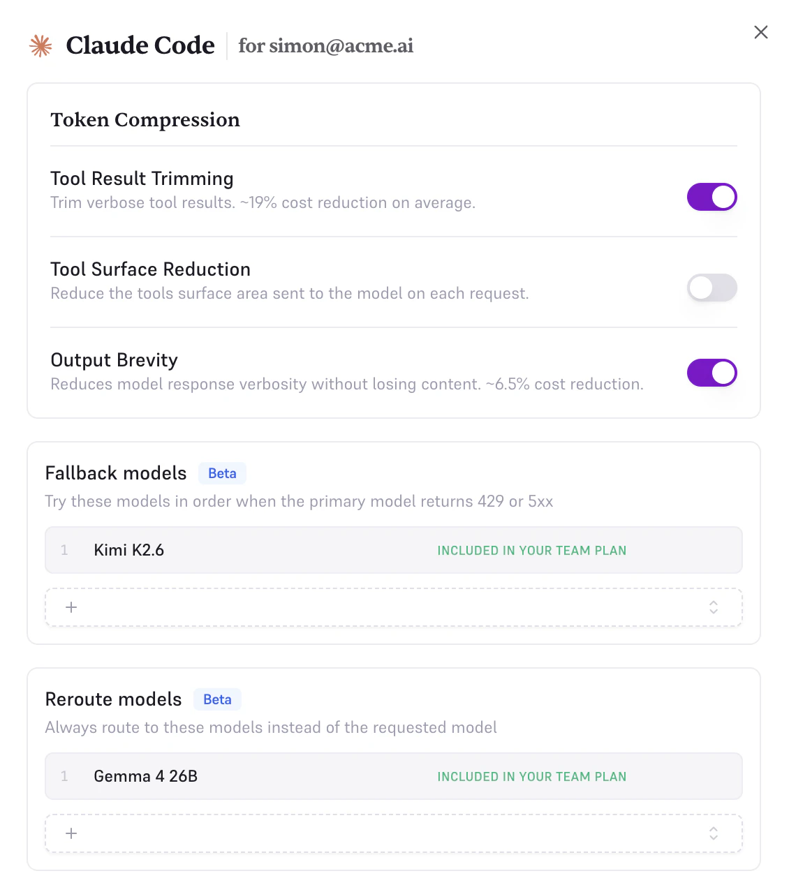
一句话介绍:Edgee Fallback Models 是一款为 Claude Code 等编程助手打造的备用模型路由工具,在 Anthropic 服务宕机、速率限制或计划额度耗尽时,自动无缝切换到 Kimi、Qwen 等替代模型,确保开发者编码工作不中断。
Productivity Software Engineering Developer Tools
AI编码助手 模型路由 故障切换 降本增效 模型兼容层 开发者工具 会话上下文压缩 模型链式调用 企业级AI基础设施 API代理
用户评论摘要:用户核心痛点是 Claude Code 高峰期速率限制及 Anthropic 额度削减导致开发中断。关键问题集中在:切换模型时上下文是否完整保留、50%压缩对长上下文质量的影响、不同模型工具调用(tool_use)格式转换的可靠性、是否支持自定义链路备选模型,以及模型切换的日志透明性。
AI 锐评

Edgee Fallback Models 精准踩中了 Anthropic 即将实施的信用额度削减政策(6月15日起)所引发的用户恐慌,产品发布时机堪称“天时地利”。其核心价值不在于提供另一个“更好的模型”,而在于构建了一个**弹性的模型路由层**——这在AI编码工具日益成为“卡脖子”基础设施的当下,是一个被严重低估但刚需极高的基础设施级产品。

从技术实现看,创始人坦诚“翻译不同模型间的tool_use schema是秘密武器”,这恰恰是产品的壁垒所在,而非简单的API转发。真正具备深度的功能点在于其**“全会话压缩+模型切换”**的闭环:在切换至廉价模型前,对历史对话进行无损压缩以控制token消耗,从而让开发者既能用Kimi或Qwen这类成本极低的模型来完成后续任务,又不会丢失上下文——这直接回应了评论中用户对“切换后上下文丢失”的核心担忧。

然而,该产品存在两重隐忧。其一,**市场窗口风险**:随着Amazon Bedrock、Azure OpenAI等平台纷纷内置多模型路由能力,产品存在被“平台化集成”蚕食的可能。其二,**代理层ROI存疑**:声称的50%压缩在经济上很诱人,但若面向个人开发者,每月$10-$20的订阅费是否真能对冲掉Anthropic的政策波动带来的成本冲击?更言之,其真正的目标客户应是**SaaS初创团队和内部DevOps小组**——这些群体不能忍受“单点故障”,且愿意为“零代码修改、一键切换至自有Cloud(Bedrock/Vertex/Azure)”的便捷性支付溢价。至于评论中提到的“链式路由”(先免费模型,最后用付费的大模型兜底),若真能实现自动化的成本-质量权衡逻辑,才真正让这款工具从“备用方案”升维至“智能成本优化层”。目前来看,仍缺这一丝算法野心。

查看原始信息
Edgee Fallback Models
Your Claude Code session shouldn't die when Anthropic goes down or your plan runs out. Edgee Fallback Models keeps coding assistants running by routing to alternative models like Kimi K2.6, Gemma, GLM, or Qwen when Claude is unavailable, rate-limited, or just too expensive. Or one-click fallback to your own Bedrock, Vertex, or Azure account. Same Claude Code, different backend, zero code changes. Built for teams that can't afford to stop shipping.

Hey friends

Sacha here, founder of @Edgee .

Two weeks ago Anthropic announced that starting June 15, your programmatic Claude usage gets capped at a $20-$200 monthly credit pool. For heavy Claude Code users, that's roughly a 25 to 40x cut in effective inference.
Same with Copilot that is moving to usage-based pricing June 1st.

A lot of people are angry about it. I get it. But we're builders, and the right answer to a market change is to ship better tools, not to complain.

We started building Fallback Models the week before Anthropic's announcement, after one too many Anthropic outages. The timing is now coincidentally perfect.

Here's what our Fallback Models feature does:

→ Anthropic down? Route to Kimi K2.6, GLM, Qwen, Gemma, or others.

→ Plan limit hit? Same thing, automatically.

→ Want to route always? Pick your model.

You can also fall back to your own Bedrock, Vertex, or Azure account in one click. Same Claude Code on top, your cloud underneath, zero code changes.

And it works the same with Copilot, Codex...

How it fits with our other features:

- Compression: use fewer tokens

- Teams: see who uses tokens and on what

- Fallback Models: keep working when your primary model can't

Fallback Models ships with our Team plan. The compression engine that powers all of it is free to try, no credit card.

Two questions for you:

- Which fallback models would you actually want to use?

- What other failure modes should your coding assistant handle?

Will be in comments all day 🙏

edgee.ai/fallback-models

8
回复

@sachamorard bravo for this new launch - keep up the great work, keep launching

1
回复

smart approach to a real pain point. the rate limiting on Claude Code during peak hours has killed my flow more times than id like to admit. curious how the token compression affects output quality though — does it handle long context windows well or is there a tradeoff with the 50% savings?

3
回复
Hello @ozandag. Good question. Token compression is deterministic and lossless. As it removes pollution, it does not alter the LLM result. But you know, the best way to check it is to try ;)
1
回复
@fmerian Love the "compress" part. Most fallback tools just switch models and you lose half the context. Do you recompress the conversation history before sending to Kimi/Qwen, or do you keep the full context and let the model handle it? If this works well, it could cut my AI bill in half. Upvoted.
3
回复
@olivier_jury yep, the compression is made on the full conversation, at each request… and really fast ;)
4
回复

The auto-fallback when rate limits kick in is the part I always end up wiring by hand. Good luck with the launch!

3
回复
@fberrez1 thank you very much. We had this problem in the team, so we fixed it ;)
1
回复

@fberrez1  I had the same pain point. Built in is always better than a custom wrapper.

0
回复

Congrats on the launch!! This solves a real issue for developers who can’t afford downtime when Claude is rate limited or down. Keeping coding running with simple fallback models will make workflow feel more stable.

1
回复

The transparent proxy approach here is clever. Intercepting at the API layer means zero client changes, and that matters. We've burned time at RetainSure debugging failures partway through a session when Claude's rate limits kicked in at the worst moments. How do you normalize tool_use schemas across models? Claude's format doesn't map cleanly to Qwen or Gemma, and that mismatch can quietly degrade agent output.

1
回复
@anand_thakkar1 you pinpointed one of the most complicated part of our job. Translating an Anthropic request into a Qwen/Kimi… compatible semantic, that’s our secret sauce. Sorry, I have to keep it secret 🤫
1
回复

Can we set the sequense of fallbacks? See, I'd love to give you a sequence of the LLMs I don't pay for and then, last resort, OpenAI and Grok can squeeze the last of my life blood out of me. Thanks.

1
回复

@osakasaul Fallbacks are indeed Chainable yes ! Do you have a quick idea of which LLMs you might talking about ?

3
回复

The fallback angle is practical for agent workflows, especially when a coding session is mid-task and the provider limit hits. I’d be curious how you surface model switches in logs, since silent fallbacks can make debugging output differences harder.

0
回复

Fallback models for Claude Code is exactly what's needed hitting a rate limit mid-task and losing context is painful. Does it maintain the full context when switching models or does the fallback start fresh?

0
回复
#6
Runway Agent
Generate edited, sound-designed videos via chat
152
一句话介绍:Runway Agent 是一款通过对话式AI将创意简报直接转化为带音效与剪辑的成片视频的工具,解决了内容创作者在生成片段后仍需手动剪辑和配乐的效率痛点。
Design Tools Social Media Marketing
AI视频生成 对话式剪辑 音效设计 内容创作 社交视频 广告制作 Runway 项目管理 短视频 AI Agent
用户评论摘要:用户普遍认可“项目级”编辑与音效集成是差异化价值,关注点集中在:能否处理Reels/TikTok竖屏格式;能否保持角色和视觉的一致性(如品牌色、模板记忆);以及能否解决此前Runway片段过短、画外音不连贯的问题。也有用户期待类似Claude Code for Diffusion模型的精确控制能力。
AI 锐评

Runway Agent 的定位并非又一款“提示词→片段”的AI玩具,而是试图将视频生成从“资产生产”推向“成品交付”的关键一步。从用户反馈来看,真正的痛点并不在于生成单帧画面的质量(那是Sora们解决的问题),而在于将多个片段组合成一条有叙事、有情绪、有音效的完整视频时产生的“剪辑鸿沟”。Agent 以对话形式承接创意简报,并端到端输出含音效的成片,本质上是在用AI代理替代传统后期流程中的人工规划与协调工作。

然而,这款产品面临的挑战也十分具体:首先,“项目级”的视觉一致性是一个技术高门槛,如果Agent无法在多个镜头间保持角色、色调、模板的统一,那么“成片”就仍是拼贴;其次,用户质疑的10秒片段限制和竖屏适配问题,暴露了底层模型对时间与构图维度的掌控力不足。Runway Agent 的方向无疑是正确的——将复杂度从用户侧转移到模型侧,让创作者回归创意而非技术操作。但如果执行上只是给生成接口套了一层聊天UI,而没有真正打通“编辑”与“音画同步”的逻辑引擎,它最终只会沦为又一个华丽的玩具,而非创意团队的效率引擎。

查看原始信息
Runway Agent
Runway Agent is a conversational AI that takes a brief and outputs finished, sound-designed, edited videos for ads, shorts, and social content. Available in the Runway web app.

Runway Agent is a chat-based AI inside the Runway web app that handles ideation, editing, sound design, and final output as a single conversation.

You describe what you need, the agent builds toward it, and the output is a complete, publish-ready file rather than raw footage requiring further work.

What makes it different: Most AI video tools are prompt-in, clip-out. Runway Agent operates at the project level, covering generation, editing, and audio in one session. The "finished" framing in Runway's own copy is the operative word here. The output includes sound design, not just visuals.

Key features:

  • Conversational interface for creative direction and execution

  • Full video output with editing and sound design included

  • Targets ads, shorts, and social content formats

  • Available on Runway web

Who it's for: Content teams, solo creators, and marketers producing short-form video for social, ads, or branded content who want to go from idea to finished output without context-switching between tools.

An agent that can hold a creative brief and execute it end-to-end is a different product category from a generation tool. Whether the execution holds up in practice will be the real test, but the direction is the right one.

P.S. I hunt the latest and greatest launches in tech, SaaS and AI, follow to be notified @rohanrecommends

3
回复

@rohanrecommends The concept is cool. Also does it help in scheduling posts directly on twitter/ linkedin? upvoted.

0
回复
I struggle with photos to get the detail I want. With videos, it’s much worse. We need something like Claude code to Diffusion models. 😅
3
回复

Chat-based video editing could be a game changer for solo content creators the editing part is always the bottleneck. Does it handle vertical format for Reels and TikTok or mostly landscape output?

0
回复

I stopped using Runway when the clips didn't go beyond 10 sec and there was no voice over consistency across clips. Hoping 'project level' editing can help with solving for the challenge of consistency and character integrity.

0
回复

This feels like one of those tools people will either love immediately or ignore completely. The idea is strong though, especially if it cuts down the usual video-editing pain.

0
回复
@rohanrecommends I love the idea of ​​a "project level" rather than a simple prompt → clip. The real pain point is precisely the editing and sound design after generation. Quick question: can the agent maintain visual consistency across multiple videos? Like, if I tell them to "use my template and brand colors," will they remember? Looking forward to testing this for short videos. Upvoted 🚀
0
回复
#7
DynamicNotch
Dynamic island for macOS
125
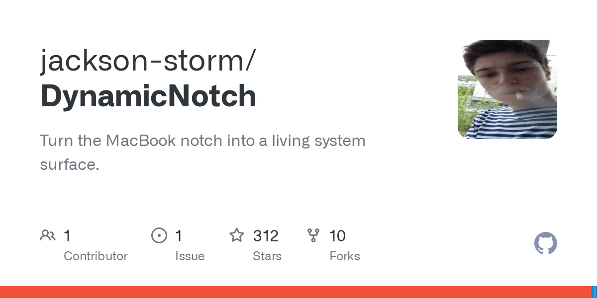
一句话介绍:DynamicNotch为MacBook用户带来了与iPhone端动态岛完全一致的交互体验和动画逻辑,让非Pro机型也能在菜单栏享受便捷的通知与状态管理功能,解决了Mac缺少原生硬件级交互反馈的痛点。
Productivity GitHub Apple
动态岛 macOS工具 菜单栏增强 系统美化 通知管理 交互体验 动画引擎 原生设计 效率工具
用户评论摘要:用户关注项目动机与现有同类方案(如TheBoringNotch)的差异。开发者回应称因不满竞品实现质量与代码依赖,决定自研引擎追求极致原生感。正面评论称赞其界面干净、体验流畅,认为能提升日常使用愉悦度。
AI 锐评

DynamicNotch的价值不在“复刻”,而在“较真”。市面上多数类似项目止步于套壳代码或粗糙的动画模拟,而这款产品选择从底层自建引擎,从用户正反馈(尤其对“干净感”和“原生感”的认可)来看,确实在交互细节、动画曲率、行为逻辑上逼近了iPhone动态岛的体验。但需要注意的是,这仍是一个“伪硬件”层面的美化工具——它解决的是“菜单栏看起来更像iPhone”的审美需求,而非生产力层面的核心痛点。开发者声称要“做得像原生”,但这个“原生”本身在Mac生态中就不存在,用户对“动态岛”的认知是基于iPhone硬件切割屏幕的物理反馈,而MacBook的菜单栏始终是软件层,这种移植本质是视觉隐喻,难免有“为了动态而动态”的冗余感。从125票的评价看,它或许是小众极客的完美玩具,但离真正改变Mac交互逻辑还有距离:缺少深度的系统级集成(如小组件嵌套、手势分层回馈),未能利用菜单栏的特性开发出超越iPhone体验的独创功能。如果后续能基于自研引擎拓展出“Mac专属动态交互”(如更深度融合专注模式、文件拖拽预览、菜单栏实时App状态强化),而不是停留在“让刘海变成动态岛”,产品才可能从“精致仿品”跃升为“生态级工具”。目前阶段,它是同赛道里最用心、最干净的那一个,但天花板也显而易见。

查看原始信息
DynamicNotch
The difference between this project and others is that it is built on its own engine, and not taken from other ready-made repositories. It completely copies the logic, animations, and behavior of a real Dynamic Island on an iPhone, unlike other projects. The main goal is to make the project as native as possible, both in terms of design and interaction.
I’m curious, what made you decide to start this project was it for development experience or did you genuinely feel like you needed something like this
2
回复

@matthias_bettin I downloaded similar analogues, but I didn't like the implementation and almost all of them are based on TheBoringNotch, I liked the idea itself.

1
回复

This actually looks pretty clean. Honestly, this is the kind of small Mac tweak that makes daily use feel nicer.

2
回复

@a_y_u_s_h That was my main task, to make it as clean and native as possible

2
回复
#8
DockFlow
Save, switch, and automate Dock layouts for every workflow
116
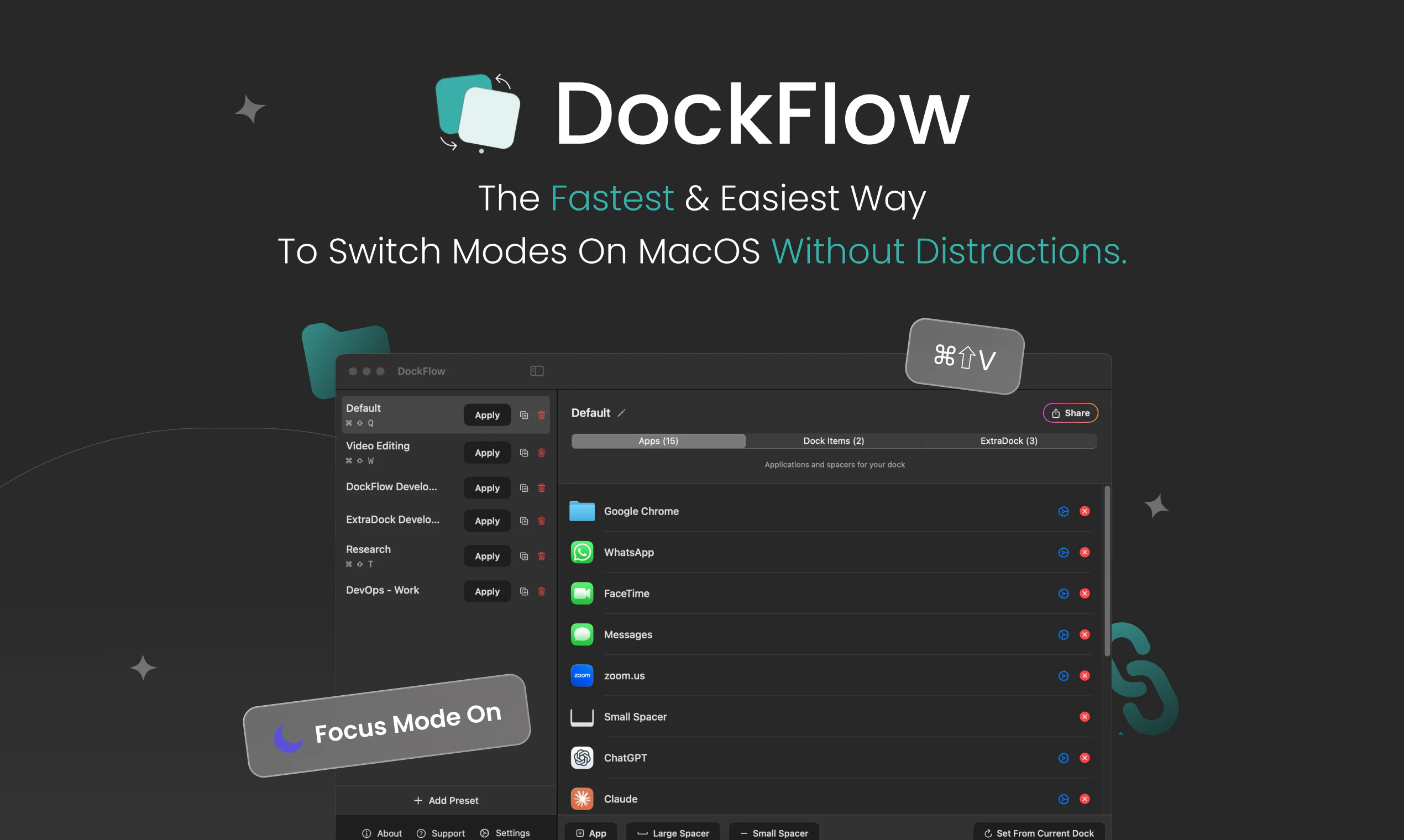
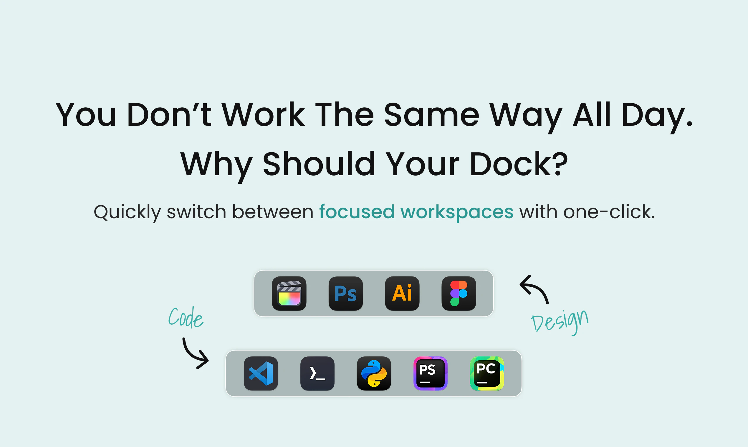
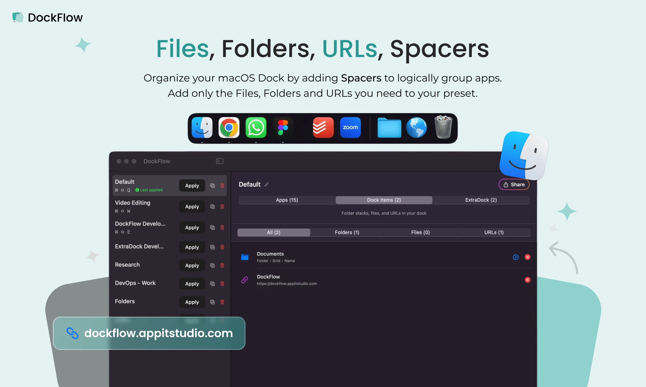
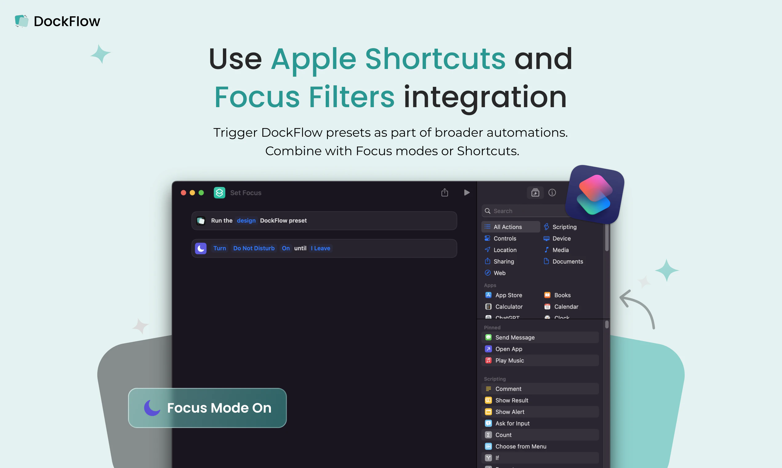
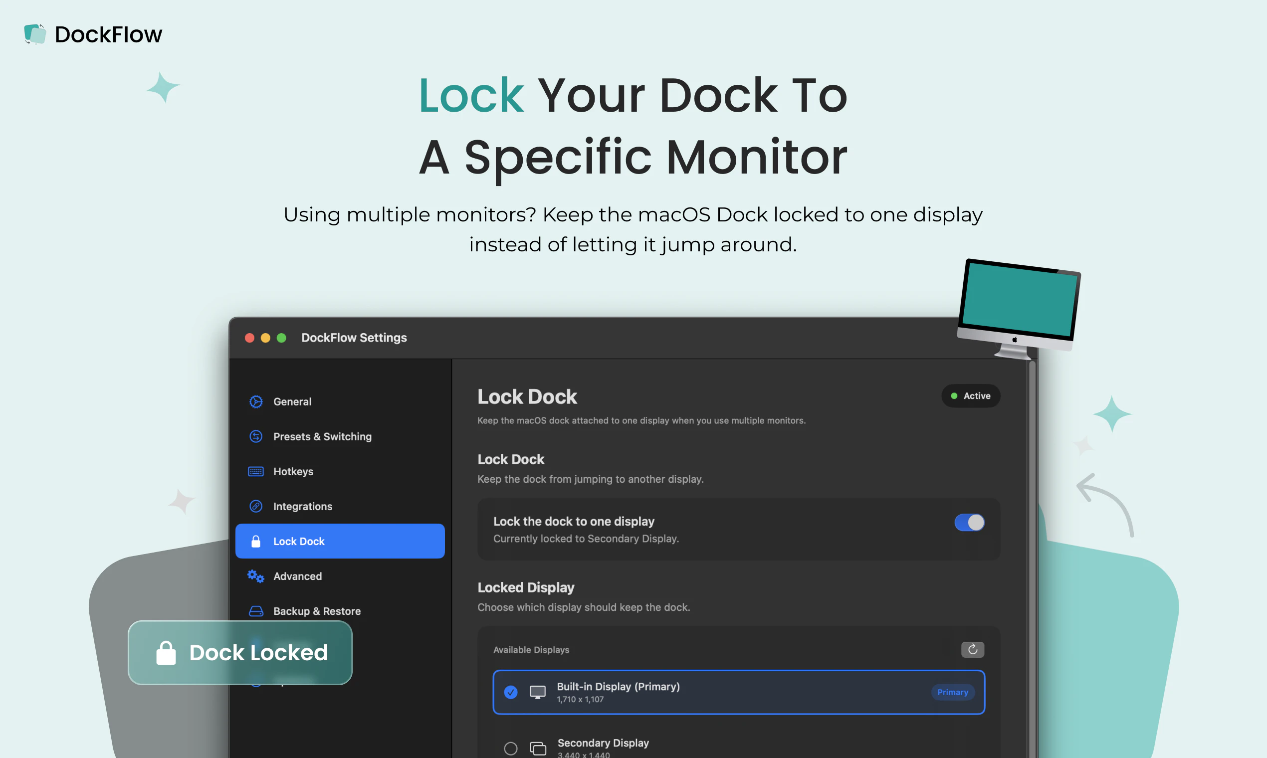
一句话介绍:DockFlow 是一款macOS Dock布局管理工具,让用户一键保存和切换不同工作场景(如设计、编程、写作)的Dock预设,解决频繁手动拖拽图标、整理Dock的痛点,快速进入工作流。
Productivity Tech
macOS工具 Dock管理 工作流自动化 效率工具 生产力 应用切换 预设管理 菜单栏工具 快捷键 Mac插件
用户评论摘要:用户关心切换预设时是否保留应用未保存状态,开发回复称直接关闭,但可设置排除应用。用户询问是否恢复窗口位置,开发表示依赖macOS行为,正与Spancer集成以实现窗口控制。另有用户肯定热键功能有效减少了切换摩擦。
AI 锐评

DockFlow的价值不在于它有多炫酷,而在于它精准击中了macOS用户一个长期被忽视的“小痛苦”——Dock布局的碎片化。在苹果系统内建逻辑里,Dock是静态的、千人一面的,但人的工作流是动态的、分场景的。DockFlow巧妙地用“预设+一键切换+应用生命周期管理”这组组合拳,把Dock从一个“启动器废纸篓”变成了一个“工作流开关”。

从产品设计看,它避开了两个坑:一是没有自造一个Dock替代品,而是基于原生Dock,这保证了零学习成本和系统级别稳定性;二是没有试图做一个“窗口管理巨无霸”,而是聚焦于“哪些应用出现在Dock”这一薄层,很克制。116票在Product Hunt不算爆款,但评论区显示用户关注点已经深入到了“未保存状态处理”和“窗口位置恢复”等细节,说明它确实被重度用户在真实场景中考验过。

风险点也很明显:macOS的沙盒限制和系统更新可能导致Dock操作API不稳定,开发者明确承认窗口恢复功能非自身所能,依赖第三方集成,这既是诚实的交代,也是产品护城河较浅的证明。如果苹果某天在系统偏好设置中内置了类似功能,DockFlow会面临“掘墓人风险”。目前看来,它更像一个精巧的“系统补丁”,而非一个不可替代的业务。对于愿意为“每天省下两分钟拖图标时间”付费的用户来说,它已经足够好了;但对于追求彻底自动化工作流的极客,它只是拼图的一小块。

查看原始信息
DockFlow
DockFlow is a Dock utility that lets you save and swap between different macOS Dock presets. Set up one for design, another for coding, another for writing. One click to switch, close the apps you don't need, and open the ones you do. I built this because I kept wasting the first few minutes of every session dragging icons back into place before I could actually work. Now I pick my context, and I'm already in my workflow. A year and 70 updates in, over 1,000 people use it.
Hey Product Hunt 👋 I’m Asaf, the maker of DockFlow - a macOS app that lets you save multiple Dock presets and switch between them instantly when you change context (coding, meetings, design, personal time, etc.). The idea came from constantly dragging apps in and out of the Dock whenever I jumped between projects and wanting that switch to be a single, reliable action instead. With DockFlow you can: Save dedicated Dock layouts (“presets”) for different workflows. Switch presets with one click from the menu bar or a custom hotkey, and optionally close apps that don’t belong to the current preset so you stay focused. Include apps, folders, and files, use spacers to visually group tools, and keep everything running on the native macOS Dock (no custom dock or extra permissions). Save your last context when switching presets - allows you to get back right to your latest tasks when needed. For power users, automate Dock changes with Shortcuts or the CLI so your Dock can adapt based on time of day or other triggers. Since our first launch we’ve shipped a lot of improvements, including better menu bar access to settings, more robust hotkey handling, support for folder stacks, app actions, and multiple stability fixes to keep DockFlow reliable in daily use. Thanks for checking out DockFlow. I’ll be here all day answering questions, collecting ideas, and iterating based on your feedback 🙏
2
回复

The preset model is cleaner than it looks. It's not just icon positions, it's app lifecycle management across contexts, which is where the real complexity lives. At RetainSure I switch between customer-facing work and engineering several times a day and the context tax adds up. How do you handle apps with unsaved state? Does DockFlow warn before closing or delegate that to each app?

1
回复

@anand_thakkar1 Hey there,

DockFlow closes everything right away,

Apps that have a safe pop-up before closing will still promote them

In DockFlow, you can set excluded apps that will never be closed when switching presets, so this allows you to have some safeguards on really sensitive apps or apps that you want to keep active all the time, like email or WhatsApp, etc.

Thank you for showing interest in DockFlow! 🙏

0
回复

When you switch presets, does it also restore window positions or just open and close apps?

1
回复

@othman_katim 
Hey,
Sorry for the late response,
Yes, this is happening, but it's due to macOS behavior, not something DockFlow directly handles.
We are working on some integrations with the third-party app Spancer to gain full control over window sizes and locations when switching presets.
Thank you for your interest in DockFlow super appreciated 🙏

0
回复

Nice work on the hotkeys, context-switching between dock presets is the kind of friction I keep wanting gone. Good luck with the launch!

1
回复

@fberrez1 Thank you very much!

Try it let me know what you think 😄

0
回复
#9
Podio
Your personal news radio, built around your interests
34
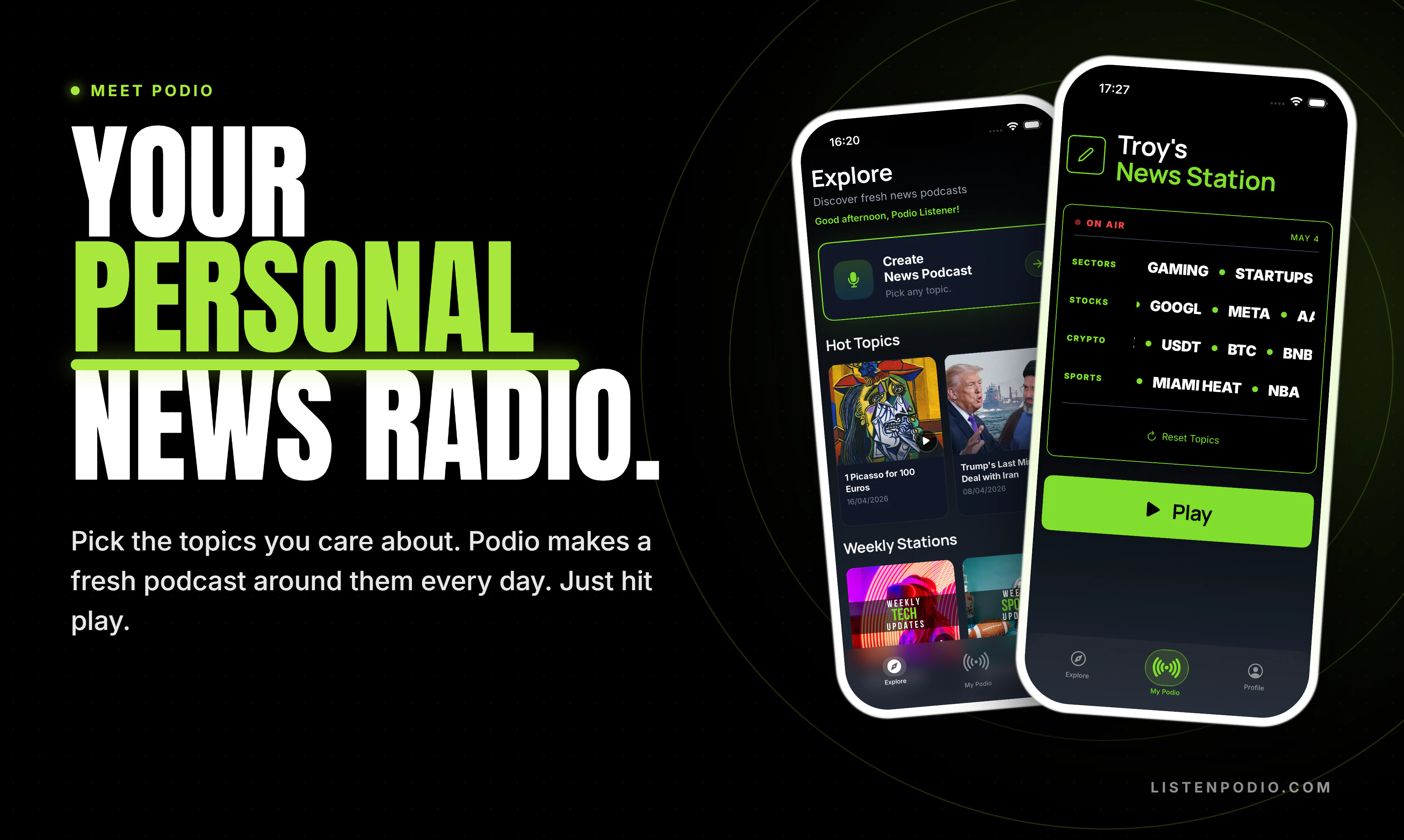
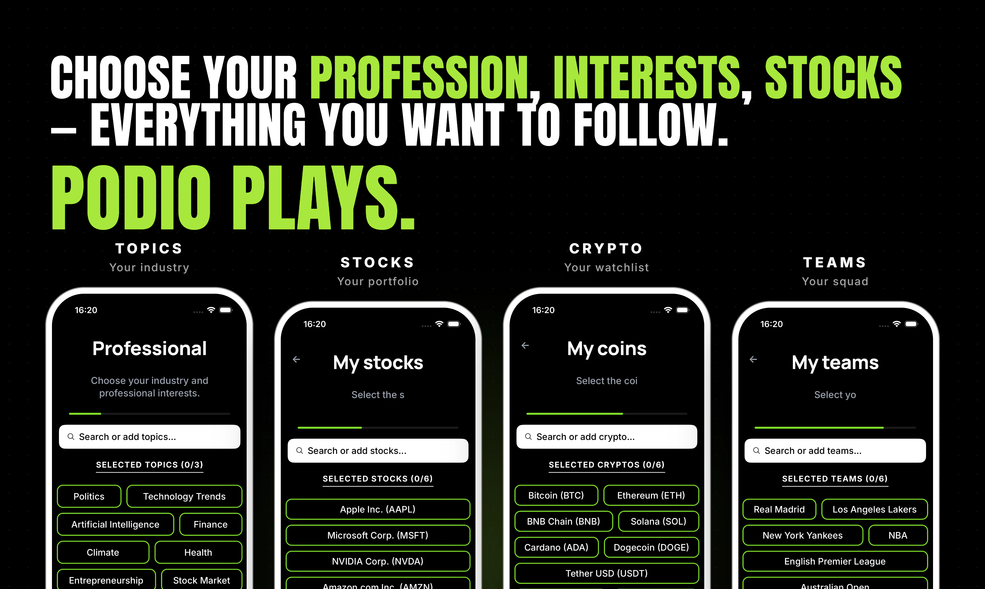
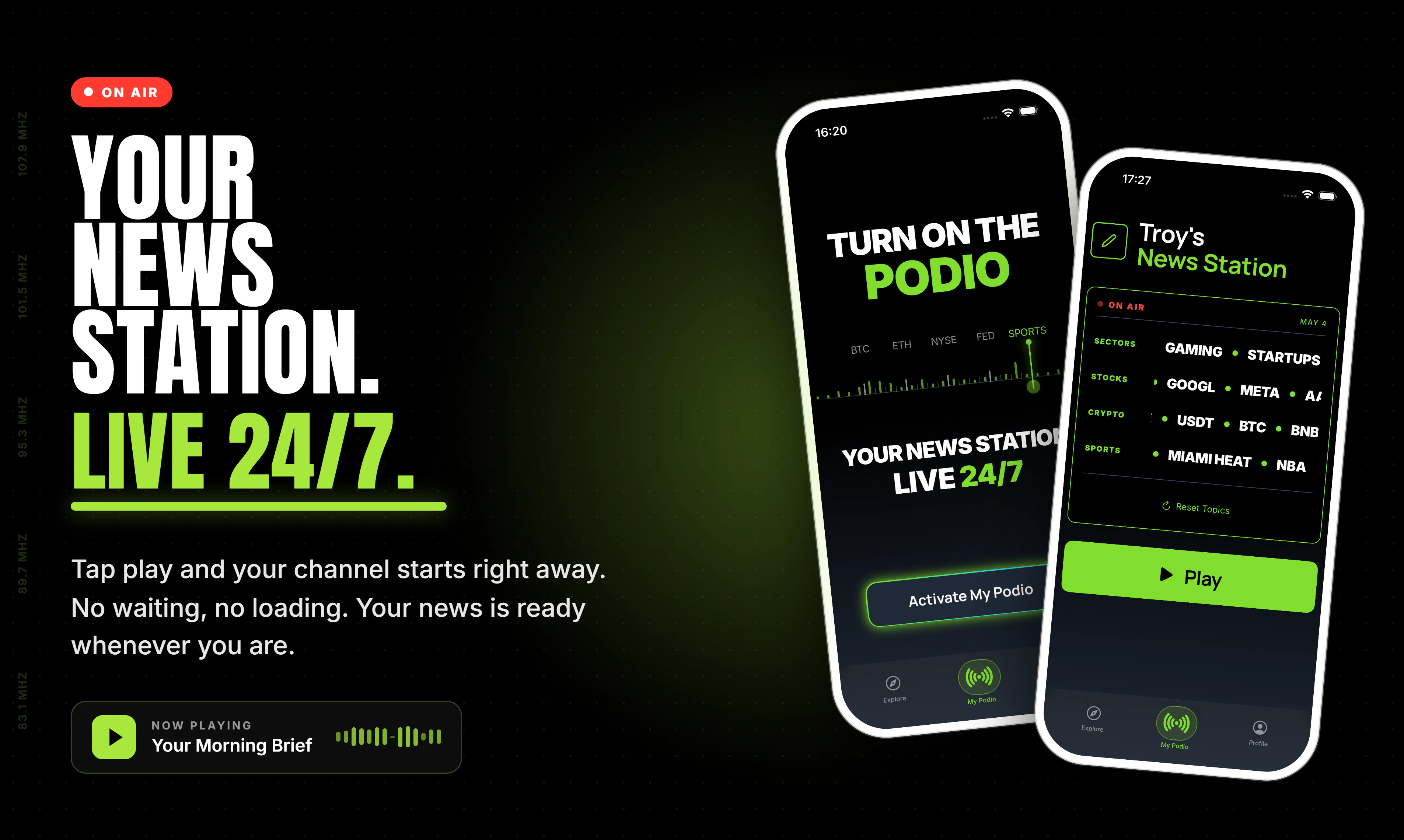
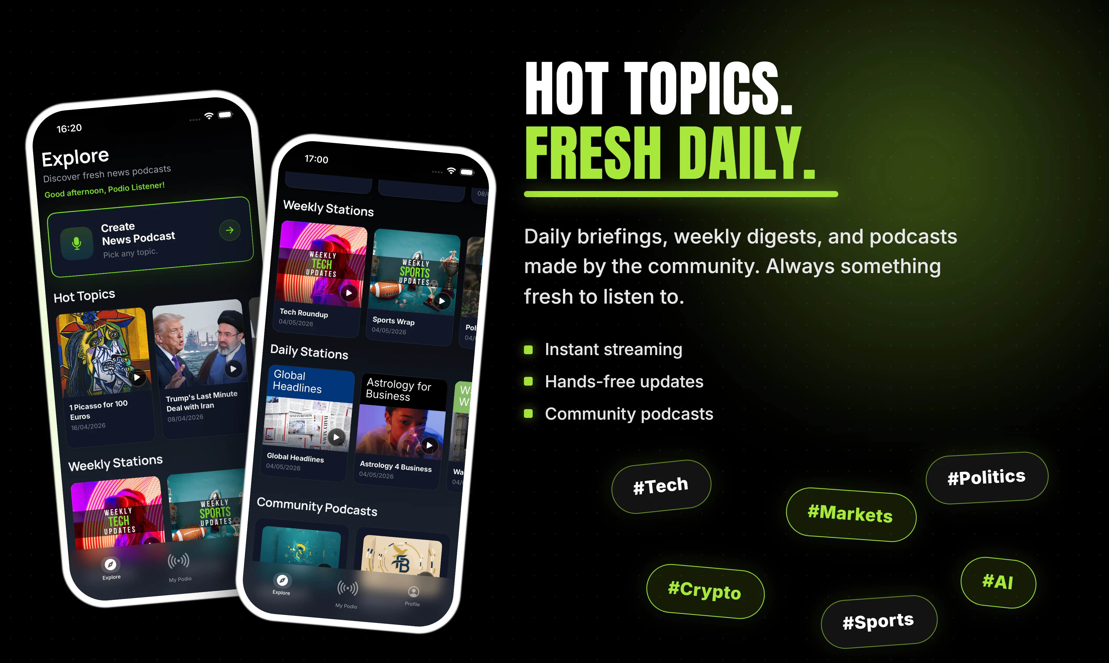
一句话介绍:Podio是一款将用户订阅的兴趣领域(工作、股票、体育、加密等)实时转化为个性化音频电台的APP,解决用户在碎片时间(通勤、健身等)中通过“刷信息流”获取新闻带来的焦虑和效率低下问题,实现“只听不刷”的被动式信息消费体验。
Productivity News Entertainment
个性化新闻电台 AI音频生成 语音助手 信息聚合 兴趣订阅 反焦虑工具 播客替代品 碎片时间效率工具 新闻过滤 产品猎人新品
用户评论摘要:用户普遍认可其“替代刷屏、减少焦虑”的理念。有效反馈集中在个性化深度:用户关心AI能否学习收听习惯达到超个性化;另有用户询问能否接入个人信源(如指定网站或X账户)。创始人均回应称正开发记忆与自定义来源功能。
AI 锐评

Podio的定位精准地击中了信息时代的一个集体痛点——“刷信息流”带来的焦虑感与时间黑洞。其“电台化”的思路并非简单的内容转译,而是对信息消费模式的一次祛魅:将用户从主动的、充满诱惑的“狩猎者”角色,切换为被动的、放松的“收听者”。这种设计有助于降低认知负担,有效拦截“标题党”和“算法陷阱”造成的情绪波动。

但产品的真正挑战在于其核心卖点:个性化。目前通过用户自定义话题来实现“定制”,这种一级过滤在初期有效,但容易陷入“信息茧房”且缺乏惊喜。用户评论中提出的“学习收听习惯”和“自定义信源”是通往深度个性化的关键路径,若处理不当,Podio极易退化为一款“有分类栏目的AI播报RSS阅读器”。另一个隐忧是音频内容质量——AI生成的语音合成与自然语言组织能否达到足以让用户“听完”而不感到机械乏味的水准?这对一个两人团队的技术和内容把控力是巨大考验。

总体而言,Podio是一个价值观正确、切入点犀利的MVP,其在反“刷屏”理念上的市场教育价值大于当前的体验价值。如果不能在个性化算法和音频听感上建立壁垒,它将很快面临来自竞品(如谷歌NotebookLM的Audio Overview或更成熟的播客聚合器)的降维打击。建议团队优先死磕“超个性化”和“旁白听感”这两点,而不是在UI上过多雕花。

查看原始信息
Podio
Choose what you care about (work, interests, stocks, sports, crypto, your teams) and Podio builds a live station around it. Hit play, you're on air. At the Explore, Hot Topics cover what's breaking; daily and weekly channels handle the rest. No feeds, no scrolling.

Hey Product Hunt 👋

I'm Samet. Building Podio with @armanaksoy34

Quick context on why this exists: we kept opening news apps, scrolling for ten minutes, and walking away more anxious without actually knowing more. The feeds aren't broken. They're just doing a different job than the one we wanted them to do.

So we tried audio. You tell Podio what you follow (your industry, a few stocks, the team you support, whatever it is) and it builds a live news station around that. Hit play, you're on air.

It works like a real radio, not a podcast app. There's no episode list to manage. You press play and there's news on what you picked.

Inside the app right now:

🎙 Custom stations you build yourself

🔥 Hot Topics: ready-made stations on whatever's moving today

📅 Daily and weekly channels that show up without you asking

We've been at this about a year and shipped to early users a few months back. The product changes most weeks based on what people tell us, which is why I'm here.

Try it: 📱 iOS: apps.apple.com/us/app/podio-news-podcast-maker/id6747738443 🌐 Web: listenpodio.com

What I'd really value: spend a few minutes with it, then tell me what you'd change. If it clicks for you, an upvote means a lot to a two-person team. If it doesn't, please tell me why. That's the more useful comment anyway.

Huge thanks to @armanaksoy34 for being a relentless co-founder and to everyone on PH for taking a look ❤️

5
回复

@armanaksoy34  @RohanRecommends  @samet_sezer So, finally a filter away the trash and only listen what you like to. love the concept. This is spotify for news.

0
回复

Point about scrolling news apps for ten minutes and just walking away anxious is so incredibly accurate. Endless doomscrolling is a terrible way to start the morning. Replacing that with a passive, hands-free radio format is a brilliant concept. @samet_sezer

3
回复

@samet_sezer  @vikramp7470 Thank you so much for your comment Vikram :) Appreciate the support

1
回复

@vikramp7470 Thanks Vikram, really appreciate it 🙌 Mornings shouldn't drain you before the day even starts.

2
回复

Cool! It reminds me one guy who built something like podcast from tweets. This is also an interesting idea :)

1
回复

@busmark_w_nika Thank you for the comment :) wow, that actually sounds really cool

1
回复

@busmark_w_nika Haha that’s actually a really cool comparison 😄Appreciate the support Nika! 🙌

1
回复
The podcast had a baby with a news radio and raised it on AI. And it SLAPS.
1
回复

@anusuya_bhuyan This might be the new tagline ngl 😂 thanks Anusuya!

1
回复

I really like this concept. Finally an app that builds me a live station with exactly the topics I care about - no endless scrolling through feeds.

Quick question: How personalized does the content get over time? Does it learn from what I skip or listen to longer?

1
回复

@hsr88 Hey Krystian, thank you so much for your comment :)

We are working on the memory of the agents to increase personalization over time, we will launch an agent training feature for hyper-personalization soon.

As of now, you can select topics as specific as you want and your unique set of news will be curated instantly.

0
回复

Came across this today and the concept is interesting. I like the idea of not having to scroll through feeds but I am a bit unsure how well it will actually match my specific interests without feeling too generic. Will give it a try and see if it actually feels personal or not. Btw good luck with the launch.

1
回复

@sidraarifali Hey Sidra, thank you so much for the kind comment and for giving Podio a try!

🙌

We’ve put a lot of effort into making the personalization extremely granular. You can go into very fine details when specifying your interests.

I’d love to hear how it matches (or doesn’t match) your specific topics once you’ve used it for a bit. Any feedback (positive or critical) will directly help us improve the algorithm.

Really appreciate you stopping by and good luck with your own projects too!

0
回复

Tired of doomscrolling news feeds and wasting time?

We've built Podio so you can just hit play and stay informed hands-free.Podio turns your interests into a live, personalized audio stream:


Perfect for commuting, workouts, cooking, or deep work.
No screens, no algorithms fighting for your attention. It's early, and I'd genuinely love your honest feedback (what's working, what's missing, content quality, etc.).

Many thanks to my co-founder @samet_sezer who made this possible.
Can't wait for the feedback and comments today!

👉

Try it free on the App Store: https://apps.apple.com/us/app/podio-news-podcast-maker/id6747738443

1
回复
Where are the news coming from can I give my personal sources ?
0
回复

@bengeekly Thank you for your comment!

😊

We pull news from both local and global sources across the web, along with updates and posts from X.

Regarding personal resources, how would you like to add your own?

One option is letting users input whitelisted websites and specific X accounts to follow. Would that cover what you had in mind, or were you thinking of something different?

Really appreciate the feedback!

0
回复
#10
Monkey Morse
A typing test, but for dits and dahs
17
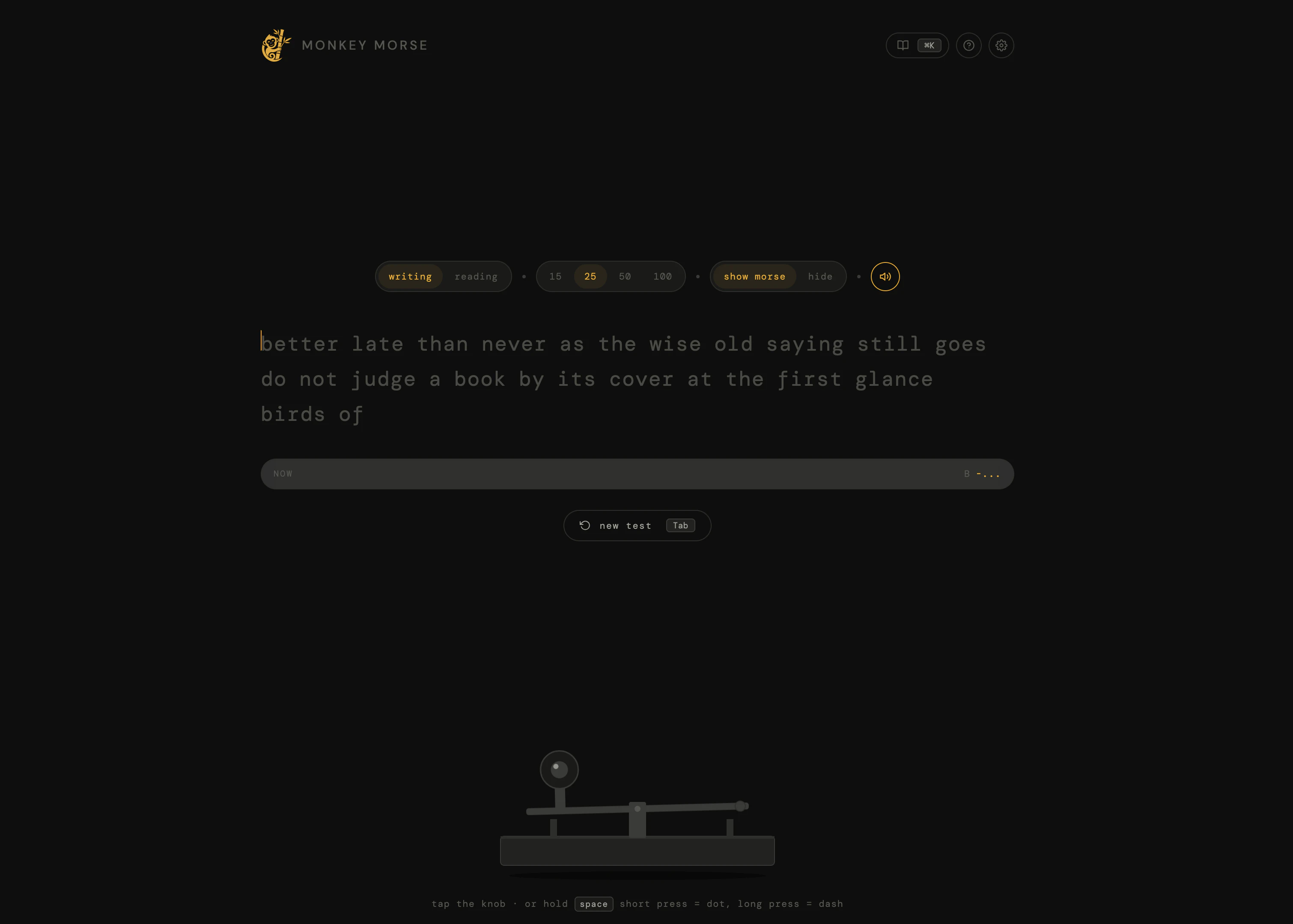
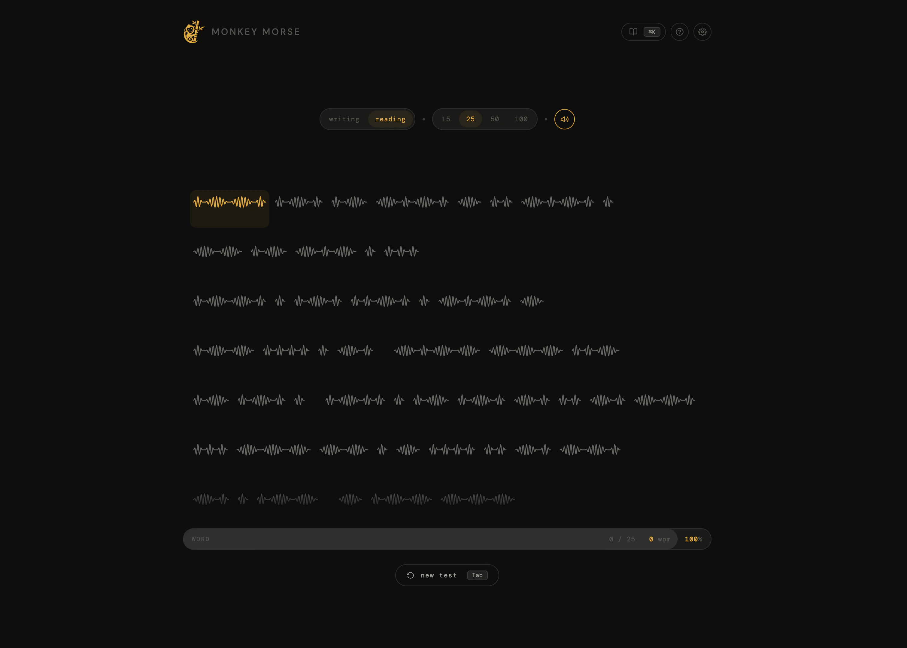
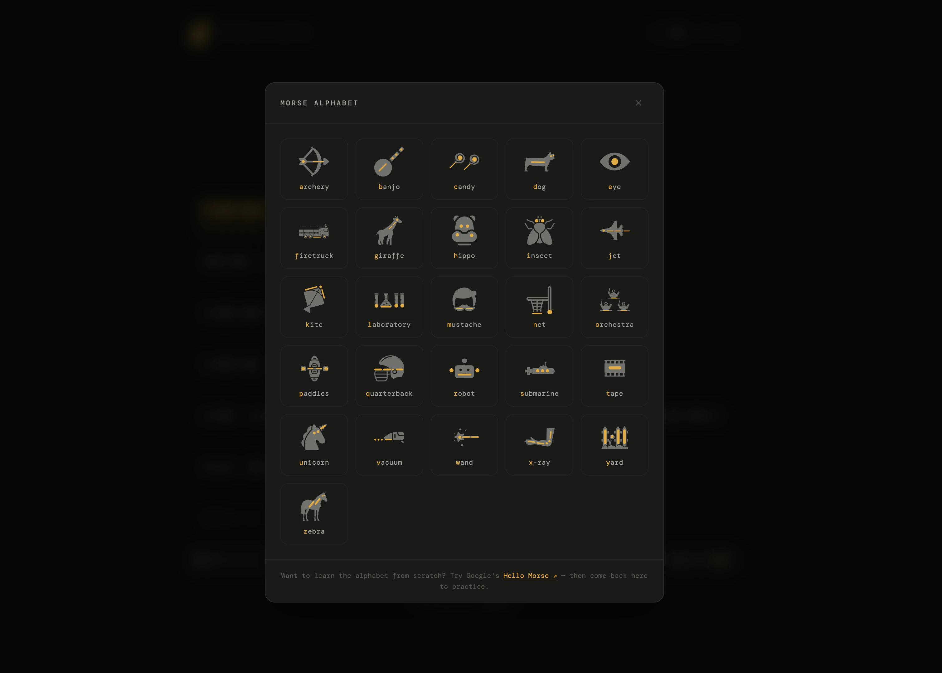
一句话介绍:Monkey Morse 是一款借鉴了Monkeytype风格的浏览器端摩斯电码训练器,通过打字测试的形式,解决现有学习工具界面老旧、缺乏进度反馈的痛点,让用户轻松、有趣地练习发报与解码。
Productivity Education Games
摩斯电码 打字测试 学习工具 浏览器应用 训练器 实时统计 免费工具 趣味学习 电键模拟
用户评论摘要:用户@anin_arafath祝贺发布,并询问作者更侧重于“让练习变得有趣”还是“让准确性/一致性追踪真正对学习有用”。作者未直接回复,但这指出了产品在娱乐性与实用性之间的核心平衡问题。
AI 锐评

Monkey Morse巧妙地将“打字测试”这个已被验证具有高用户粘性的交互范式移植到“摩斯电码学习”这一小众垂直领域,本质上是一种体验的降维打击。产品最聪明的点在于,它没有去跟专业的CW(等幅电报)软件比拼功能深度,而是抓住了“快速反馈”和“即时重启”这两个令人上瘾的机制,大幅降低了学习过程中的挫败感——这正是无数没撑过Koch法前期枯燥训练的初学者最需要的。

然而,产品目前有明确的两难处境:它更像一个“游戏化的测试工具”,而非系统性的“学习课程”。评论区的核心矛盾——“有趣”还是“有用”尚未得到解决。如果只追求即时的WPM和准确率,用户很可能陷入“在熟悉的内容上刷高分”的虚假成就感中,而难以真正将听到的随机电码变成肌肉记忆。目前的“解码”模式也仅仅是把字符映射用打字测试的壳子套了一遍,缺乏根据用户错误率动态调整的渐进式学习路径。

从商业和持续价值角度看,该工具可能更适合作“学习流程中的一环”——比如作为Koch法或Farnsworth法学习后的检验平台。如果后续不能补完一套基于最短学习路径的算法推荐(如优先推送用户常错的字符),它很快会变成一个“用一次就卸载”的新奇玩意。真正的产品价值不在于做得像Monkeytype,而在于能否成为摩斯电码领域的“Duolingo”:既有刷题的快感,又有科学的教学内核。目前,它只完成了前者的一半。

查看原始信息
Monkey Morse
Monkey Morse is a clean, browser-based morse code trainer inspired by monkeytype. Tap a telegraph key to send dots and dashes, or decode morse audio and type the matching letter. Tracks WPM, accuracy, and consistency in real time. Free, no signup.

Hey Product Hunt 👋

I built Monkey Morse because I wanted to learn morse code but every existing tool felt like it was made in 2010 — clunky UIs, walls of dots and dashes, no sense of progress.

So I borrowed the bit that makes monkeytype addictive (clean typing test, live stats, instant restart).
Would love feedback from anyone who's tried to learn morse before, what made you bounce off?

1
回复

@anin_arafath Congrats on the launch! A typing test for dits and dahs is a fun niche. What was more important for you? Making Morse practice feel fun, or making the accuracy/consistncy tracking actually useful for learning?

0
回复
#11
Vela
Generate motion graphics with text. No After Effects
16
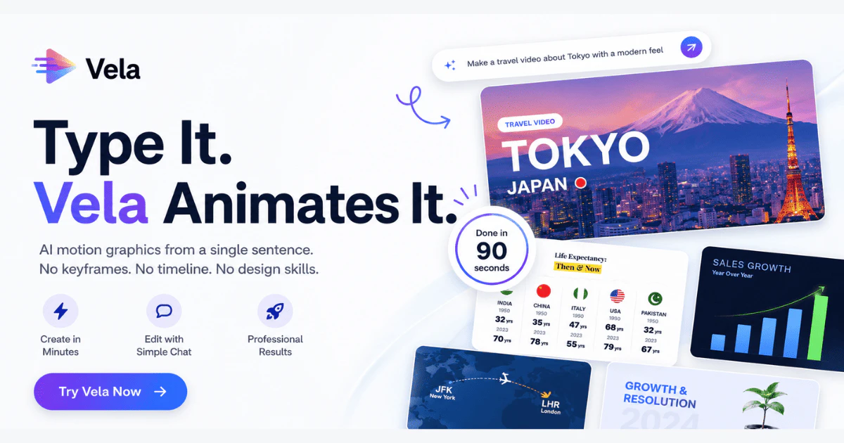
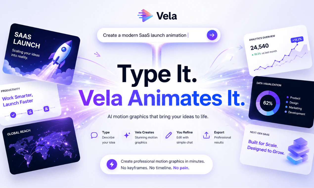
一句话介绍:Vela是一款通过文本描述即可自动生成专业动态图形的AI工具,帮助创作者、营销人员和创始人无需掌握After Effects等复杂软件,快速解决动态图形制作耗时、成本高、模板同质化的痛点。
Design Tools Marketing Artificial Intelligence
动态图形生成 AI动画工具 文本生成动画 免设计软件 营销动画 产品演示动画 动态设计自动化 创作者工具 零门槛动画
用户评论摘要:用户普遍对产品表示认可,有评论认为其“看起来太棒了”。主要反馈集中在工具是否真的能替代传统工作流,以及生成效果的专业性期待上,暂无具体批评或使用问题提出。
AI 锐评

Vela的切入点在AI视频生成的红海中显得格外犀利——它放弃了与Sora、Runway等争夺“全能视频生成”的战场,而是精准锚定“动态图形(Motion Graphics)”这一垂直领域。这恰恰是商业传播中的高频刚需(产品发布、广告、教学),却又是传统AI工具的盲区:大多数AI视频工具擅长生成写实或风格化场景,但无法精确控制图文排版、字距、图层渐显等动态图形设计的核心要素。

从产品逻辑看,Vela的价值不在于“AI替代人类”,而在于“AI将抽象需求直接编译为动效代码或渲染指令”。它把用户从“操作软件”的痛苦的转移到了“描述需求”的对话中,这本质上是对设计生产流程的降维打击。尤其对于初创公司和独立创作者,省去几百美元的外包费和一个工作日的沟通周期,是实实在在的ROI提升。

然而,真正的壁垒在于“生成结果的质量与可控性”。目前演示中“浮动UI元素”或“飞行路径地图”这类常见模板化需求易实现,但用户若要求“带有微妙缓动曲线的粒子消散效果”或“符合品牌规范的字间距行间距”,Vela是否能通过“再聊天”准确校准?此外,一旦用户要求复杂度超过模型预设的组件库,其鲁棒性将面临考验。更长远看,AI动效工具若只会“模仿模板”,而不理解设计原理(如视觉层级、动势引导),最终成品仍会显得廉价。Vela必须在“自然语言理解”与“设计语法”之间找到更深的融合,而非仅做一个文本驱动的模板引擎。

查看原始信息
Vela
Vela lets you generate professional motion graphics just by typing. Describe the motion graphic you need — "a clean product launch animation with floating UI elements" or "a 3D map showing a flight path from Delhi to London" — and Vela builds and animates it for you. No After Effects. No keyframes. No design degree. Once it's generated, you keep refining it through chat. Say "change the background to dark mode" or "make the text entrance faster" — Vela updates it instantly.
Hey Product Hunt 👋 We built Vela because motion graphics are still absurdly hard to make — and they shouldn't be. If you've ever needed an animated intro, a product explainer, a map animation, or a motion graphic for a social ad, you know the options are: (a) learn After Effects and spend 6+ hours, (b) hire a freelancer for $400–$800 and wait 3 days, or (c) use a template that looks like everyone else's. Vela is option (d). — — — HOW IT WORKS 1. Type what you want Describe your motion graphic in plain English. "A premium dark-theme SaaS product reveal with animated UI mockups." "An animated map showing our delivery zones across India." "A clean lower-third intro for my YouTube channel." 2. Vela generates it In under 2 minutes, Vela builds and animates the entire motion graphic. Timing, transitions, typography, layout — all handled automatically. 3. Refine by chatting Don't like the color? Say "make the background navy." Want it faster? Say "tighten the animation timing." Vela updates it live. No export, no re-import, no timeline hunting. — — — WHO IT'S FOR → Creators who need professional intros and outros without a design budget → Marketers who need animated social ads without a motion designer → Founders who need a product demo animation for their launch → Educators who want animated explainers without touching a timeline → Freelancers who want to deliver motion graphics 10x faster — — — WHAT MAKES IT DIFFERENT Most AI video tools generate stock-footage collages. Vela generates actual motion graphics — animated typography, shape animations, UI reveals, and map animations — from scratch, from your description. And unlike templates, every output is unique to your prompt. You're not picking from a library. You're describing exactly what you need. — — — We're just getting started. Would love your feedback — especially from anyone who's suffered through After Effects. 🙏
1
回复

looks awesome dude

0
回复
#12
Nexpend - Subscription Tracker
Stop wasting money for unwanted subscriptions
15
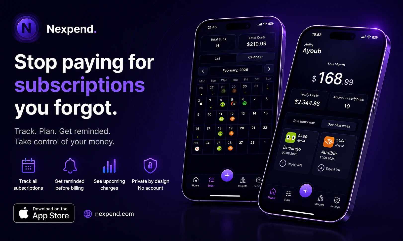
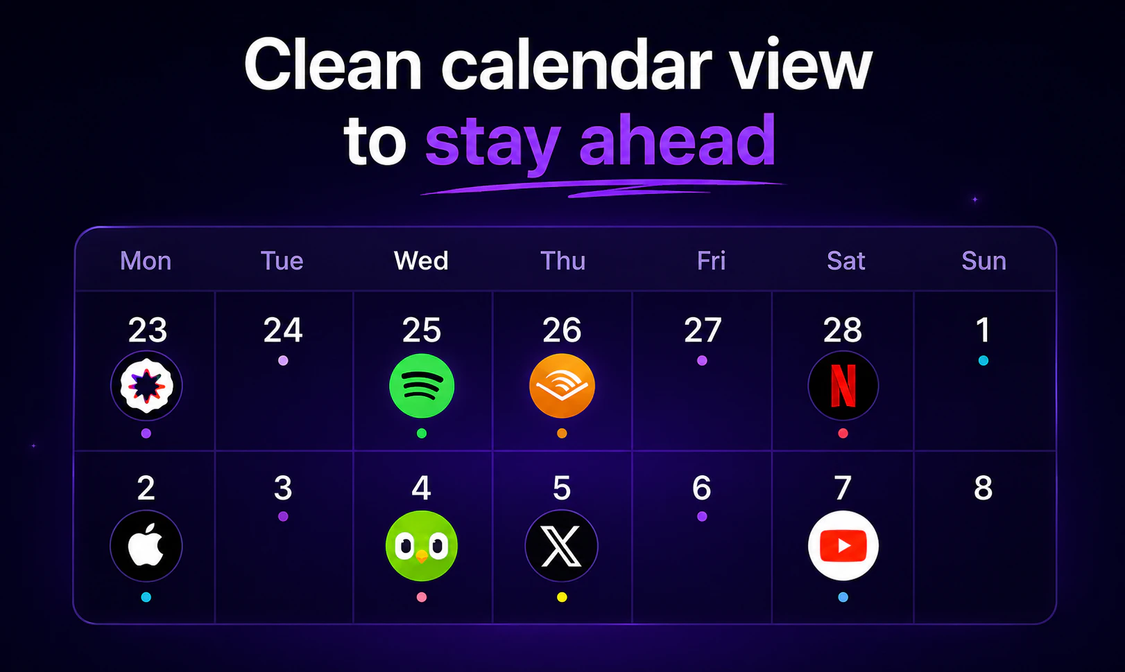
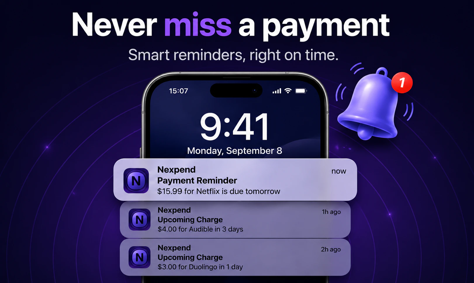
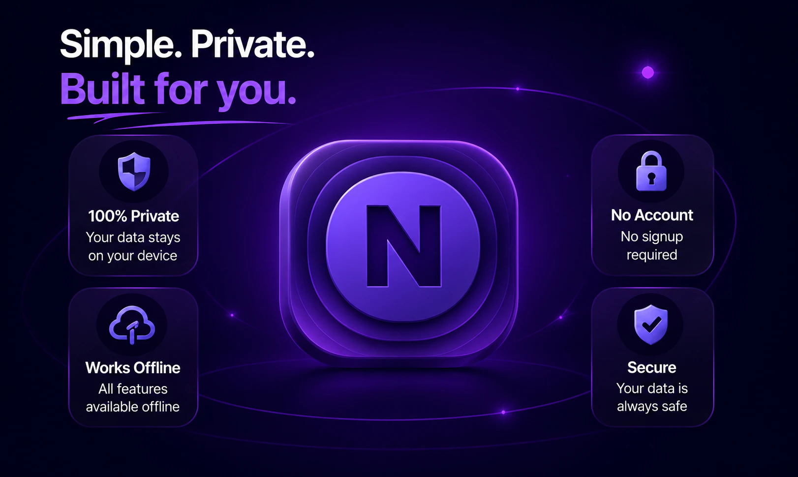
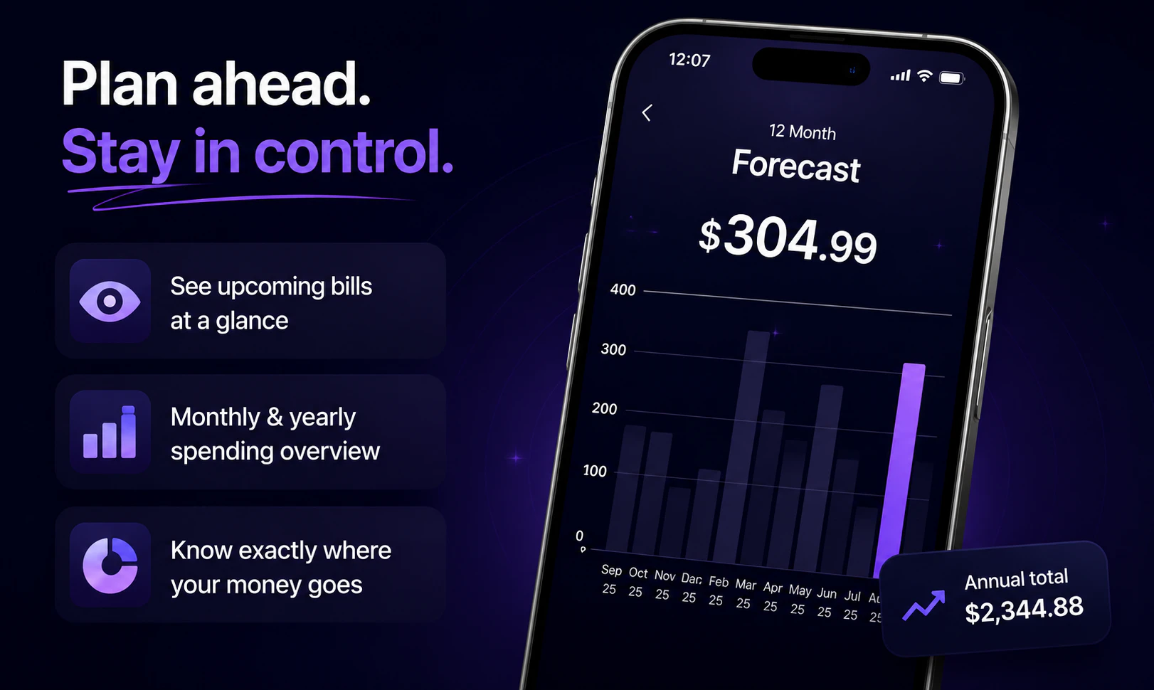
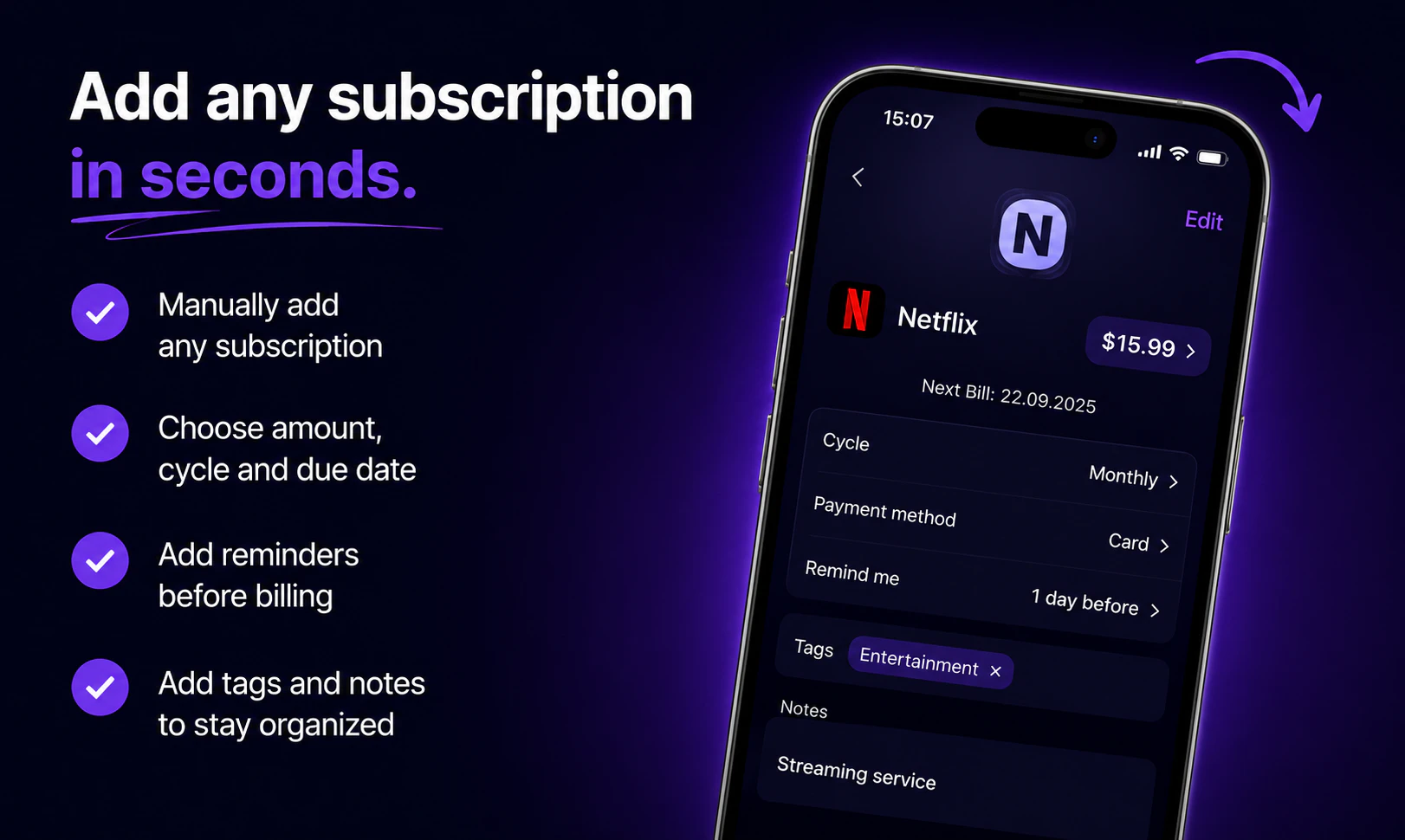
一句话介绍:这是一款主打隐私保护的本地化订阅管理工具,帮助用户在忘记付费时收到智能提醒,避免因遗忘而浪费每年约240美元的无效订阅支出。
iOS Fintech Money
订阅管理 费用追踪 隐私优先 本地数据 手动记账 个人理财 提醒工具 避免浪费 iOS工具 记账
用户评论摘要:用户普遍认可需求痛点(遗忘订阅),但多次询问能否绑定银行自动检测订阅,开发者明确拒绝并强调隐私优先。有用户建议增加Chrome扩展在订阅时自动录入,开发者未回应但暗示手动输入是初期必经之路。
AI 锐评

**定位精准,但“隐私护城河”正在成为功能牢笼。**

Nexpend的卖点“不联网、不绑卡、不上云”在当前数据泄露频发的环境下确实能击中部分极简主义或隐私敏感用户的痒点。但仔细推敲,这是一个典型的“过犹不及”设计:**手动录入所有订阅信息,本质是把“避免遗忘”的痛,替换成了“必须记忆并主动记录”的更大痛。** 用户连订阅本身都忘了,凭什么还能记住打开APP手动录入?

从评论反馈可以看出,用户最核心的需求其实是“自动发现+一键管理”,而非“一步一输入+隐私托词”。开发者对每一条关于对接银行的提问都给出长篇同一套解释,这与其说是回应,不如说是防御性话术——**用隐私正确来掩盖功能缺失。** 真正尊重隐私的解决方案,应该是让用户在本地完成支付数据导入(如API token、信用卡账单PDF解析),而非彻底割裂连接。

此外,15个投票和寥寥数条评论(基本是亲友团互赞)表明产品尚处于极早期。单靠“手动记账+提醒”的模式很难形成粘性——同类竞品如Bobby、Subby已覆盖成熟,而银行APP内置的订阅检测功能正在崛起(如Mint、Rocket Money)。Nexpend若只停留在“用记事本形式卖隐私故事”,大概率只会成为用户App Store里另一个“下载后忘记打开”的订阅本身。**值得尝试的方向是:增加本地PDF/截图批量导入、化手动为半自动,或做成智能日历式卡片管理,否则这个产品救不了忘记订阅的人,只会成为用户又一阵的自我感动。**

查看原始信息
Nexpend - Subscription Tracker
The average person wastes $240/year on forgotten subscriptions. Nexpend helps you track every subscription, get smart reminders, and take full control of your spending.
Hey everyone 👋 I built this after realizing I was paying for subscriptions I didn’t even remember. Most tools I tried felt too complex or required too much setup, so I wanted something simple, fast, and private. Curious to hear how you’re currently managing subscriptions (if at all). Happy to answer any questions or take feedback!
4
回复

Does Nexpend connect to bank transactions to detect subscriptions automatically, or is it manual tracking only?

1
回复

@naimz No for banking connection -> it's built around privacy, so no linking with any entity, also it's built to keep data locally on your device.

Nexpend isn’t trying to replace bank-connected finance apps. That’s a different product with a very different tradeoff.

A few reasons behind this approach:

  • Privacy matters a lot. I intentionally don’t ask users to connect their bank account, email inbox, or any third-party service just to use the app.

  • Not everything can be auto-detected anyway. School fees, gym memberships paid in cash, family subscriptions, local services, manual recurring payments, subscriptions on cards you no longer actively use… many real-world recurring expenses won’t be caught automatically.

  • Anything you use to manage subscriptions requires initial input somewhere. Whether it’s a spreadsheet, Notion, another app, or a finance dashboard, the first setup always exists.

0
回复
Congrats Ayoub 🚀 Wishing you big success today 👏
1
回复

@mustapha_ajermou1 Thanks Mustapha for the support 🙏🙏

0
回复

congrats on the launch can i link it with my bank for example mercury and it detects subs from there ?

1
回复

@nabil_bakour1 Thanks, buddy 🙏
No brother for banking connection -> it's built around privacy, so no linking with any entity, also it's built to keep data locally on your device.

Nexpend isn’t trying to replace bank-connected finance apps. That’s a different product with a very different tradeoff.

A few reasons behind this approach:

  • Privacy matters a lot. I intentionally don’t ask users to connect their bank account, email inbox, or any third-party service just to use the app.

  • Not everything can be auto-detected anyway. School fees, gym memberships paid in cash, family subscriptions, local services, manual recurring payments, subscriptions on cards you no longer actively use… many real-world recurring expenses won’t be caught automatically.

  • Anything you use to manage subscriptions requires initial input somewhere. Whether it’s a spreadsheet, Notion, another app, or a finance dashboard, the first setup always exists.

1
回复
Congrats on the launch Ayoub 👏 App well needed, I wish there’s a chrome extension that gets triggered whenever I subscribe to any platform, so I don’t have to add it manually.
0
回复
Subscribe or Upgrade plan, because the pain is forgetting to downgrade before the next payment then u get shocked with the amount deducted
0
回复
#13
JellyNet
Sell your idle API quota. Buy any LLM for less.
13
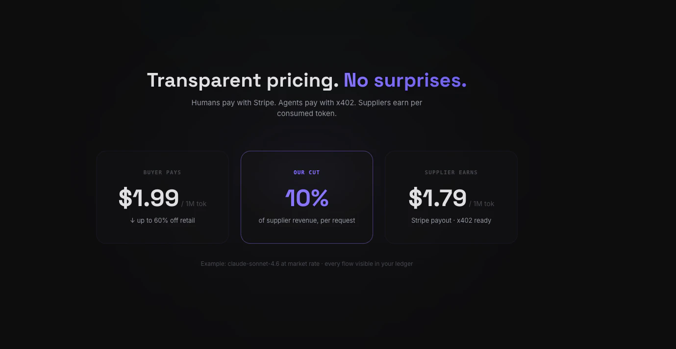
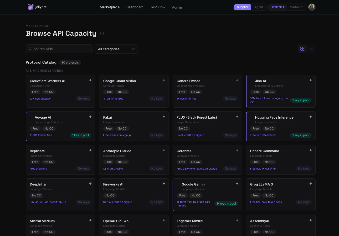
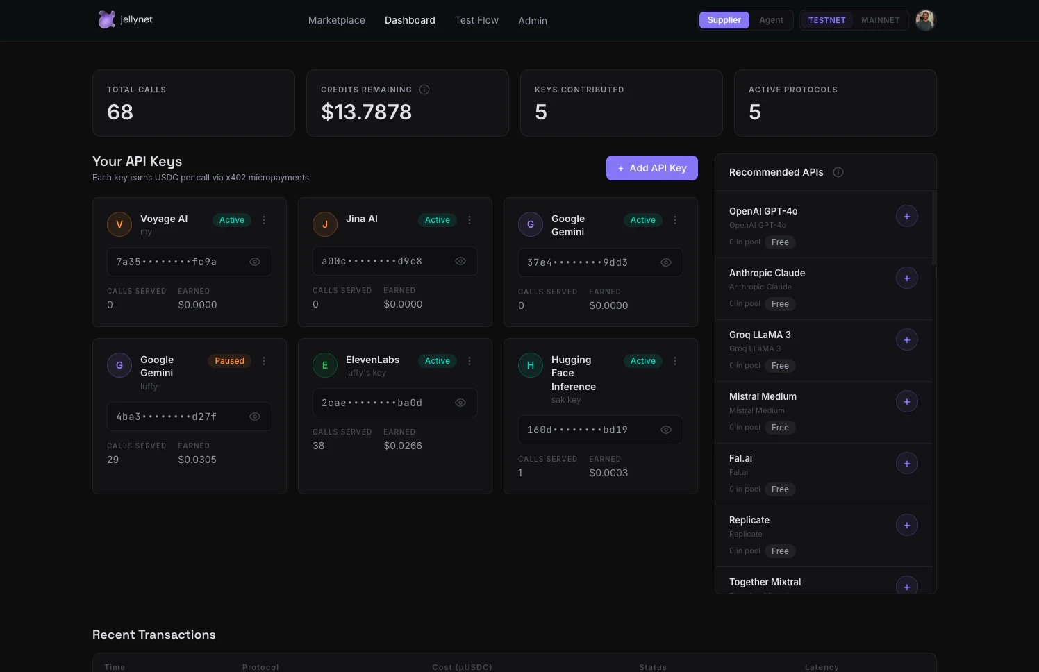
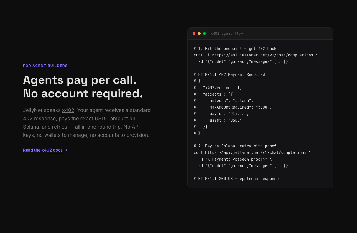
一句话介绍:JellyNet是一个API容量共享市场,让开发者将闲置的AI API密钥(如OpenAI、Anthropic等40+供应商)贡献到公共池中赚取USDC,同时买家通过一个通用密钥即可低价调用任意模型,实现“闲置变现、按需购买”。
API Developer Tools Artificial Intelligence
API容量共享 AI基础设施 闲置资源变现 P2P市场 LLM聚合 通用API密钥 无供应商锁定 x402微支付 Solana 去中心化
用户评论摘要:用户认可解决多API密钥管理的痛点,但关注路由算法是否优化成本/延迟,以及请求路由到第三方密钥时的可靠性、隐私与信任问题。创始人回应了验证、自动重试和经济激励设计。
AI 锐评

JellyNet的构想——API版本的Airbnb——确实挠到了开发者“花冤枉钱买配额”的痒处。但它的真正价值不在于“共享经济”的理念包装,而在于将“闲置资源”金融化,创造了一个高效的二级市场。对供应商而言,它把沉没成本变成了被动收入;对买家而言,它打破了供应商的定价权和锁死效应,实现了30%的折扣。

不过,产品目前仍面临严峻考验。首先是信任问题:虽然创始人提到了ZK加密和自动验证,但在实现之前,敏感数据通过他人密钥流转本身就是安全灾难;买家无法知道调用的是谁的金钥,供应商也无法控制谁用了自己的配额。其次是经济模型可持续性:60%的分成比例对供应商很有吸引力,但10%的平台抽成能否覆盖路由、重试、异常处理和未来合规成本?随着规模扩大,恶意供应商刷失效密钥或买家滥用免费额度将导致系统脆弱。最后是用户体验的现实落差:x402微支付虽然酷炫,但Solana链上的网络拥堵和手续费用可能削弱“即用即付”的即时性,而普通开发者更可能选择简便的Stripe信用卡,而非触碰加密钱包。

JellyNet的方向是正确的——AI基础设施的下一步确实是优化存量而非堆砌新算力。但它的天花板不在技术,而在能否建立起一个足够透明且可信的治理机制,让“共享”不至于沦为“风险外溢”。若只是简单做一层密钥转发,那它很快就会沦为机器人爬虫的养料;若能真正解决隐私与信任的桥梁问题,它或许能成为AI时代的“HTTP代理民主化”基础设施。

查看原始信息
JellyNet
JellyNet is an API capacity-sharing marketplace. Suppliers contribute idle API keys across 40+ LLM providers and earn USDC for every call served. Buyers get instant access through one universal API key with automatic failover across the entire pool. AI agents pay per-call using the x402 payment protocol — no signup, no API key management. Just a standard HTTP request with a USDC micropayment on Solana. Self-serve: your own keys serve your own calls first & free.
Hey Product Hunt! 👋 I'm Mukul, solo founder of JellyNet. Here's the problem that wouldn't leave my head: I pay for API subscriptions across OpenAI, Anthropic, Google, ElevenLabs, Mistral, and a dozen others. Most months, I use maybe 30-40% of my quota. The rest just expires. Multiply that by every developer, startup, and AI team out there — we're collectively wasting millions in unused API capacity every month. JellyNet fixes this. It's an API capacity-sharing marketplace: For Suppliers (people with API keys): → Paste your idle API keys into JellyNet → We pool them into a shared capacity layer → Every time someone uses capacity from your keys, you earn USDC → Your own calls use your own keys first — completely free → You only start earning when others consume from your pool For Buyers (developers and AI agents): → One universal API key (jn_xxx) works across 40+ LLM providers → Weighted-random rotation across the entire pool — automatic failover → If one key hits a rate limit, we silently retry on the next one → No vendor lock-in, no provider-specific SDKs For AI Agents (the x402 flow): → Send a standard HTTP request to our endpoint → Get back a 402 Payment Required with a USDC price → Pay the micropayment on Solana, retry with proof → Get the upstream response — no account, no key, no signup → This is the HTTP 402 status code working as originally intended What's live today: - 40+ supported providers (OpenAI, Anthropic, Google, Mistral, Cohere, ElevenLabs, Replicate, Stability AI, Voyage, and many more) - Universal API key with weighted pool rotation - x402 agent payment rail on Solana - Fiat payments via Stripe for human buyers (coming soon) - Epoch-based revenue distribution (8-hour cycles) - Real-time supplier dashboard with earnings tracking - Automatic 429/rate-limit retry with silent key rotation The economics: - Suppliers earn 60% of every call served (native-call mode) - Buyers get 30% below retail pricing - JellyNet takes 10% - Your own keys serve your own calls FREE — payment only happens when you consume from other suppliers' pools I built JellyNet because I believe the next wave of AI infrastructure isn't about building more capacity — it's about better utilizing what already exists. Every idle API key is wasted value. Every rate-limited developer is a missed opportunity. This is real P2P "capacity sharing" — the Airbnb model applied to API subscriptions. You're not reselling; you're sharing surplus capacity and getting compensated for it. Would love to hear from the PH community: What API subscriptions do you pay for but barely use? That's exactly the surplus JellyNet turns into income. 🪼 Try it out → https://www.jellynet.net Join our Group → https://t.me/jellynet
5
回复

@mukul_israni 
This is solving a real pain for me. I currently manage API keys for OpenAI, Anthropic, and Gemini across 3 different dashboards with 3 different billing cycles. The universal key concept is exactly what I need — just swap the base URL and it routes to whoever has capacity? That's clean.
Question: how does the routing decide which provider to use? Is it random or does it optimize for something?

0
回复

Quick breakdown of what you can actually do right now:

🛒 Browse the marketplace (no login needed) — jellynet.net/marketplace
→ 40 providers across 12 categories: LLMs, image gen, speech, embeddings, vision, crypto, market data

🔑 As a buyer:
→ Sign up, get a universal jn_xxx key
→ Swap your provider URL to api.jellynet.net — that's it, no SDK
→ Smart routing picks the cheapest available key. If it 429s, silent retry on the next one.

💰 As a supplier:
→ Paste your idle API keys
→ Your own calls run free first
→ Surplus earns you 60% per call served
→ 8-hour payouts in USDC or fiat 🤖 For AI agents:
→ x402 micropayments on Solana — no signup, no API key, just pay-per-call with USDC

$5 free credits on signup to try it out.

We broke down the full story in a thread here: https://x.com/jellynet_/status/2058452265095278629?s=20

Would love honest feedback — what's missing, what's confusing, what would make you actually use this. We're building in public and every comment shapes what ships next 🙏

2
回复

This is a pretty unusual take on the LLM API problem. How do you handle reliability and trust when requests are routed through supplier contributed API capacity?

1
回复

@dmitrii_volosatov Great question — trust is the core design challenge.

Three layers handle it:

First, every API key goes through a validation call before entering the pool. If it doesn't return a valid response, it's rejected.

Second, routing uses weighted-random rotation across the supplier pool. If a call fails (5xx or rate limit), the router silently retries on the next available key — default 3 retries within a 9-second budget, buyer-configurable. No single key is a bottleneck.

Third, the economics enforce trust: suppliers only earn when their keys successfully serve calls. Failed calls = auto-refund to buyer, zero payout to supplier. Direct financial incentive to contribute reliable keys.

On the privacy side, we're building toward end-to-end ZK encryption for prompts and responses so that content is never exposed in transit between buyer and supplier infrastructure — neither JellyNet nor the supplier can read what's being sent. Early stage on that but it's core to the roadmap.

0
回复
#14
CloudRaptor
Cloud Server management, made simple
10
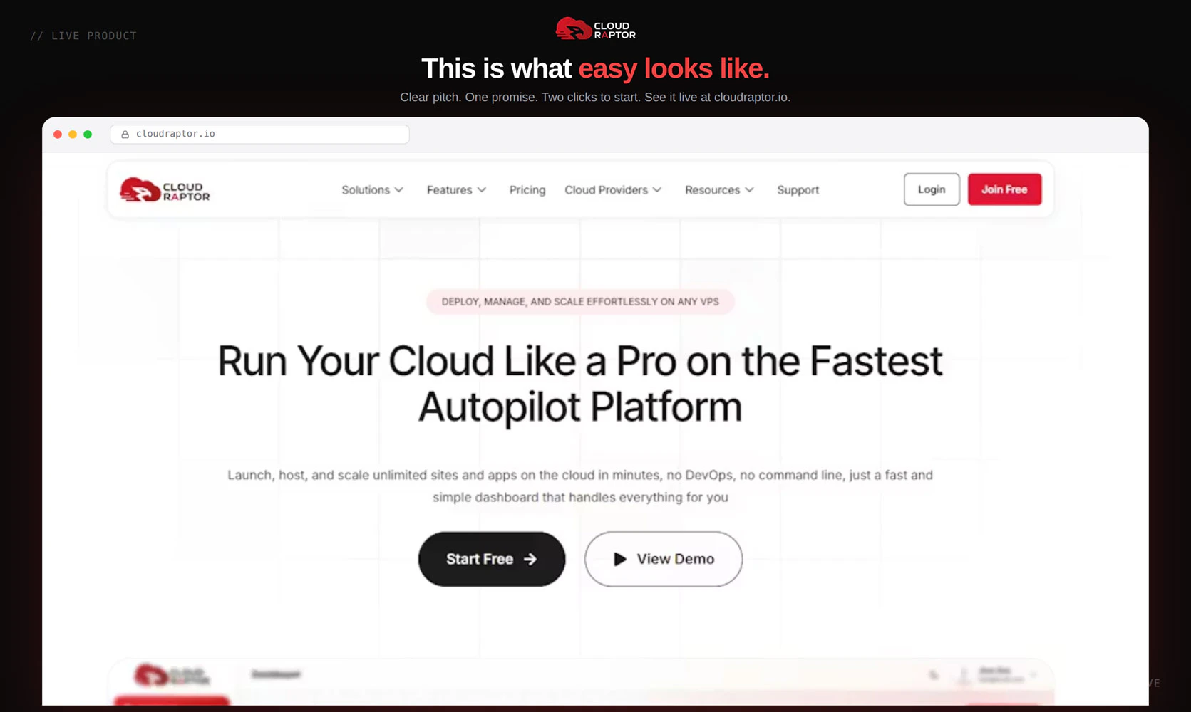
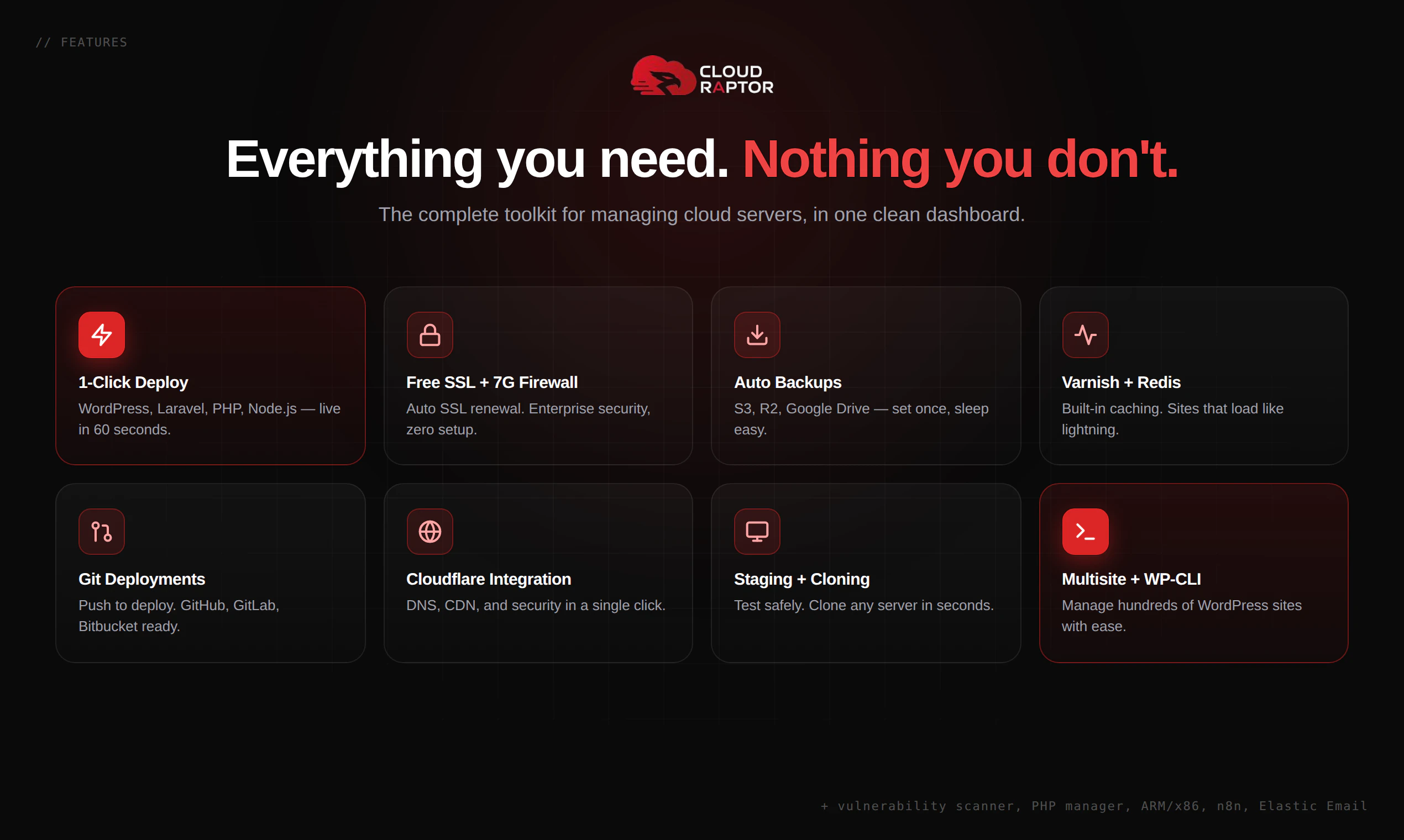
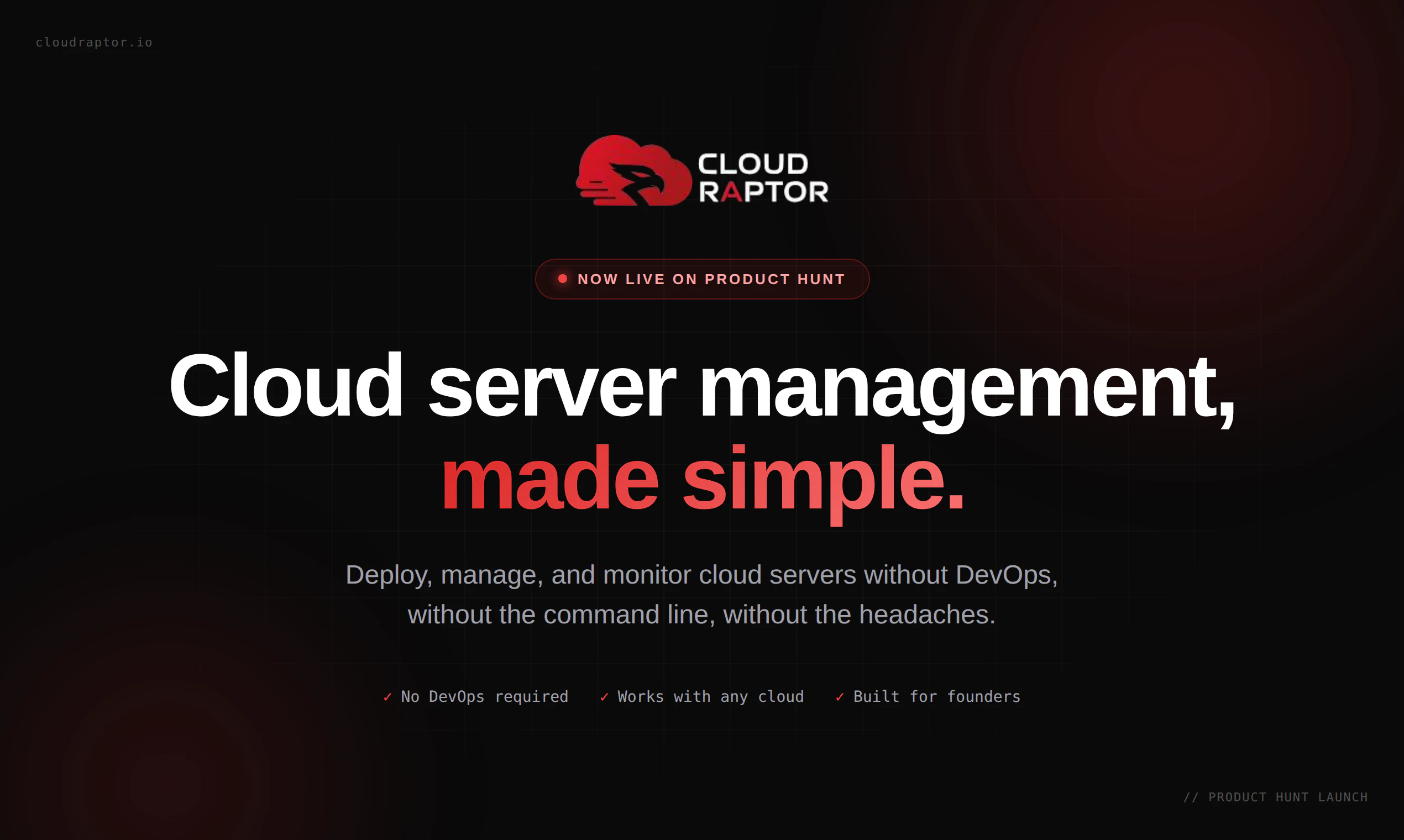
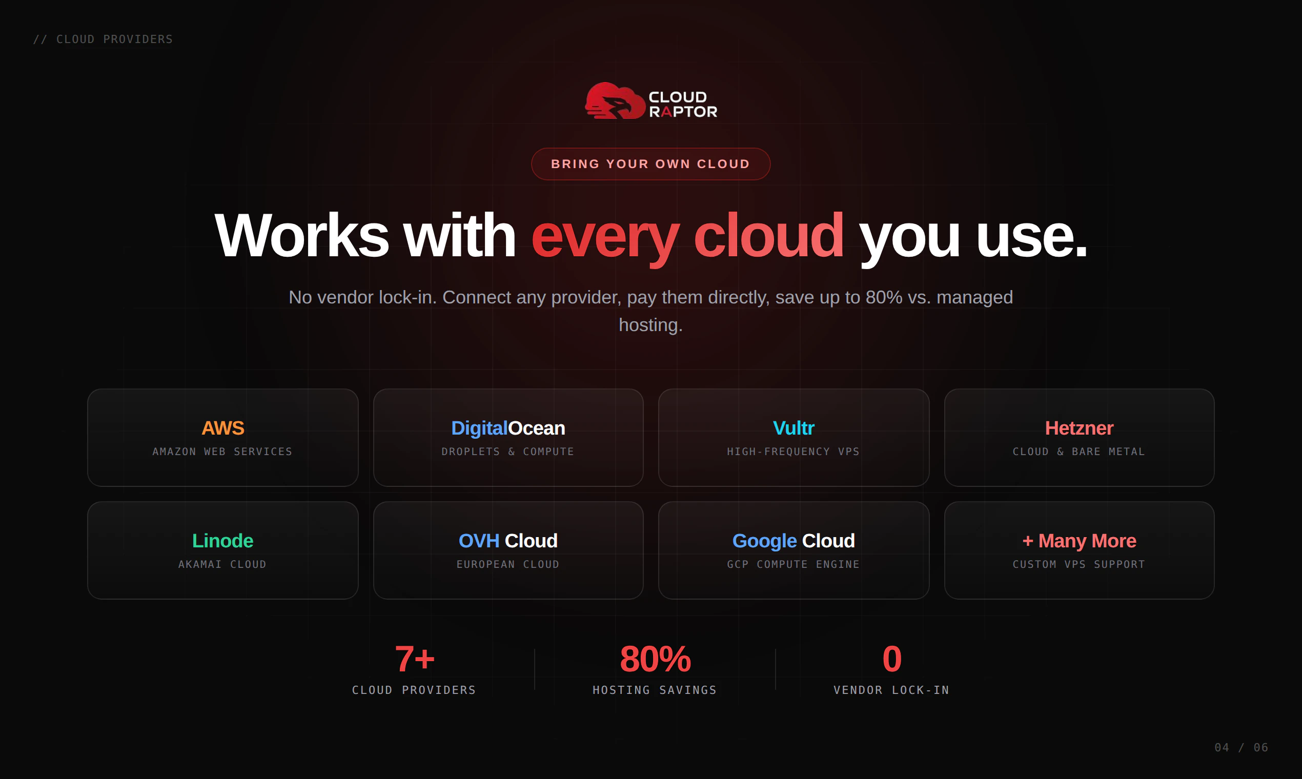
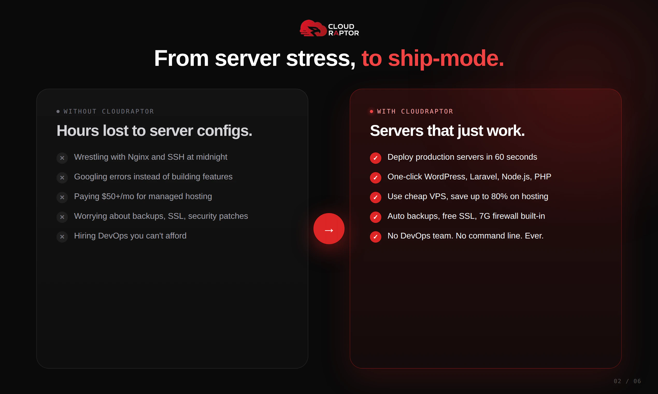
一句话介绍:CloudRaptor 让不懂 DevOps 的创始人与机构,通过可视化面板一键管理多云服务器(如 AWS、DigitalOcean),彻底告别终端配置、安全漏洞与高昂账单的噩梦。
SaaS Developer Tools Development
服务器管理 一键部署 云面板 无代码运维 Docker隔离 WordPress托管 VPS管理 站长工具 独立开发者 多云集成
用户评论摘要:用户普遍赞UI清爽,支持迁移但新手担心操作复杂。关键问题是:部署失败无明确错误提示,影响初体验(4赞差评);制作者回应将排查日志并修bug。另用户呼吁提供视频演示与直播引导。
AI 锐评

CloudRaptor 抓住了“技术债转嫁”这个核心痛点:它不是在造新的服务器,而是为那些被 Linux 命令行、安全漏洞和高昂运维成本折磨的“非技术”创始人,提供了一座真正可落地的逃生舱。

其产品逻辑很清晰——用 Docker 隔离每个站点,解决传统共享面板“一损俱损”的致命伤;用多云统一管理,消除因性能/价格迁移产生的学习成本;用一键部署替代手动配置,把精力从“运维”还原回“业务”。这显然吸取了像 RunCloud、Ploi 等前辈的教训,并将安全性(尤其针对黑客事件)作为差异化卖点。

但仅凭 10 个投票和有限评论,能洞察到两个潜在红线:一是“部署失败无日志”这类技术失误,对主打“无痛”的产品堪称致命打击,说明产品在混沌工程和异常处理上尚不成熟;二是用户“看演示才敢下单”的诉求,暗示当前沟通能力薄弱,缺乏有说服力的转化素材。如果连标准化的部署链路都不能保证第一次成功,那么“简单”只会成为最讽刺的借口。

展望来看,CloudRaptor 撕开的切口极为精准——小型代理、独立站群和原型验证阶段的创业者。但要真正成为“营收利器”,还须补齐针对多账户协作、自动化备份恢复的可视化编排,以及一套让用户敢于“一键迁移”的零风险导流方案。否则,它可能始终停留在“仪表盘美观”但“信任成本高”的尴尬区间。

查看原始信息
CloudRaptor
CloudRaptor makes server management simple. Deploy WordPress, Laravel, PHP, or Node on any cloud (AWS, DigitalOcean, Hetzner, and more) without touching a terminal. Get one-click deployments, automatic backups, free SSL, and built-in security out of the box. It's built for founders and agencies, not DevOps engineers. If you've ever lost hours fighting server configs, CloudRaptor is the dashboard you wish you had years ago.
Hey Product Hunt 👋| I'm Mizanur Rahman, maker of CloudRaptor. Quick backstory. I was running multiple websites on shared hosting, then upgraded to VPS when traffic grew. That's when the real problems started. Linux, terminal, configs. If you don't have a DevOps background, it's a nightmare. I tried open-source panels and got hacked once. Lost dozens of sites overnight. No backup, no idea where the gap was. Then I tried paid services. Good performance, but the bill kept climbing and I never had full control of my own server. That's when it hit me: speed, security, and cost. I shouldn't have to compromise on any of them. I started building CloudRaptor in 2023. Today it's finally here. What it does: Connect your DigitalOcean, AWS, Vultr, Hetzner, or any VPS. Manage everything from one dashboard. No terminal. No DevOps. Host unlimited sites on one server, and every bit of resource is 100% yours. A few things we obsessed over: ⚡ Dashboard that actually feels fast. Click and it responds instantly. 🚀 One-click WordPress. Server ready, site live, done. 🔒 Security with zero shortcuts. I lost my own sites to a hack. Built this so that never happens to anyone else. 📦 Every site runs in its own isolated Docker container. One site breaks, the rest stay safe. 📊 Lightweight monitoring that doesn't slow your server down. This is our first launch and I genuinely want feedback. What works, what doesn't, what's missing. Drop a comment or DM me, even just thoughts on the dashboard help a lot. 🙏
13
回复
Honestly, congrats, man 🎉 I've been following your journey on Twitter for months and seeing this launch. The UI looks SO clean compared to the panels I've used. Quick q before I jump in, I'm running 4 client WordPress sites on a single Hetzner box right now. Can I migrate them in without breaking anything? A little scared to move tbh.
10
回复

@tanjum Thank you, that genuinely means a lot 🙏 And I totally get the fear, moving client sites is nerve-wracking. Good news: you connect your existing Hetzner server and your sites keep running exactly as they are. Nothing gets touched until you choose to. You can bring them under management one at a time, no big-bang migration. Want me to walk you through it personally? Happy to hop on and make sure it's smooth.

0
回复

This looks amazing!! But also kinda overwhelming lol 😅 I'm a complete beginner, never deployed a server in my life, and I just have a blog idea. Is this too advanced for someone like me or can I actually use it?

8
回复

@monir_ Ha, you're exactly who we built this for 😄 You don't need to know anything about servers. You click "deploy," click "install WordPress," point your domain - done. The scary stuff happens behind the scenes so you never see it. If you can run a blog, you can run this. Start with one site, and you'll see how simple it feels.

0
回复

Upvoted! Rooting for indie makers like you 🚀 One thing that would make me pull the trigger today, do you have any kind of demo or video walkthrough? I learn better seeing it in action before I connect my own server.

7
回复

@glenn_ryan3 Appreciate the support 🙌 Totally reasonable, seeing it beats reading about it. We're putting together full walkthrough videos on our YouTube channel and adding more this week. In the meantime, I'd be glad to give you a quick live demo or send a short clip of the exact flow you care about. What would you most want to see, deploying a server, or installing an app?

0
回复

Tried to deploy a server and it failed twice. No clear error message, just spun and died. Not a great first impression for something that's supposed to be "simple." 👎

4
回复

@angelaaa That's genuinely frustrating and I'm sorry, you're right that a failed deploy with no clear error is exactly the experience we're trying to eliminate. I want to fix this for you specifically. Could you share which cloud provider and region you used, and roughly what time it failed? I'll dig into the logs on our side right now. And the unclear error message itself is a real bug, thank you for flagging it, that's getting addressed.

0
回复
#15
DropStories
Paste a link, get a beautiful Instagram Story
9
一句话介绍:DropStories是一个专为Android用户设计的链接转Instagram故事工具,通过粘贴任意链接即可自动生成精美的故事模板,解决了在社交媒体分享链接时预览图制作耗时且效果不佳的痛点。
Android Social Media Marketing
Android工具 Instagram故事 链接转图片 内容分享 模板生成 社交媒体美化 创作者工具 Material 3设计 订阅制 自动化预览
用户评论摘要:用户Hari(开发者)在评论中主要介绍了产品动机、功能和使用场景,未收到其他用户的具体反馈或问题。期待用户试用后提供模板适配性和链接处理能力的改进建议。
AI 锐评

DropStories精准切入了一个小而实际的痛点——在Instagram上分享链接的“内容包装”环节。其核心价值不在于技术创新,而在于将“截图-裁切-排版”这一繁琐流程压缩为“粘贴-选模板-分享”的三步操作,尤其对Android生态中缺乏同类工具的场景具有稀缺性。0.99美元的低价订阅制符合“工具型产品”的轻量变现逻辑,但这也暴露出其天花板:功能单一、高度依赖Instagram生态,且模板质量和样式更新速度将直接决定用户留存。值得肯定的是,产品坚持Native Material 3设计,避免了Android应用常见的“iOS移植”的割裂感,这在小众工具中尤为可贵。然而,缺乏用户评论的反馈闭环是致命短板——开发者强调“阅读每条评论”,但产品上线后无真实用户互动,可能意味着初期曝光不足或目标用户覆盖不精准。真正的挑战在于:如何证明“10秒生成故事”的价值足以让用户每月付费?除非后续能拓展到支持多平台(如WhatsApp Status、Telegram Stories)或附加图片编辑能力,否则难以突破工具类产品的“用完即走”宿命。对独立开发者而言,这是一个教科书级的“痛点解决方案”,但商业视角下,它更像是Instagram原生功能的“补丁”,而非可持续的独立生意。

查看原始信息
DropStories
Sharing a link to Instagram Stories shouldn't take 10 minutes in Canva. But it does, because Instagram's link sticker is ugly and screenshots of article headers or YouTube thumbnails look lazy. DropStories fixes that. Paste any URL, whether it's a YouTube video, Substack post, podcast, blog article, or product page, pick a template, and tap share. The preview gets pulled in automatically. Done in 10 seconds. Built for creators, writers, and anyone who shares links regularly on Android.
Hey Product Hunt 👋 I'm Hari, an Android dev based in the Netherlands. I built DropStories because I kept wanting to share links to my Instagram Story and never had a good way to make a preview. So I screenshotted. Sometimes the article header, sometimes the YouTube thumbnail, sometimes a chunk of a webpage. It always looked lazy. Some apps eventually started generating previews for specific things, but there's still no universal way to take any link and turn it into something that looks nice on a Story. I looked around and found a few options on iOS, but nothing that felt right on Android. So I built one. DropStories is simple. You paste any link, whether it's a YouTube video, a Substack post, a podcast, a blog article, or a product page. It pulls the thumbnail, title, and source automatically. You pick a template and tap share. It opens in Instagram with the image attached and ready to post. About 10 seconds end to end. The whole app is built with the latest Material 3 Expressive design, so it actually feels like it belongs on Android instead of looking like an iOS port. Different people use it differently. YouTubers promote their latest video. Newsletter writers share their new issue. Podcasters share episodes. Bookstagrammers share what they're reading. Whatever the link, the workflow is the same. A quick note on the model. Free tier gives you 2 templates and unlimited links. Pro unlocks all templates. It's €0.99 a month or €4.99 a year (₹79 a month or ₹499 a year in India). Cheap on purpose, because I'd rather more people use it than squeeze a few. Brand presets and a few other things are on the roadmap. I'd love to know which templates feel right and which feel off, and what kind of links the app doesn't handle well yet. I read every comment and ship fast. Not asking for upvotes. Just try it on a link you actually want to share, and tell me what's broken. Thanks for hunting 🙏
1
回复
#16
Folio
The modern, clickable alternative to boring PDF resumes.
9
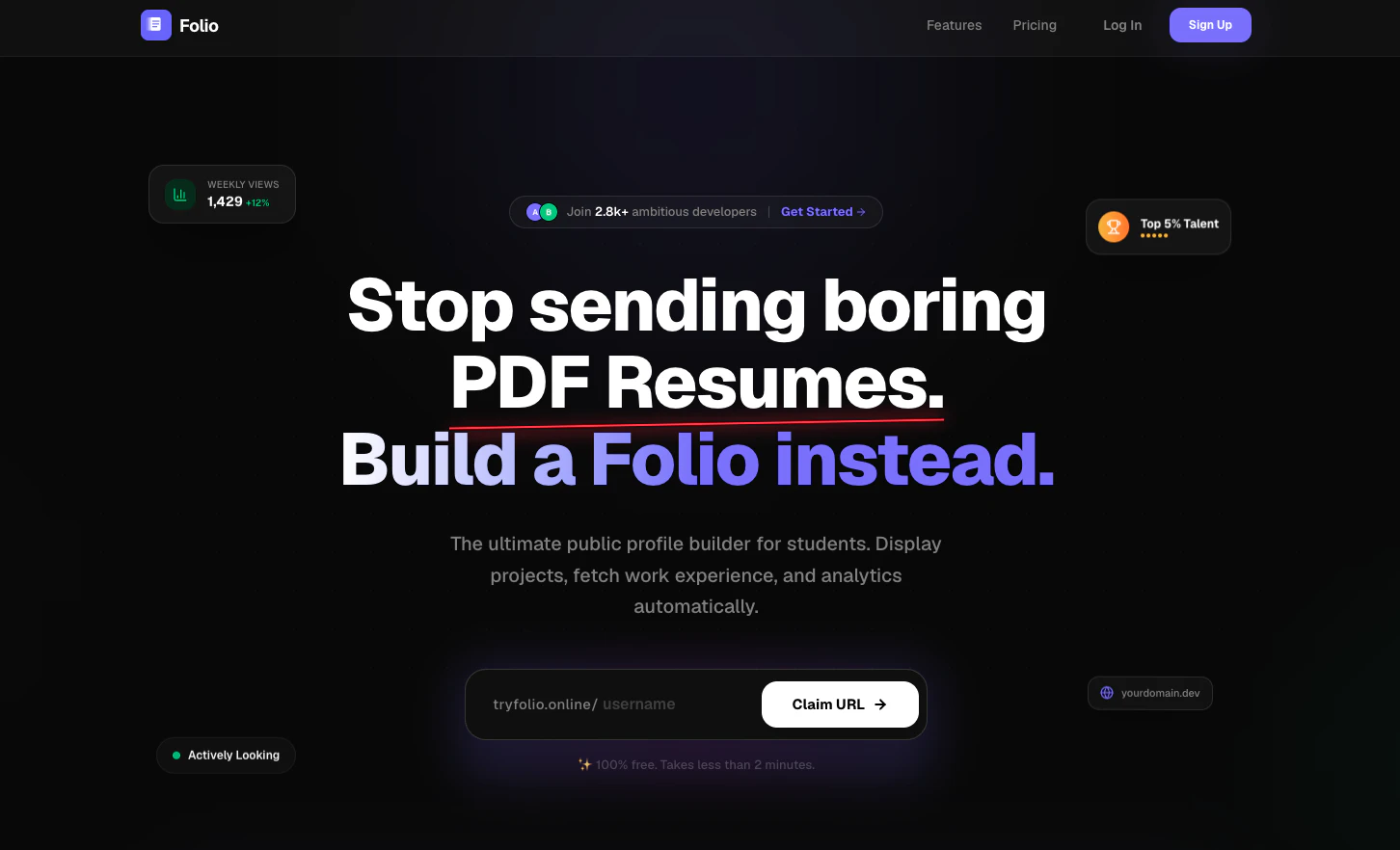
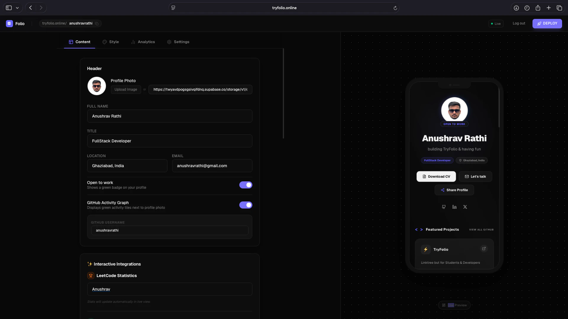
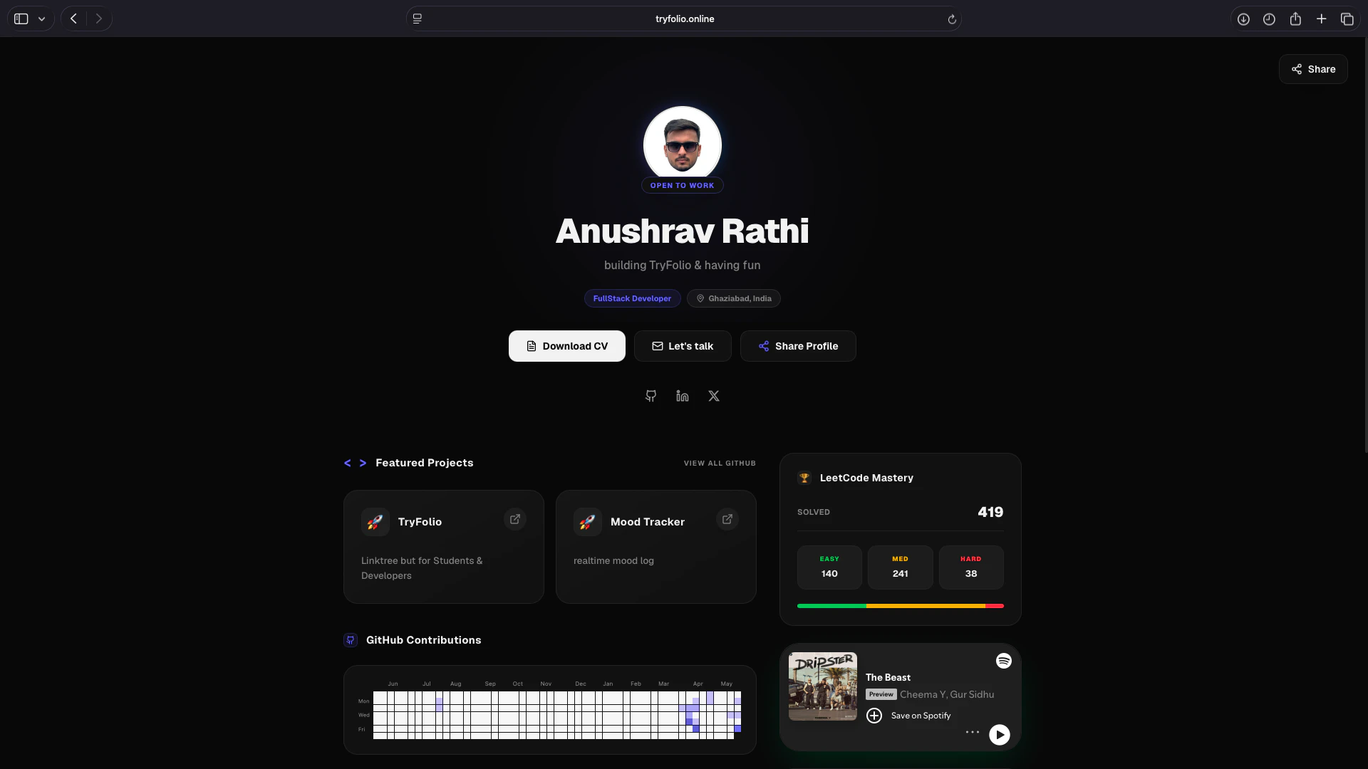
一句话介绍:Folio 是一款专为学生和开发者设计的“可点击式”在线个人档案工具,替代传统静态PDF简历,让求职者能直观展示项目、代码和个人风格,从而吸引招聘方主动点击浏览。
Website Builder Developer Tools Career
用户评论摘要:用户对“拒绝无聊PDF”的定位表示认可,并询问用户首先添加的内容是项目、故事还是链接;另一用户称赞设计精良,并发问是否开发者无需自行搭建即可拥有在线作品集,暗示对轻量化免搭建流程有需求。
AI 锐评

Folio 切入的并非又一个“链接页”的红海,而是精准击中“简历审美疲劳”下的求职痛感。它的价值不在于技术壁垒——一个免搭建的作品集页面的技术门槛极低,而在于它对“学生和开发者”这群特定用户的心理洞察:他们既需要展示硬核技能(代码项目),又渴望凸显个性审美,传统的PDF简历在这两件事上都是灾难。相比 IndiePage 面向创业者,Folio 更符合早期职业者的语境——他们更需要一个“被点击”的入口,而非“被收藏”的联系页。但风险同样明显:9票的冷启动数据说明当前产品还未形成口碑引爆点。用户提问“首先添加什么”恰恰暴露了产品引导设计可能存在空白——如果新用户进来不知该填项目链接还是写一段个人故事,留存就会打折。此外,功能层面没有看到与GitHub、LeetCode等开发者主流平台的数据打通,若仅做一个“好看的个人展示页”,则容易被Notion、GitHub Pages甚至领英的“特色项目”功能所替代。真正能形成壁垒的,或许是后续提供的“简历点击数据分析”或“招聘方互动追踪”,让候选人看到效果的溢出,而非只是换个更美形的PDF。

查看原始信息
Folio
Create a beautiful public profile page recruiters actually click. Folio is the ultimate link-in-bio tool built exclusively for students and developers. Stop sending boring, static PDF resumes that hide your true potential. Showcase your coding projects, highlight your personal aesthetic, and bridge the gap between a simple document and a personal website. Build a Folio instead!
Hey Product Hunt! 👋 I'm Anushrav, the maker of Folio. There are hundreds of link-in-bio tools out there for almost every niche imaginable, but I noticed a huge gap: there was nothing really built specifically for students and developers. Inspired by how IndiePage created a dedicated space for indie hackers, I realized we needed something tailored for us. When reaching out for opportunities, collaborations, or sharing my background, sending a standard, static PDF resume always felt incredibly outdated. It just doesn't capture your coding projects, your personal aesthetic, or your actual vibe. I wanted something that bridged the gap between a boring document and a time-consuming personal website. So, I built Folio. It’s the modern, clickable alternative designed to help you easily spin up a beautiful, public-facing profile that highlights your work in a way that makes recruiters and partners want to click. I'd love for you all to give it a spin. What do you think of the design? What features or integrations would make this a no-brainer replacement for your current resume? Excited to hear your feedback!
5
回复

@anushravrathi “Stop sending boring PDF resumes” is a clear hook. What are you seeing users add first coding projects, personal story, achievements, or links like LinkedIn?

2
回复

@anushravrathi Hello Anushrav, I checked out the website because the logo caught my eye xd. The design is absolutely top-notch, and the message in the hero section is super clear. If I understand correctly, developers can create a live online portfolio without having to build and host one from scratch? Congrats on the launch!

0
回复
#17
SocraDraft
The Socratic Partner for Flow-State Writing
9
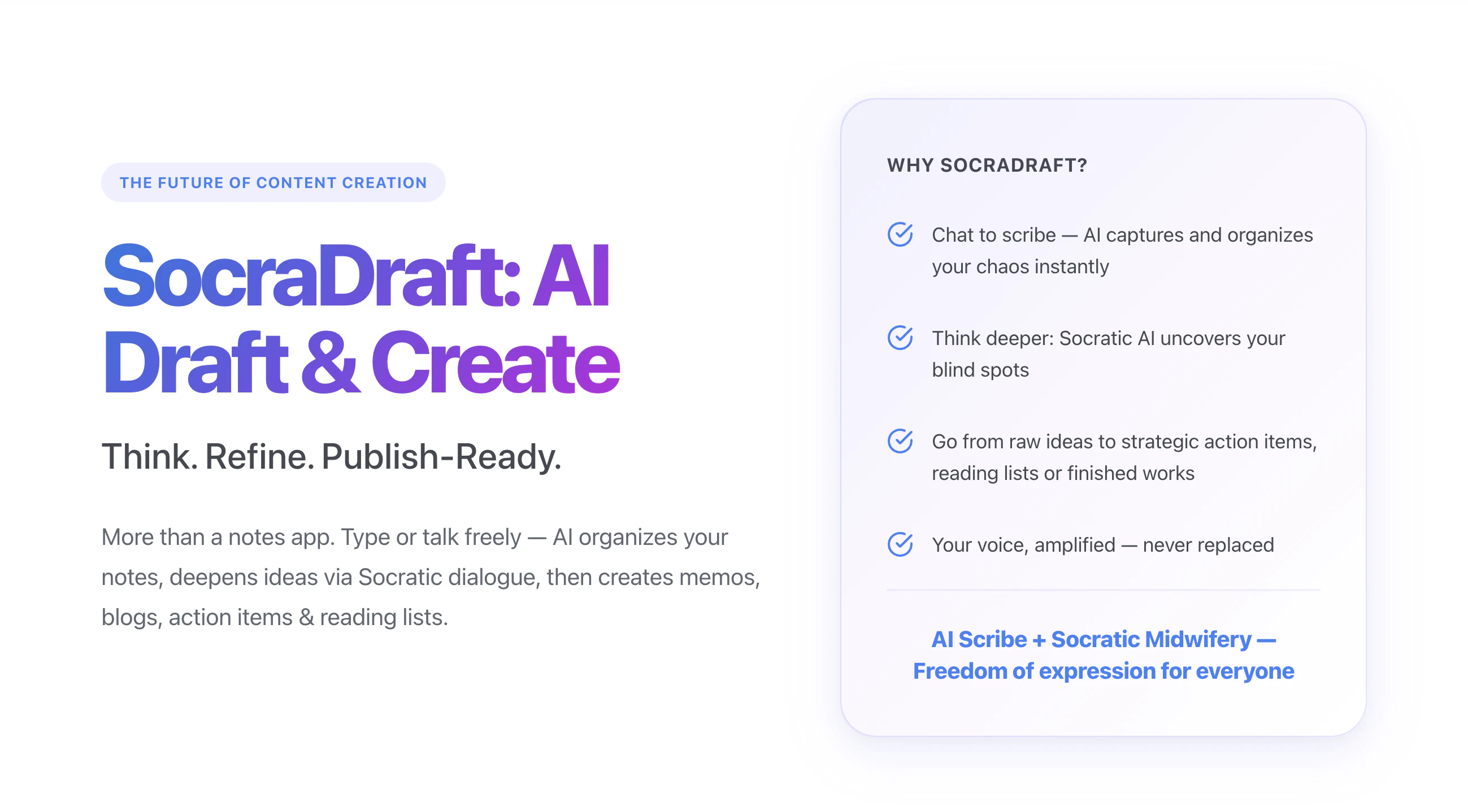
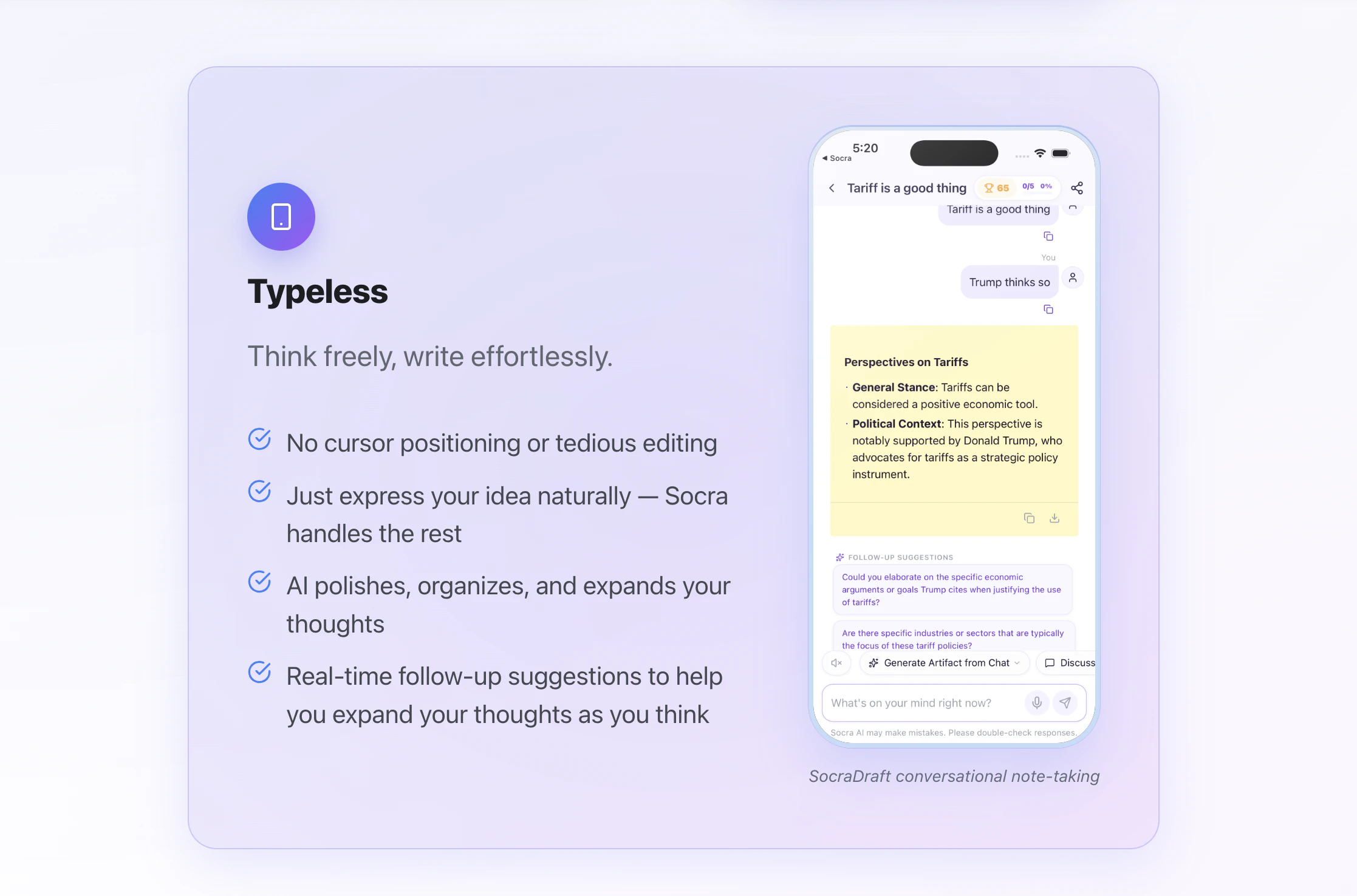
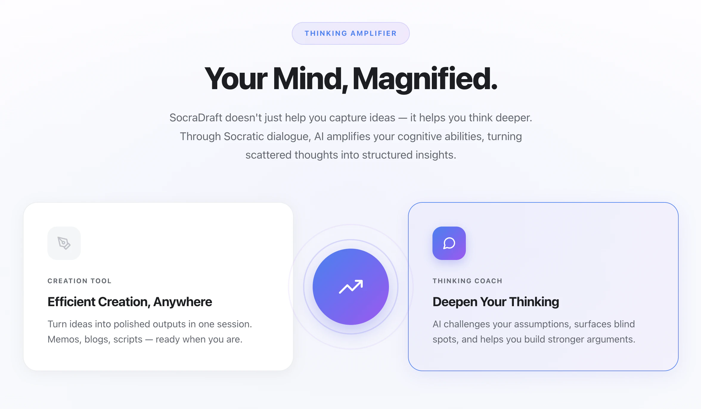
一句话介绍:SocraDraft是一款融合苏格拉底式对话的AI写作伴侣,帮助用户在碎片化思考到成文过程中消除表达摩擦,将散乱想法转化为结构化的备忘录、博客或行动清单。
Android Productivity Writing Notes
AI写作助手 笔记工具 苏格拉底式对话 头脑整理 思考加速器 主动创作 流式写作 内容生成 知识管理 AI原生应用
用户评论摘要:创始人Wood指出,传统笔记应用是静态存储,想法易成“数字垃圾”;SocraDraft从“被动记录”演进为“主动推理+执行”,增设“苏格拉底导师”阶段来挖掘逻辑盲点,再一键转成成品。用户未提出负面反馈,但产品投票数仅9,可能反映早期曝光度或留存待验证。
AI 锐评

SocraDraft的立意很聪明——它没有试图做一个“更好的Notion”,而是直接回击了一个典型痛点:写作过程中“思想快于手指”或“有灵感但不会组织”的哑火时刻。它用苏格拉底式提问替代了传统的排版、语法修正,把AI的角色从“助理”升级为“捣乱者”:不是帮你写,而是逼你思考。这种“主动认知摩擦”的产品逻辑,在AI写作工具同质化严重的当下,确实提供了一种差异化路径。

但问题也很明显:投票数只有9,说明它还未真正打动其目标人群。苏格拉底式对话虽然理论上能激发深度思考,但在实际写作流中可能是个“干扰源”——用户更常需要的是快速输出,而不是被反推。产品在“低摩擦捕捉”和“高摩擦启发”之间摇摆,容易导致两头不讨好。

此外,创始人在介绍中把“打字、排版等机械动作”定性为“摩擦”,但这恰恰是写作流畅性的基础——好的思想组织往往伴随打字节奏。完全取消这种“机械感”,可能会让写作失去“手感”和“自我修正”的空间。SocraDraft的真正价值,或许不在取代传统编辑器,而在于成为“思考热身”工具:在正式动笔前,用它进行头脑风暴和逻辑勘误。如果能定位为“写作前的思考引擎”,而不是“写作中的替代品”,性价比会更高。

查看原始信息
SocraDraft
SocraDraft is more than a notes app. Type or talk freely — AI organizes your notes, deepens ideas via Socratic dialogue, then creates memos, blogs, action items & reading lists. SocraDraft helps you write in flow by combining frictionless input (dump unedited thoughts) with Socratic coaching (deep questions that sharpen your thinking), so you can express ideas you'd normally skip and produce clearer output.
Hey, Product Hunt! 👋 I am Wood, founder & developer of Socra AI & FunBlocks AI. SocraDraft is an AI-native writing agent app and active thinking partner that uses Socratic dialogue to transform your scattered thoughts into refined, publish-ready content like memos, blogs, and action items. ✅ What inspired you to build this? We realized that most traditional note-taking apps act as static storage bins. You capture a brilliant idea, but it often ends up as digital clutter because it lacks a partner to help refine it. Inspired by the Socratic method—the foundation of our main Socra learning platform—we wanted to build an active "thinking partner." We envisioned an AI scribe that listens, challenges your assumptions, and actively helps develop your ideas from the inside out, rather than just passively recording them. ✅ What problem were you trying to solve? The friction of traditional writing and the isolation of the drafting process. When you write alone, you have to organize your own language, worry about imperfect expression, and often miss logical gaps or blind spots. The tedious mechanics of writing—cursor positioning, formatting, and manual editing—cause many great, half-formed ideas to be lost in hesitation. We set out to eliminate this friction by creating a "typeless" experience where you can express your thoughts naturally, knowing AI will handle the structure, logic, and clarity. ✅ How did your approach or process evolve while working on this launch? Initially, we focused heavily on frictionless capture—simply building a better AI scribe to organize messy inputs. However, as we developed SocraDraft, we realized that merely capturing ideas wasn't enough to push them to the finish line. Our approach evolved to prioritize *development* and *execution*. We integrated a "Socratic Tutor" phase to actively probe reasoning and surface blind spots, followed by a "Consultant" phase to convert those refined thoughts into publish-ready artifacts (like memos, blog drafts, reading lists, and podcast scripts) in one click. It shifted from being a smart capture tool to an end-to-end "thinking accelerator."
0
回复
#18
SlateHut.com - AI website builder
Easiest way to make websites!
9
一句话介绍:用户只需一句话描述业务,即可在约60秒内生成一个包含托管、表单、CMS和自定义域名的完整、可直接编辑的网站,解决了非技术人员快速建站和复杂操作流程的痛点。
Design Tools Marketing Website Builder
AI建站 自动化建站 无代码建站 拖拽编辑 网站生成器 快速建站 表单系统 CMS 托管服务 极速部署
用户评论摘要:用户反馈产品非常易用,能快速开发博客、商业网站,变更可立即部署;内置组件、表单和CMS系统实用;有用户展示了一分钟生成的网站案例。暂无问题或建议。
AI 锐评

在产品满大街的建站赛道,SlateHut这个60秒出活、一键托管、拖拽编辑的定位,听起来确实足够“爽”。但9个投票和寥寥几条好评,暴露了它目前的尴尬处境——技术demo很酷,但离真实的市场认可还很远。核心问题在于,它想解决的用户痛点——“不懂技术、没时间、怕麻烦”——已经被Wix、Squarespace甚至WordPress+Elementor解决得很好了。SlateHut所谓的“一句话AI生成”,本质上只是把模板选择步骤智能压缩了一下,底层依然是模板堆砌加拖拽编辑。用户完成初始网站后,真正的挑战在于:如何不花钱持续获得高质量AI辅助?如何保证生成的网站不会千篇一律或出现逻辑硬伤?其免费政策很诱人,但后续的变现门槛(如自定义域名是否收费、CMS存储限制)才是决定留存率的关键。一句话总结:这是一个看起来很美的小工具,足够易用,但要想在巨头林立的市场中活下来,它需要的不只是“快”,而是明确区别于同行、且不可被简单复制的“AI能力”,比如针对SEO的智能优化、基于行业数据的个性化配色与文案生成。否则,它终将只是又一个被收藏夹吃灰的尝鲜品。

查看原始信息
SlateHut.com - AI website builder
Describe your business in one sentence → get a real, live website in ~60 seconds. Not a chat thread. Not a draft you babysit. An actual site — hosting, forms, CMS, custom domain — that you edit by point-and-click. That's SlateHut. Free to start, no card.

Tried your product, it's very easy to develop any blog/business site using it, and it's very fast with changes deployed to production.

1
回复
With SlateHut, you can build your website in few mins & connect your domain. Slatehut comes with a ton of inbuilt components, in built contact form and a cms system for blogs or directories.
0
回复

@SlateHut.com - AI website builder made the following website in 1 shot. Check more demo here https://slatehut.com/showcase

0
回复
#19
Poker Planner
Plan poker trips without spreadsheets
8
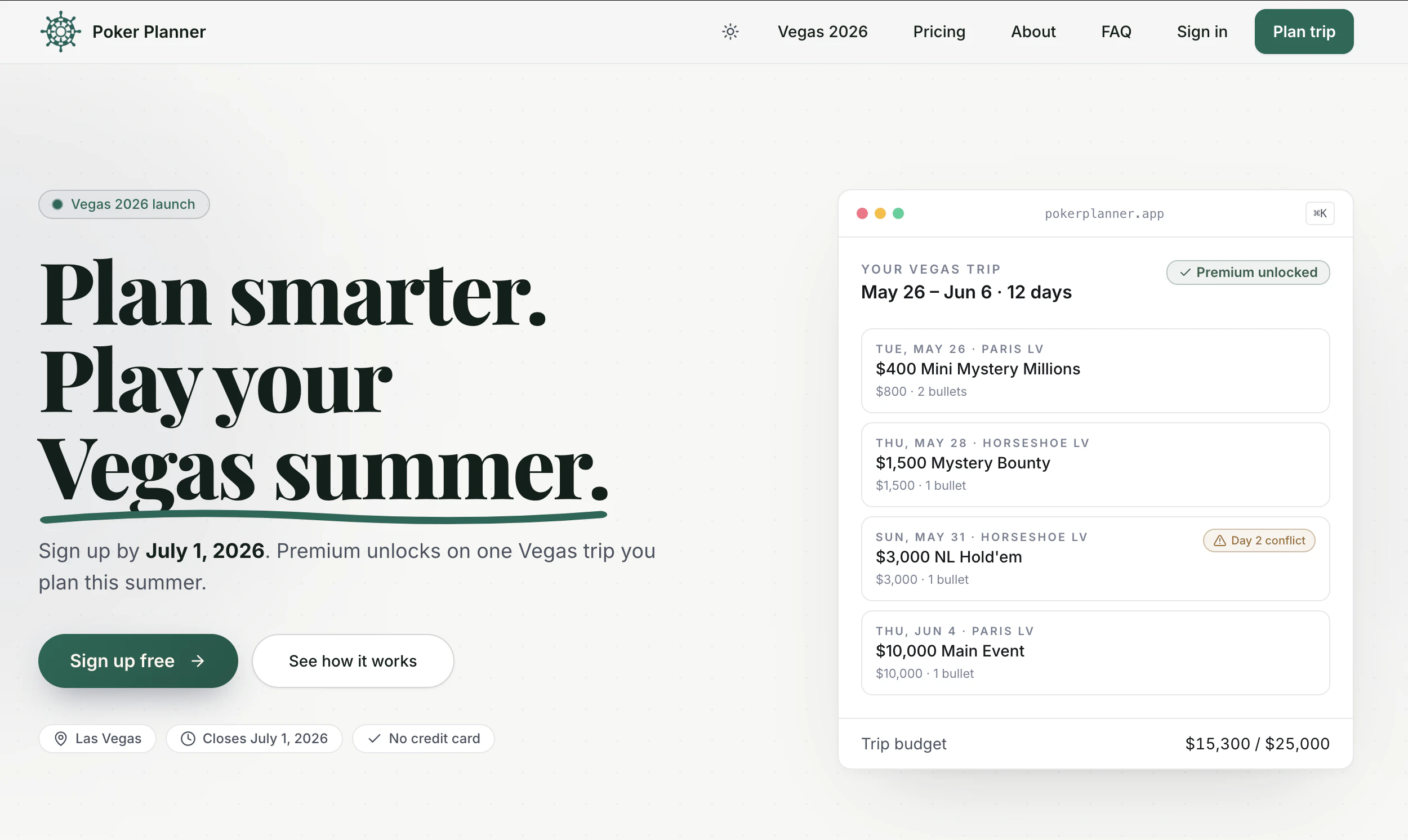
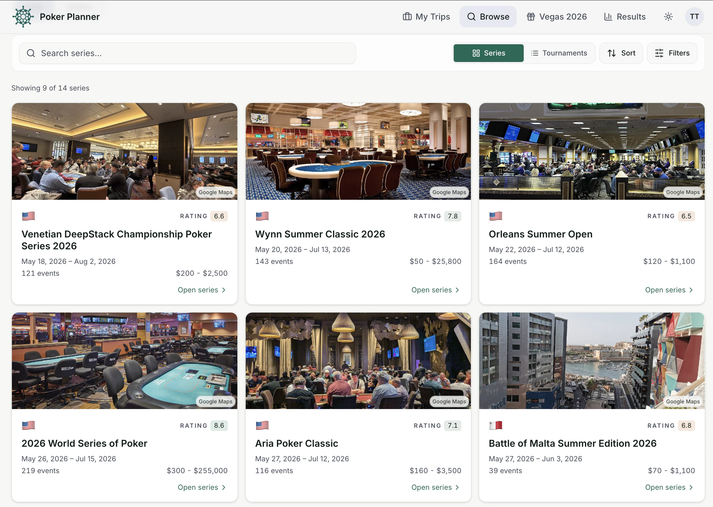
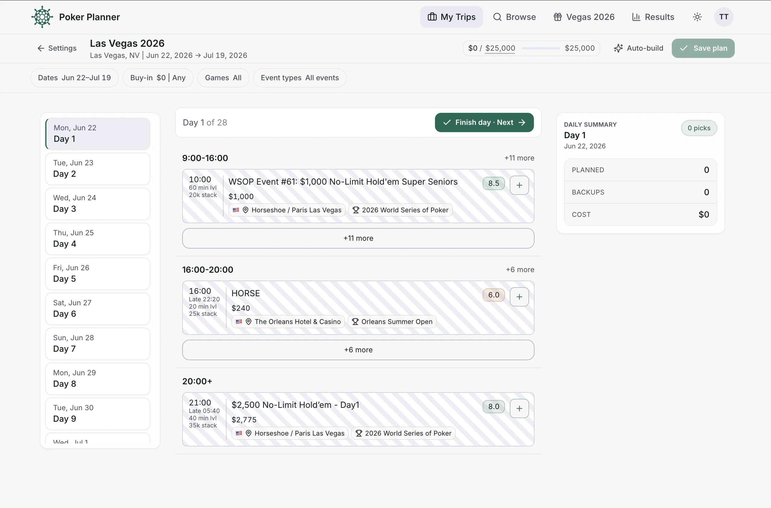
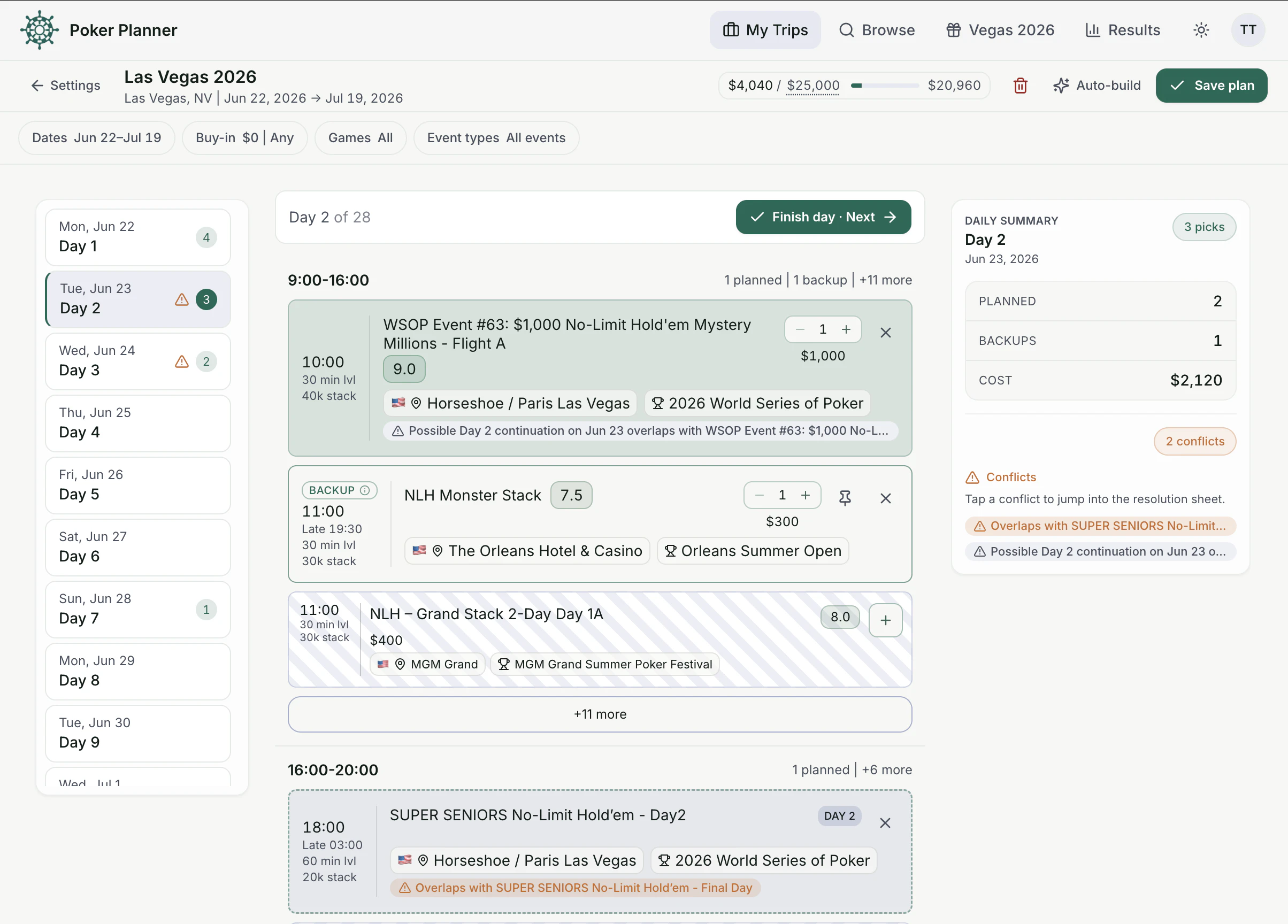
一句话介绍:Poker Planner专为现场扑克玩家打造,通过自动化管理锦标赛日程、买进、资金和冲突,解决使用电子表格规划扑克旅行时繁琐、易出错的痛点。
Productivity Travel Games
扑克规划 锦标赛日程 资金管理 冲突检测 旅行工具 现场扑克 赛事日历 日程导出 扑克玩家 生产力工具
用户评论摘要:用户建议增加日程导出到谷歌日历并支持提醒的功能。开发者回应支持导出.ics文件,兼容谷歌、苹果和Outlook日历,每场锦标赛可独立设置提醒。开发者自述产品源于自身痛点,期待反馈。
AI 锐评

Poker Planner的定位精准且务实,它切入了一个被主流生产力工具忽视的细分场景:现场扑克玩家的旅行规划。核心价值不在于创造全新需求,而在于将“多网页、多标签、一张电子表格”的混乱流程,整合为一个专用、自动化的工具。从用户评论看,导出到日历并带提醒是实现“规划到执行”闭环的关键功能,开发者已迅速回应并支持,显示了良好的用户驱动意识。

然而,产品的真正挑战在于“护城河”极低。扑克赛事数据本身是公开的,竞品可以轻易复制核心功能。目前8票的社区反馈也说明早期用户基数有限。更严峻的问题是:这类工具的用户粘性取决于大赛季(如WSOP)的周期性,非赛季期间活跃度难以维持。此外,与Gmail、Excel等通用工具的深度整合(如自动从赛事邮件抓取信息、与银行流水对账),以及社交功能(如与牌友共享计划)才是提升壁垒的方向。

总体而言,Poker Planner是一个优秀的痛点解决方案,但目前尚未形成压倒性优势。若不能快速积累赛事数据源、建立社区口碑或探索付费订阅(如针对高额买入玩家的高级分析),很容易被大型赛事网站内部集成或更强大的竞品取代。它目前更像个“好用的小工具”,离“必用的行业标准”还有距离。

查看原始信息
Poker Planner
Poker Planner helps live poker players build tournament schedules around dates, buy-ins, bankroll, game types, and conflicts. Browse major poker series, compare events, track your budget, avoid overlaps, and keep your trip organized. For launch, Vegas 2026 planning is free for new signups before July 1.

We’re two friends who play live poker and work in tech.

Every big series, we had the same problem. Too many schedules, too many tabs, and eventually a spreadsheet full of buy-ins, bullets, Day 2s, backups, and conflicts.

So we built Poker Planner for ourselves.

It helps you plan a poker trip around your dates, bankroll, game preferences, and schedule conflicts.

For launch, new signups get one Vegas 2026 trip unlocked for free before July 1.

Would love feedback from anyone who has ever planned a live poker trip the hard way

16
回复

@pokerplanner good luck guys!

0
回复

Can you export the final schedule to Google Calendar with reminders?

2
回复

@othman_katim Hi,

Yes, we are supporting an export to google calendar

1
回复
@othman_katim Yes! You can exports as an .ics file that works with Google, Apple, and Outlook calendars. Per-tournament reminders are supported too.
1
回复
#20
Drink Your Water
Grab the water. Face the camera. Take the sip. It's time.
8
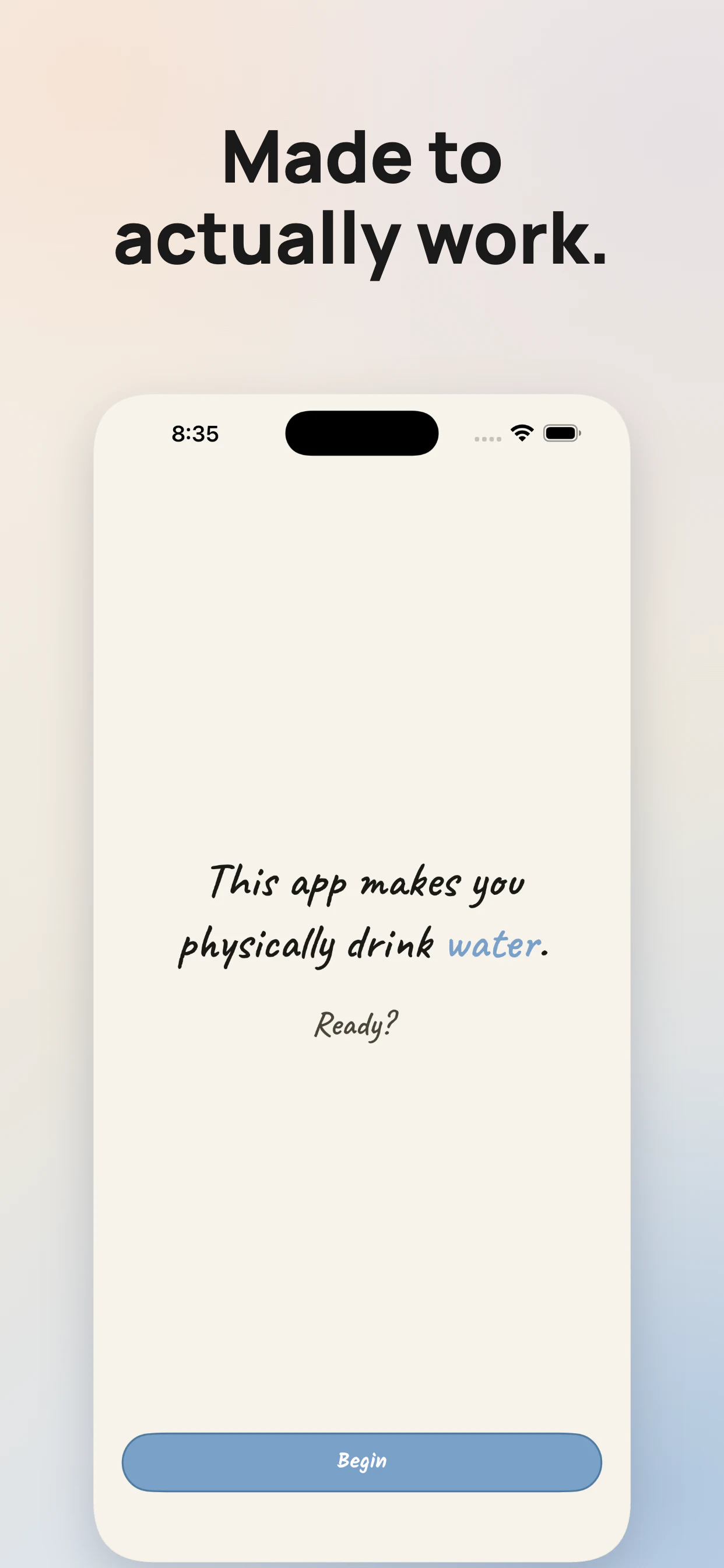
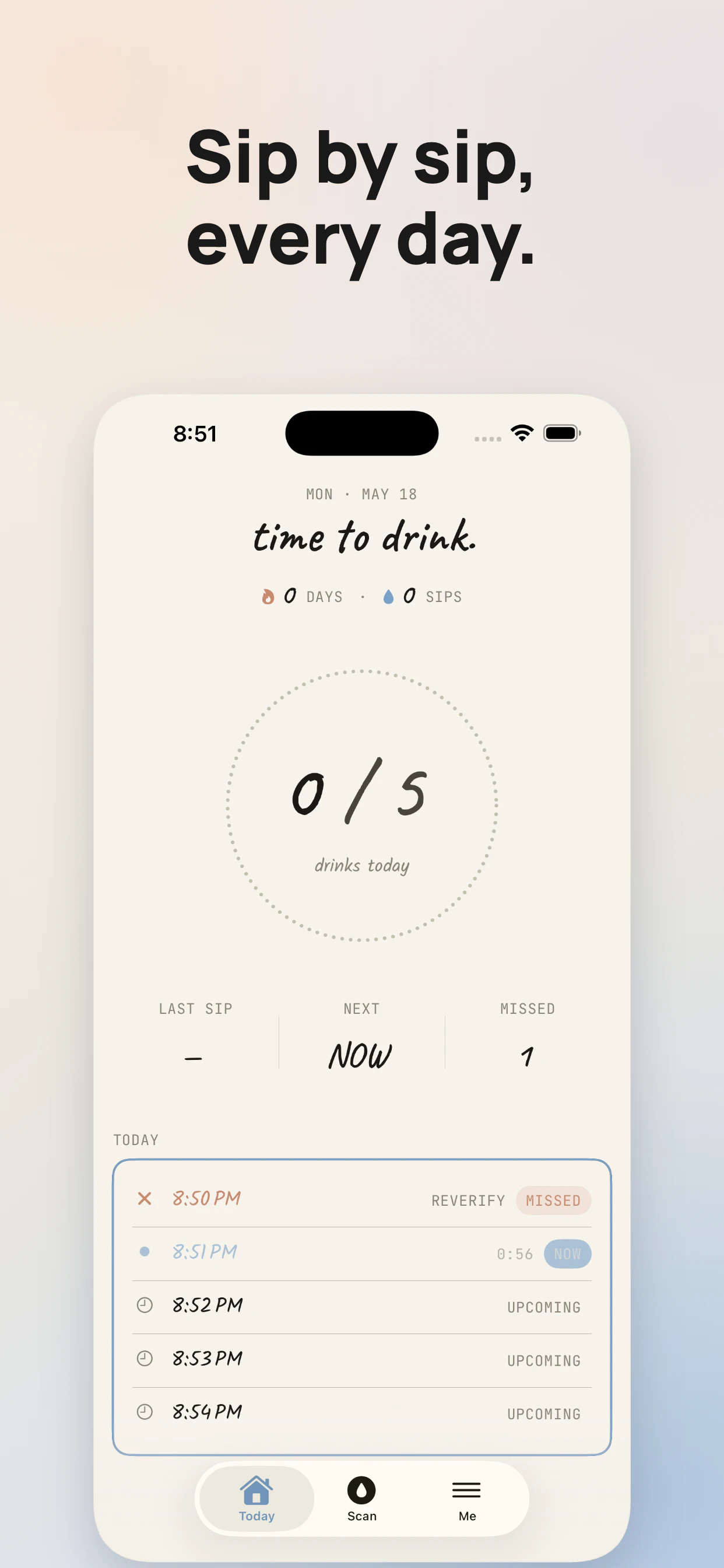
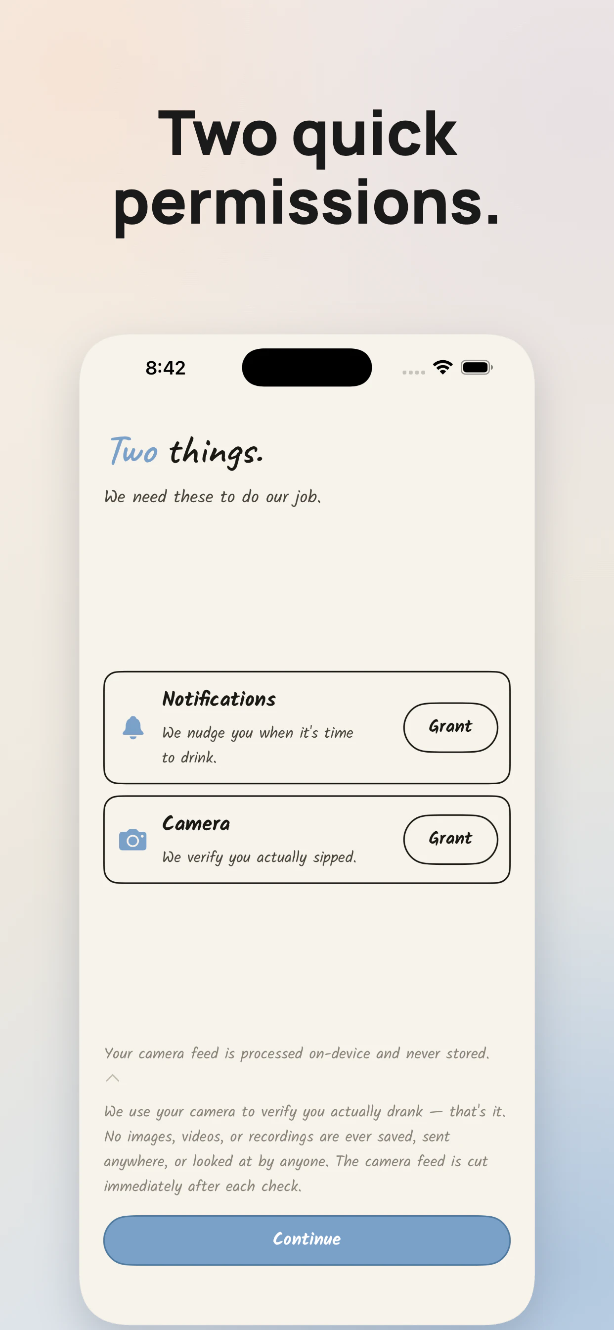
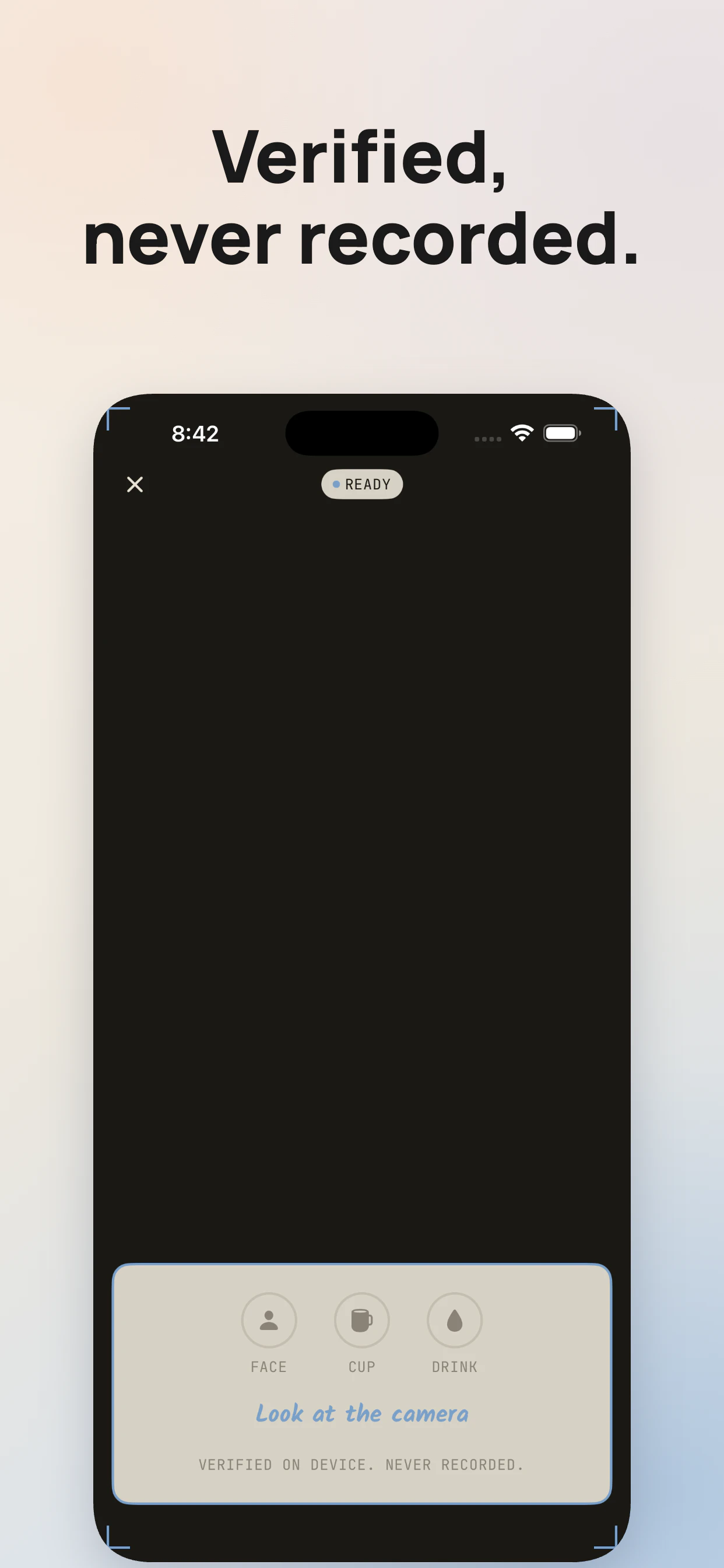
一句话介绍:Drink Your Water 是一款利用前置摄像头实时验证饮水动作的“硬核”习惯应用,专为那些对传统提醒麻木、屡次“辜负”喝水目标的人设计,用不可跳过的实际执行闭环彻底解决“知道该喝但就是不去喝”的伪习惯问题。
iOS Health & Fitness Productivity
喝水提醒 摄像头验证 行为习惯 健康工具 隐私优先 实时检测 习惯养成 防作弊 轻度介入 专注执行
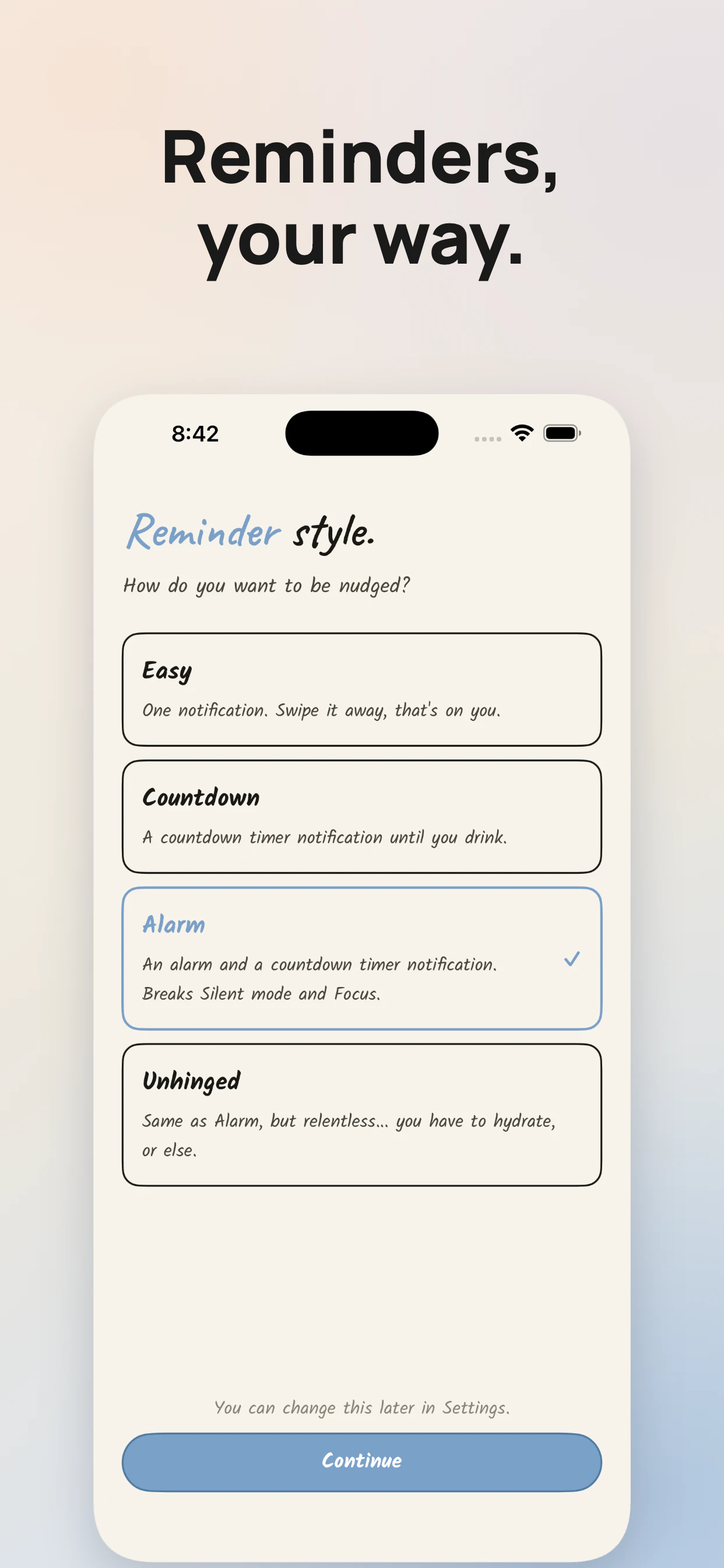
用户评论摘要:用户普遍认同“无法作弊”的设计能打破习惯拖延循环;核心疑问集中在隐私处理上,开发者回应称所有检测在本地实时完成,不存储任何录像。部分用户凭实测推荐“Unhinged”模式,认为它真正改变了行为惯性。
AI 锐评

传统喝水应用陷入了一个可悲的内卷:炫酷动画、精致累、软性推送——最终不过是用户手机里花哨的“忽视按钮”。Drink Your Water 的可贵之处在于,它残忍地拆穿了我们对自律的幻象:你不缺提醒,你缺的是不得不做。

用摄像头作为验证手段,不是为了“猎奇”,而是重构了行为闭环中的两个关键节点:消除“敷衍式响应”(不想喝时关闭通知)和防止“记忆式造假”(事后补录)。把“我要喝水”从认知任务降维成机械摄像头扫描——这正是行为设计学里代价最小的强制功能。

4种强度模式(尤其“Unhinged”模式)说明产品开发者清楚不同用户存在自控力梯度,给予了阶梯式介入空间。而“无存储、实时本地检测”的隐私声明则聪明地化解了摄像头类工具最大的信任障碍。

但风险同样存在:摄像头验证构筑了略微的“行动摩擦”,用户可能在压力下逐渐疲劳,出现“开摄像头但小口抿”式的半造假;而长期依赖逆反心理驱动,一旦习惯固化后,这种“强制机制”可能变得冗余甚至令人抵触。产品应提前规划从“强他律”向“弱他律”的平滑过渡路径。

一句话总结:它不是让你觉得“喝水真好”的温柔APP,而是让你在摄像头前没法说“不”的诚实监督员。对于每一个自嘲“喝水健忘症患者”的人而言,这可能是你离真正“喝上水”最近的一次。
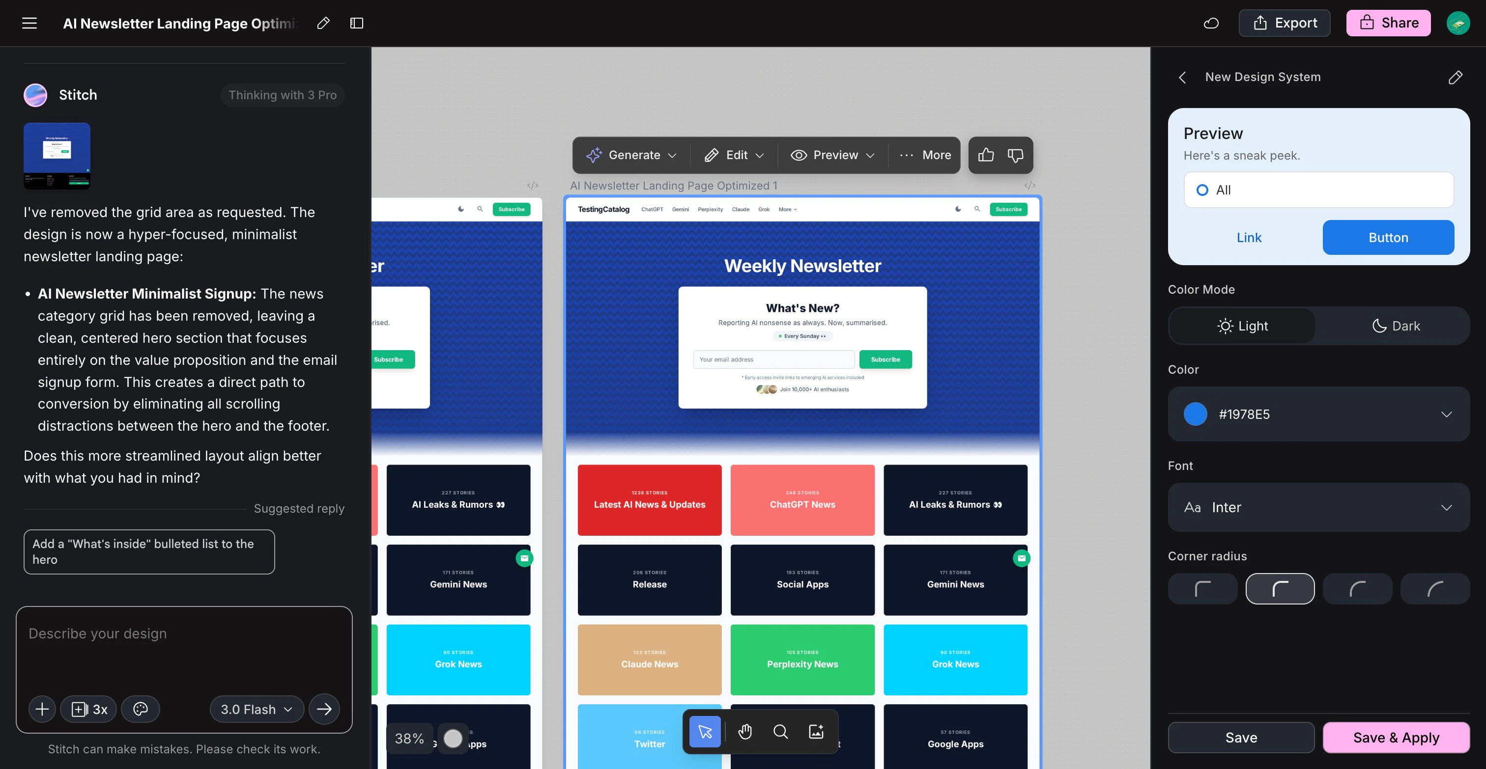
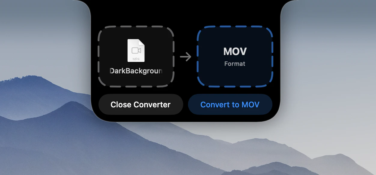
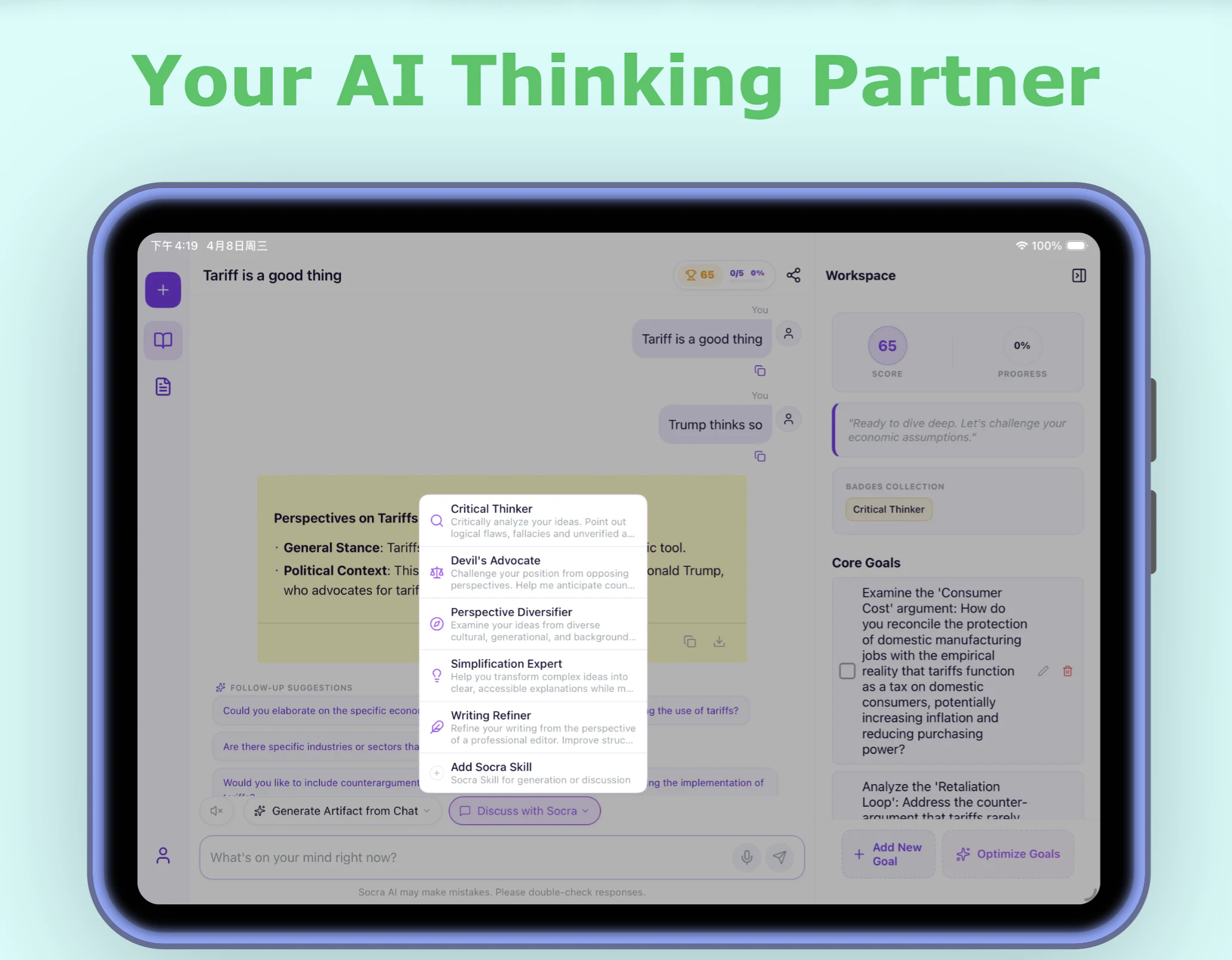
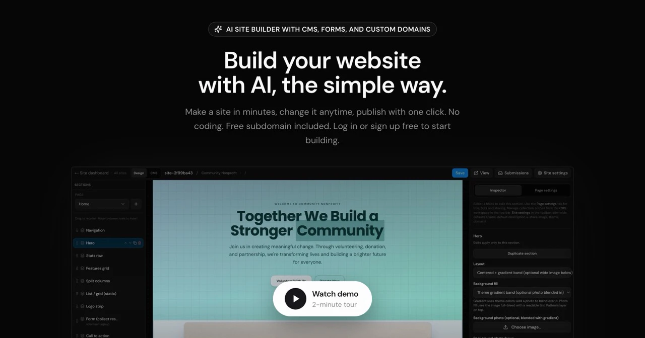
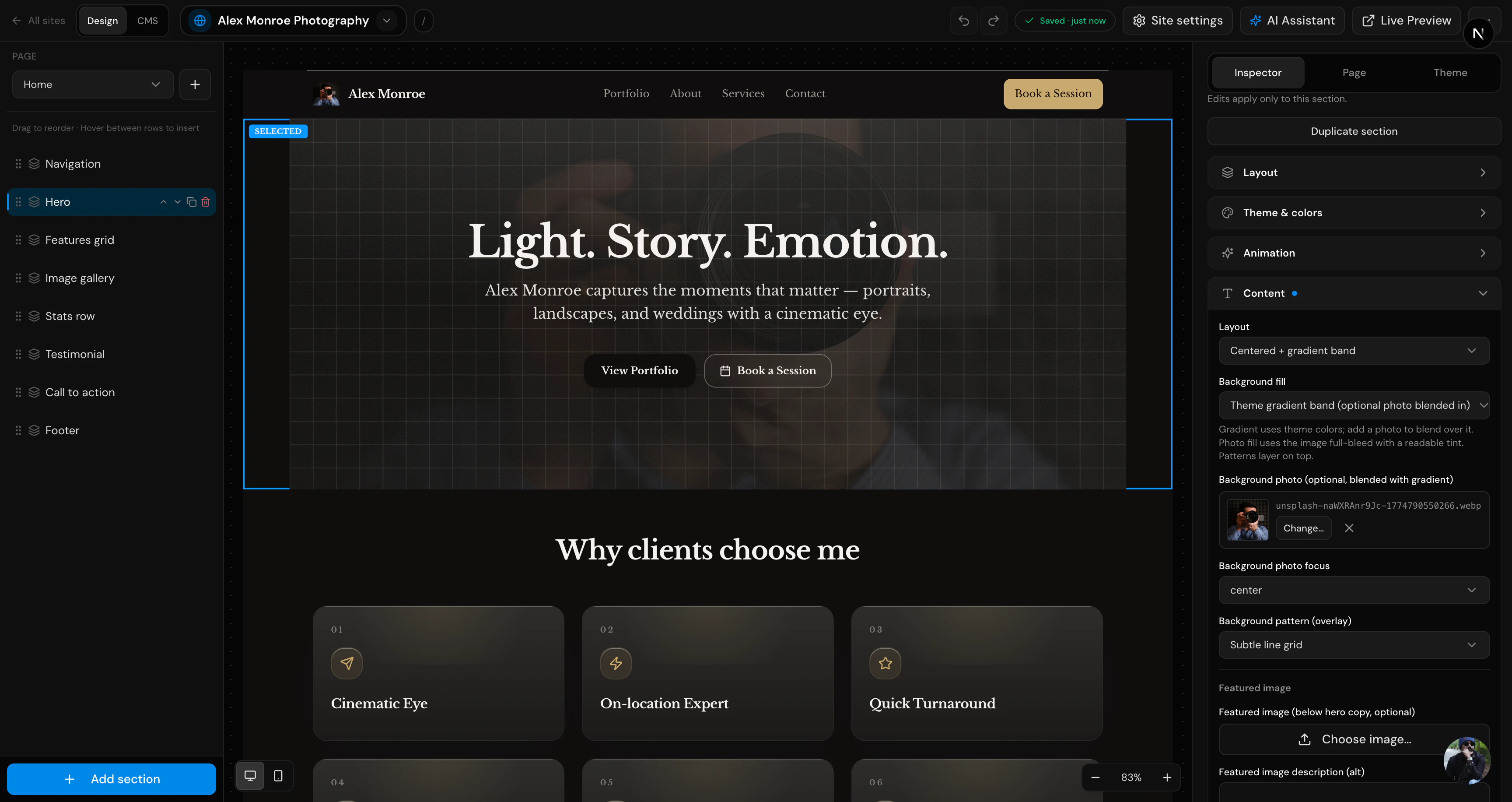
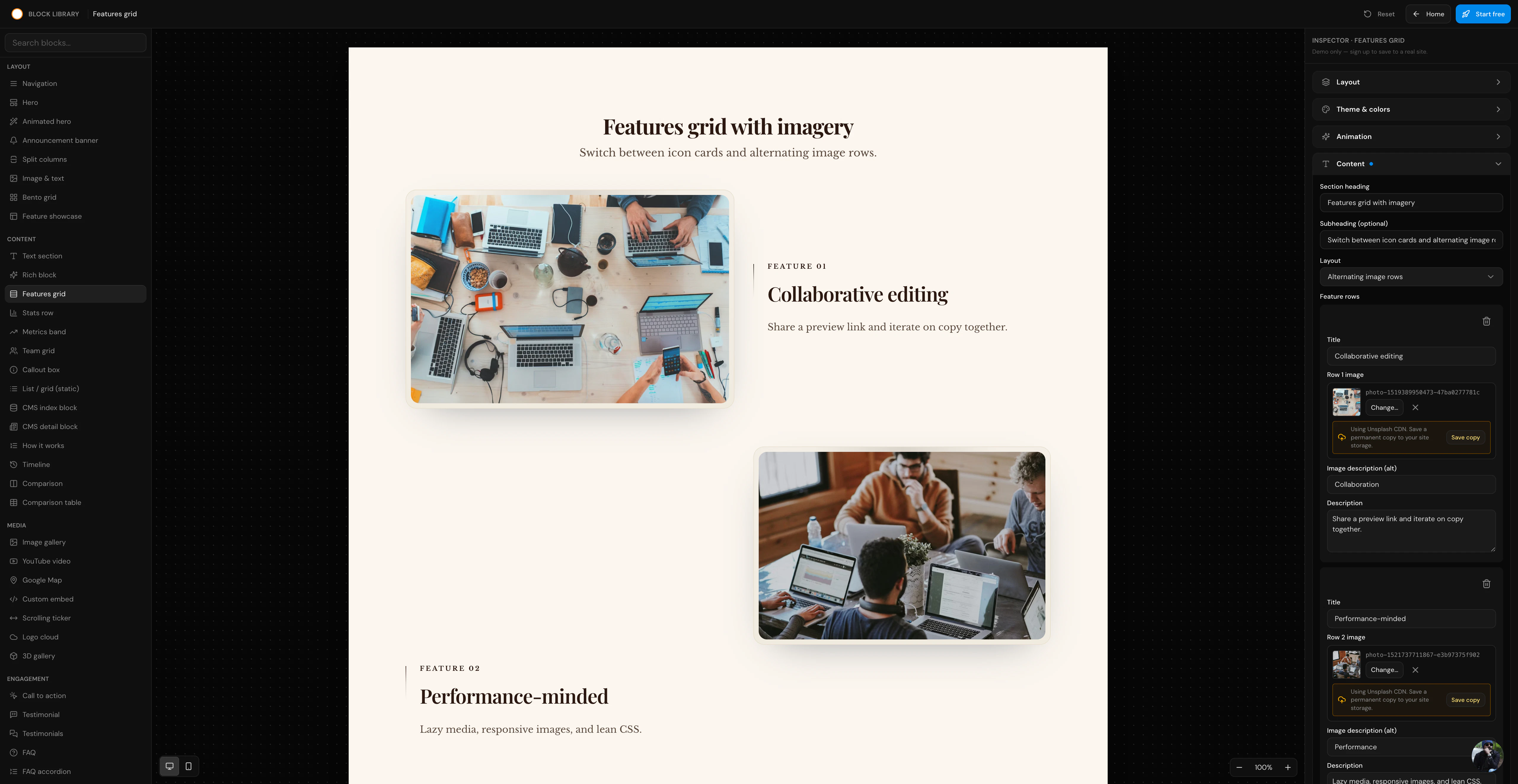
查看原始信息
Drink Your Water
Drink Your Water is not a passive tracker. It's not a gamified fish. It's accountability with a camera and actual proof. You get a prompt → You go get water → You drink it on camera. No suggestions. No polite nudges. Just camera-based sip verification, with 4 intensity modes, and a privacy-first design. Stop thinking about water. Go drink it.

I like the no-bullshit attitude here. Finally a water app that forces real accountability instead of fake streaks and cute animations.

You actually have to drink on camera when prompted.

Quick question: How do you handle privacy? Is the footage stored locally or deleted immediately after verification?

3
回复

@hsr88 Thanks!! This is what it's all about. Please give it a try and let me know how you like it! I promise you 2-5 days of use it'll turn into muscle memory.

Privacy is on the top of our mind. There is no storing of any footage at all. The feed opens up the camera, makes the detection in realtime locally, and then the feed gets cut leaving no back traces at all.

0
回复

Like most of us, I had a folder full of habit apps I'd stopped opening and reminders I'd trained myself to dismiss without thinking. The notification would fire. I'd close it. Nothing would change.

That's the loop I kept finding myself in, and why I built Drink Your Water.
Passive reminders don't change behavior. Accountability loops do. So instead of another tracker, I built something that actually closes the loop:

→ You get a notification turned into a countdown
→ You go get water
→ You drink it on camera
→ The app confirms it happened

That's it. That's the whole thing.

The front-facing camera verification was the key design decision. Just enough friction to make the action real without making it annoying:

You can't fake it
You can't dismiss it
You either did it or you didn't

Start on a normal mode first. Then try Unhinged and report back.

Happy to answer anything about the behavioral design, camera verification, how onboarding works, or why your kidneys deserve better.

Ask away.

2
回复

I've deleted more habit apps than I've ever used consistently.

The pattern is always the same → reminder fires → I snooze → I forget → I feel bad for a day → I download a new app.

Drink Your Water breaks that loop in the dumbest-smartest way possible.

You have to drink on camera. That's it. There's no way to fake it, no way to dismiss it and move on.

I tried the normal mode first. Then Unhinged.

Unhinged got me.

If you've ever ignored 47 hydration reminders in a single day (guilty), this one is actually different. Give it a shot.

1
回复

@alexcloudstar Thank you!!! This means the world to me. Hopefully this is the app that you keep on your phone and keeps you actually accountable!

1
回复